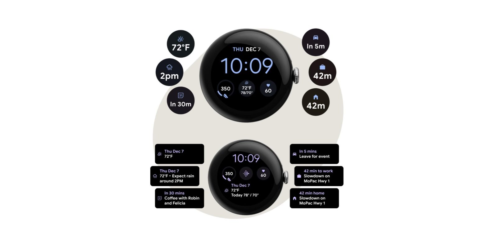
The big limitation of At a Glance when it quietly launched in June was how it only supported a single watch face, but Google has now updated it with two more complication styles.
At a Glance is no longer limited to the Modular II or Modular III layouts of the Utility watch face with its large rectangular complication slot (officially referred to as 3 line linear) on the Pixel Watch.
Now, At a Glance supports the circular “bulb” complication found on the vast majority of faces. Most of the time, it’s just showing the weather, including the current temperature, upcoming precipitation, and the day’s forecast (before 10 a.m.), which is visually quite cramped.
It can also show upcoming calendar events. “To work” is represented by a briefcase, while “home” is straightforward. “Leave for event” shows a generic car icon. There’s much less context here that will likely require a tap, but it does convey the necessary information.
There’s also support for the complication slot that appears at the top of watch faces like “Everyday” and at the perimeter of the new Adventure and Analog Arcs. It’s just the icon and an even smaller degree of text or numbers.
These updates launched on the Pixel Watch 2, but has since rolled out to the original Pixel Watch. The At a Glance complication is powered by the Google Assistant app on Wear OS.
On the Pixel 8 and 8 Pro, At a Glance received a new next day forecast that appears in the evening, and the ability to surface event and train tickets from Gmail.
More on At a Glance
- Redesigned At a Glance widget widely rolling out on Pixel
- At a Glance widget will tell you ‘About this content’
- Google Pixel’s At a Glance widget now showing food & grocery delivery status
Thanks, Silvijn
FTC: We use income earning auto affiliate links. More.


Comments