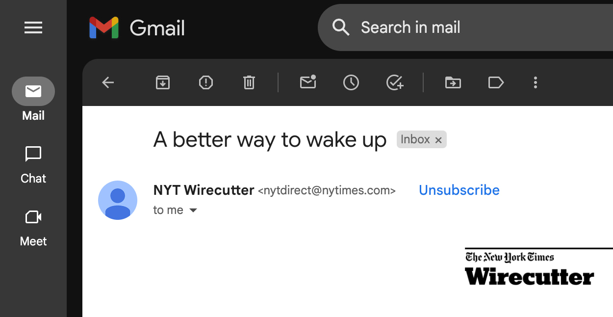
In October, Google announced that it would require bulk senders to add a one-click unsubscribe button in the body of emails. Gmail is now making its “Unsubscribe” button much more prominent.
On the web, we’re seeing this blue button next to the sender name, verification checkmark (if supported), and email address. This replaces the more subtle version introduced in 2014 that just used gray text and an underline.
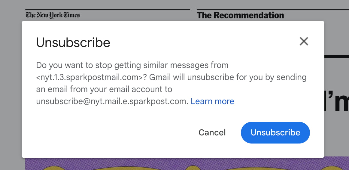
Tapping has you confirm the action before Google “unsubscribe[s] for you by sending an email from your email account.”
This shortcut also appears in your inbox when you hover over a message. It appears at the right before Archive, Delete, etc., as a very fast way to tame your emails.
Gmail for Android has long placed its Unsubscribe button in the top overflow menu, while that option is sometimes also offered when you mark a conversation as spam on the web. We expect this bigger “Unsubscribe” button to also make its way to Gmail for Android and iOS.
Be sure to reload Gmail to see this feature.
More on Gmail:
- Gmail package tracking can now bump emails to the top of your inbox
- Gmail notification icons on Android are no longer red
- Gmail spam detection has received its ‘largest defense upgrades in recent years’
- Gmail rolling out navigation rail on Android tablets
FTC: We use income earning auto affiliate links. More.


Comments