As Google’s rebrand of Nearby Share continues, we’re now seeing Quick Share appear on Chromebooks.
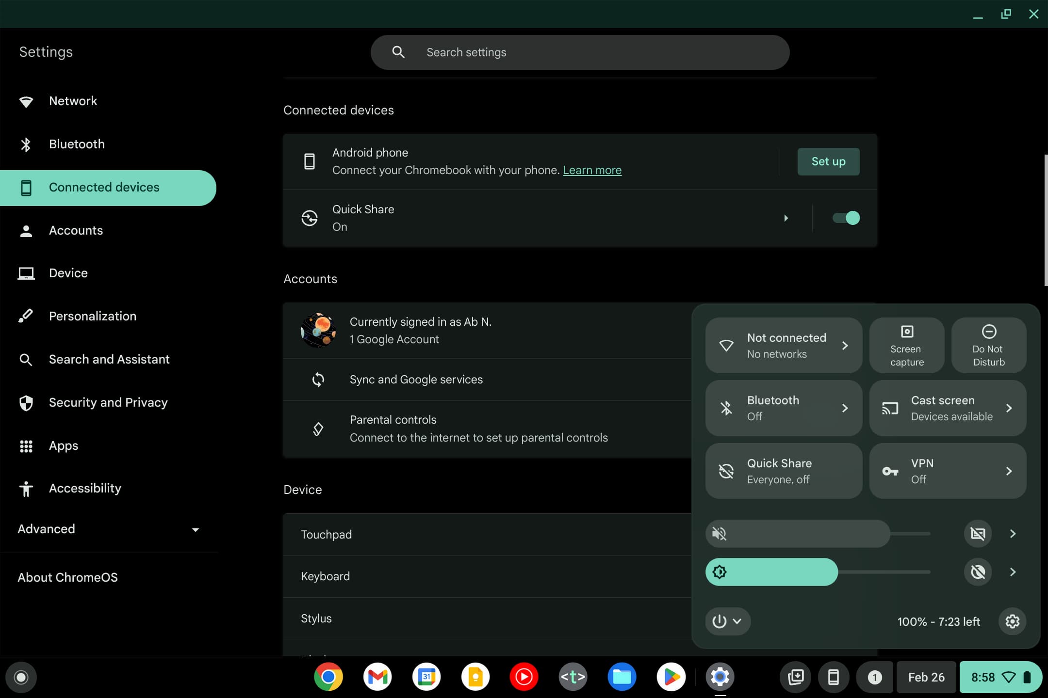
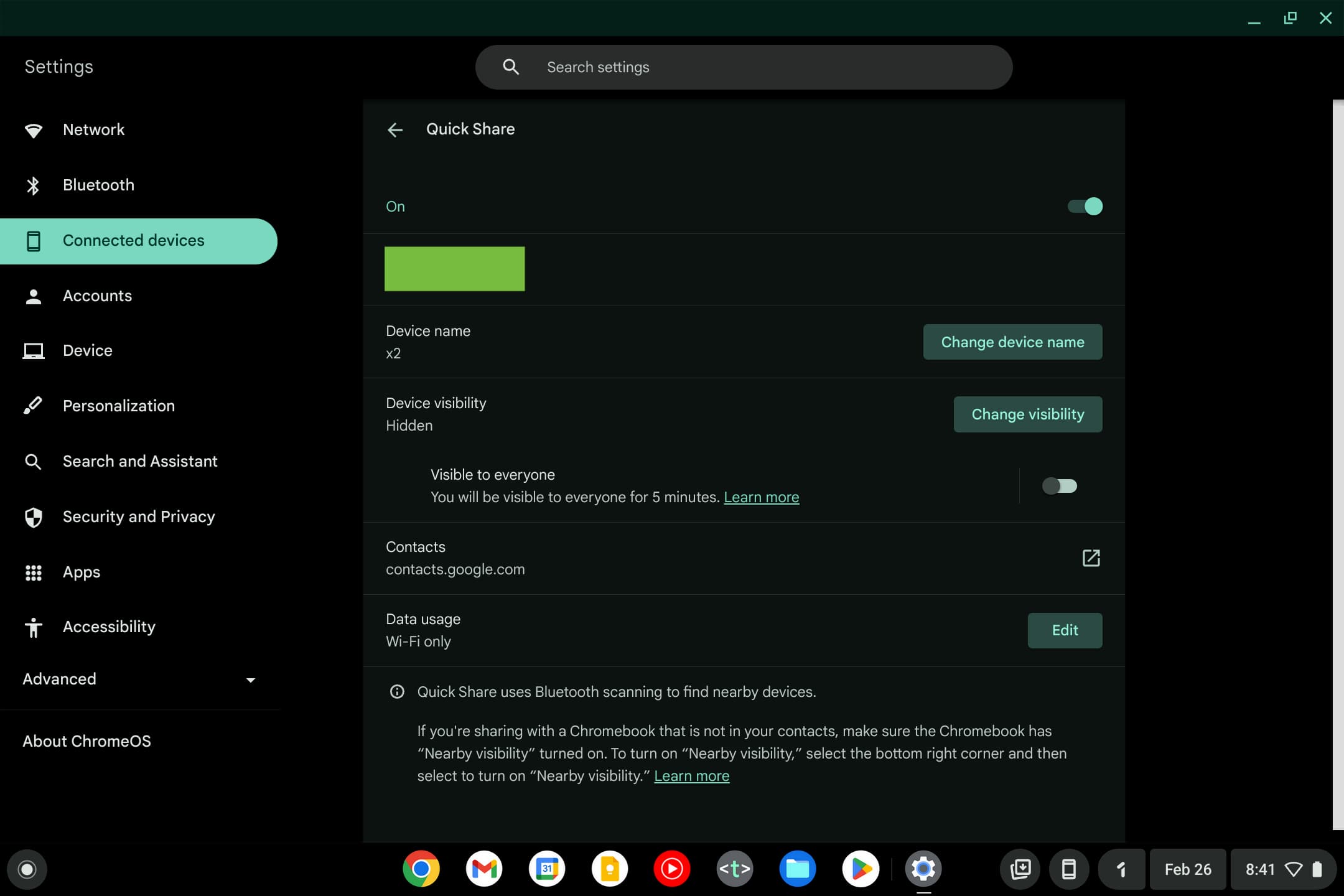
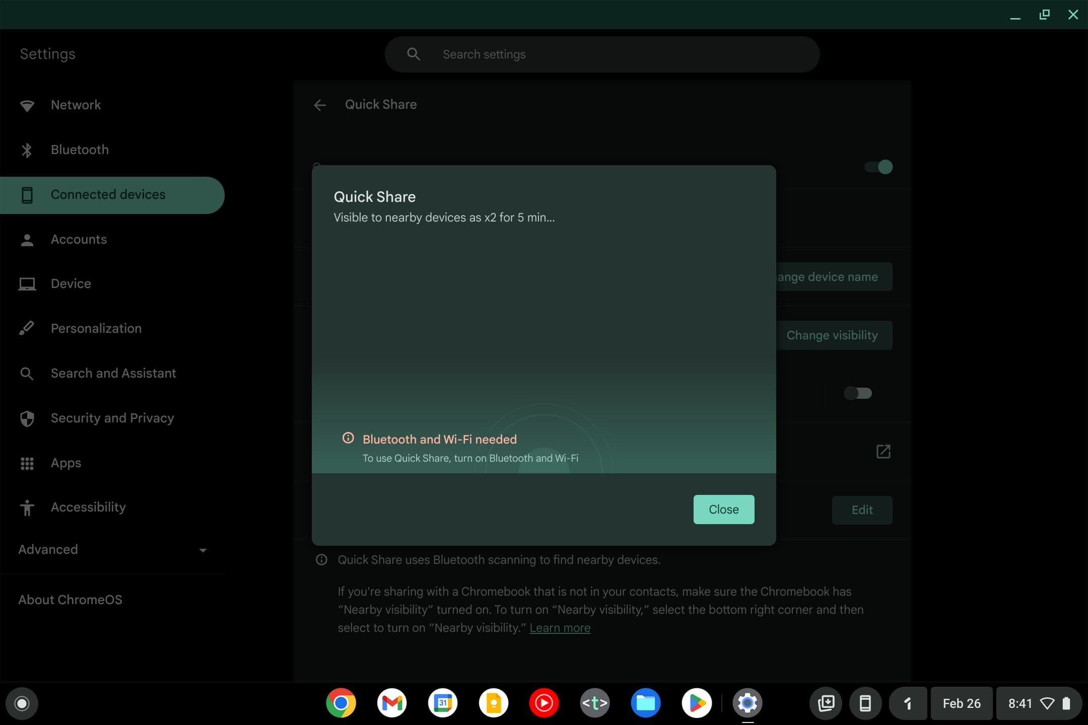
Compared to Android where there’s a new fullscreen UI, the shift from Nearby Share to Quick Share is more of a visual rebrand. The Quick Settings Tile features the new circular logo and name, which also appears in Settings > Connected devices.
In that regard, the Chromebook rebrand is like the Quick Share update to the Windows app. We’re seeing this Quick Share rebrand on the current ChromeOS 121 stable, but it’s not yet widely rolled out.
Meanwhile, version 121 introduces a redesign of the ChromeOS media player that brings it closer to the Android version. Cover art appears on the left with the responsible site, track name, and wrist appearing next to it. A big, circular play/pause button is on the other side, while the bottom is home to a scrubber flanked by next/back.
You also get shortcuts to open the Cast menu and stop sessions on your network. You can either pin it to the shelf or leave it in Quick Settings.


Old vs. new
More on Chromebooks:
- How to use Pixel Tips to get Quick Share right now
- Chromebooks added a charging sound, but you have to manually enable
- All Chromebooks should have fingerprint sensors by now
- Review: Acer Chromebook Plus 515 takes the new standard and runs with it
FTC: We use income earning auto affiliate links. More.


Comments