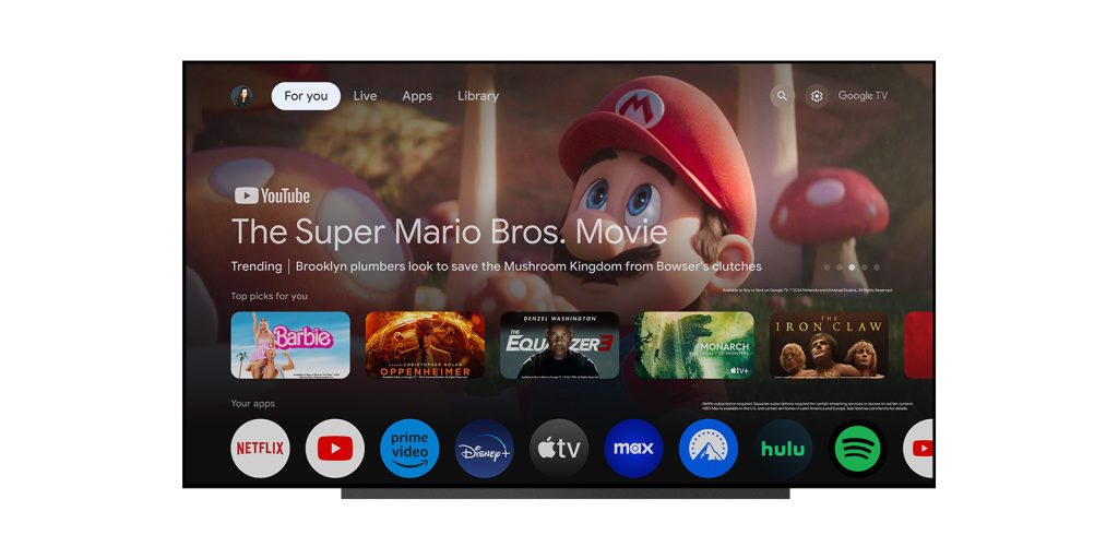
A few months after first teasing it, Google TV is now rolling out a homescreen redesign that adds circular icon shapes for apps and a handful of other tweaks.
Announced on Google’s support forums, Google TV’s homescreen redesign brings several changes, starting with app icons. As announced last year, app icons on Google TV now show in circles. These are smaller than the existing rectangles, but that also means you can show more apps at once.
Beyond that, and more importantly, the “Your Apps” row is also getting other tweaks. Starting with this latest Google TV homescreen design, you’ll be able to more easily reorder apps with a dedicated button for the function. Previously, a new UI first had to be opened up, followed by a long-press of the select button. There’s also a new “add apps” button which will apparently be used to install new apps, though it’s unclear if it connects to the Play Store or just opens the “Apps” tab.
The “Your apps” row now features “reorder” and “add apps” buttons at the end of the row, giving you more control over how your apps are organized and easier access to discover and install new ones.
Finally, Google is also adding a new means of access to free live TV channels. Instead of just putting those channels on the “Live” tab, a new shortcut app will be available for the “Your Apps” row. Google previously added this option on Android TV.
Google says this Google TV homescreen redesign is rolling out starting today and should be available to all devices over “the next few months.”

More on Google TV:
- Chromecast with Google TV update rolling out: Fast Pair, Audio output switcher
- Wasn’t Android TV supposed to basically be dead by now?
- Google TV’s homescreen video ads now include fast food too
Follow Ben: Twitter/X, Threads, Bluesky, and Instagram
FTC: We use income earning auto affiliate links. More.


Comments