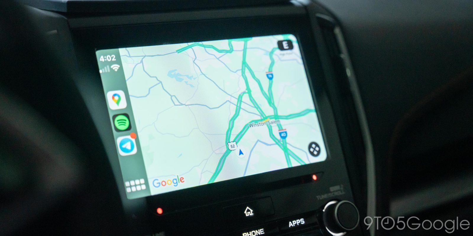
Google Maps is perhaps one of the most widely used applications on the planet and, as such, even minor changes to its design are super important. But, on Apple’s CarPlay, Google Maps is in need of a massive overhaul, because it’s a bit of a dumpster fire.
Apple CarPlay and Android Auto are hugely useful platforms for safely using the apps and services on your smartphone on your car’s display while behind the wheel. For many, support for these can be a make-or-break point in buying a vehicle.
One of the key use cases, of course, is navigation.
Built-in navigation systems in cars have gotten better over the years, but they’re often less reliable than what we have on our phones, and they often come with a cost too. As such, being able to put Google Maps on your car’s display is a huge point for many users.
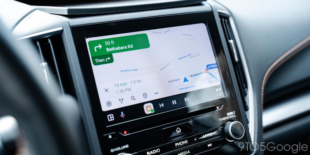
On Android Auto, that’s a pretty solid experience. Maps will show a couple of recommended destinations based on your habits, search history, calendar events, etc, as well as offering a sidebar of settings to customize the drive. It works pretty well, with users able to do just about everything they’d need to including sending their ETA to another person available from the car’s display and more.
Over on Apple CarPlay, though, the Google Maps app feels like a shell of itself.
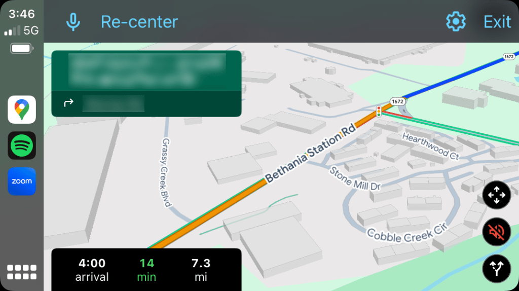
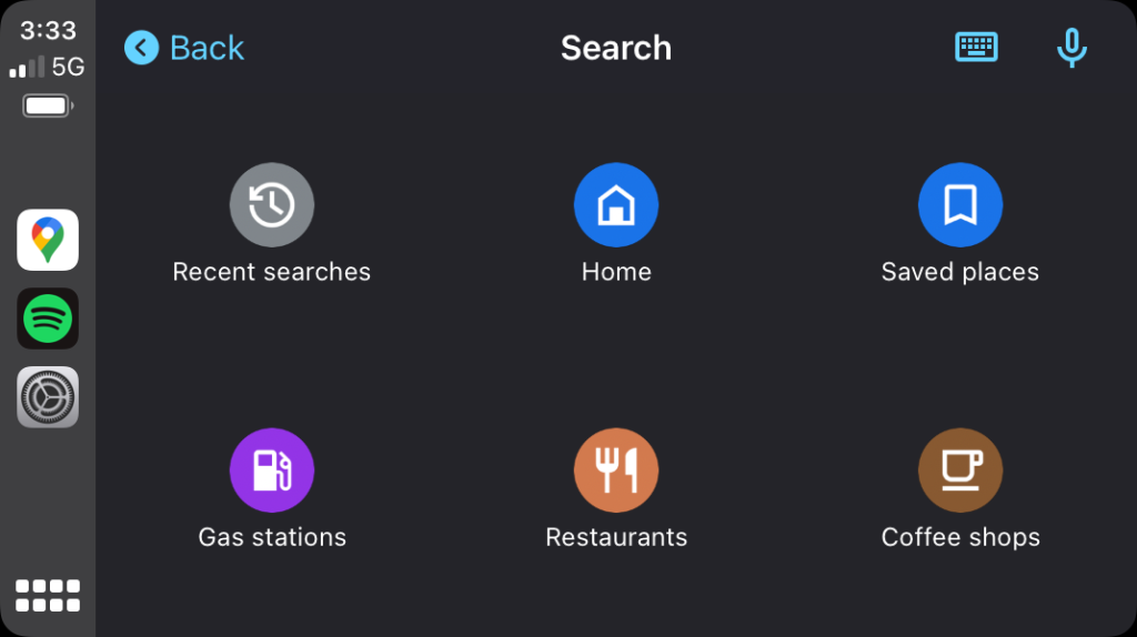
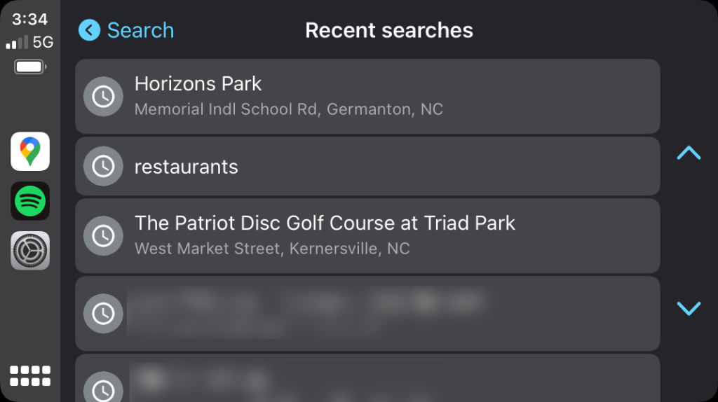
The Google Maps experience for CarPlay is barebones, to say the least. Opening the app just dumps you into the map. No navigation targets or anything in view. A search bar at the top – which is hidden – opens access to saved places, recent searches, etc. It’s usable, but it’s not convenient or nearly as functional as the phone app or Android Auto experience.
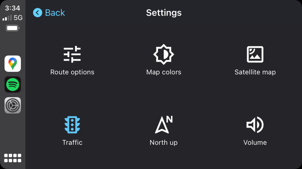
It only gets worse when you jump into settings. The options there are minimal at best, and missing a lot of more recent additions.
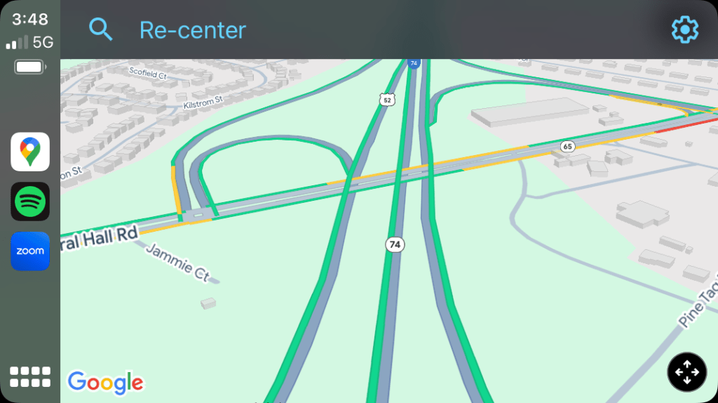
For instance, Google Maps rolled out 3D buildings to Android Auto and CarPlay earlier this year. Users on Android Auto can change this setting directly on their car displays, while CarPlay users are left frustratingly having to disconnect from the car and change the setting in the app on their iPhones.
What about navigation itself? There, the experience it at least comparable to Android Auto. Google Maps on CarPlay shows the most important data like turn-by-turn directions, a visual overview of the street you’re on, and ETA. But there’s no way to share your ETA with someone else. The UI design as a whole also looks very dated compared to the app on phones.
Top comment by NasDurden
TBF if you live in a major city where Apple Maps has updated you to their 2.0 maps system, Google Maps is a disaster compared to Apple Maps just in general. Their 3D rendered layout with buildings, houses, trees, islands, lane markings, bridges, off ramps, etc. plus just a much cleaner looking UI makes Google Maps look ancient by comparison.
Frustratingly, I can’t even reposition the map easily, as (at least in my vehicle) I’m required to use the directional arrow in the bottom right corner of the screen.
The whole experience leaves a bad taste. I’ve, personally, never been a big fan of CarPlay, but the Google Maps experience just really sours it even more. Apple Maps really does pull way ahead on CarPlay, and it’s nonsense that Google has pretty much ignored this for so long (it basically hasn’t changed since its 2018 launch), especially when it’s not like Apple is forcing Google into this outdated and limited design. There are plenty of other navigation apps on CarPlay that work just great.
Then again, it’s not like Google covers all its bases with Maps features in the car, even on Android Auto.
More on Google Maps:
- Google Maps speed trap and accident reporting is increasingly useless
- Gemini updated to automatically start Google Maps navigation
- Apple will let EU users set Google Maps as the default navigation app on iPhone
Follow Ben: Twitter/X, Threads, Bluesky, and Instagram
FTC: We use income earning auto affiliate links. More.


Comments