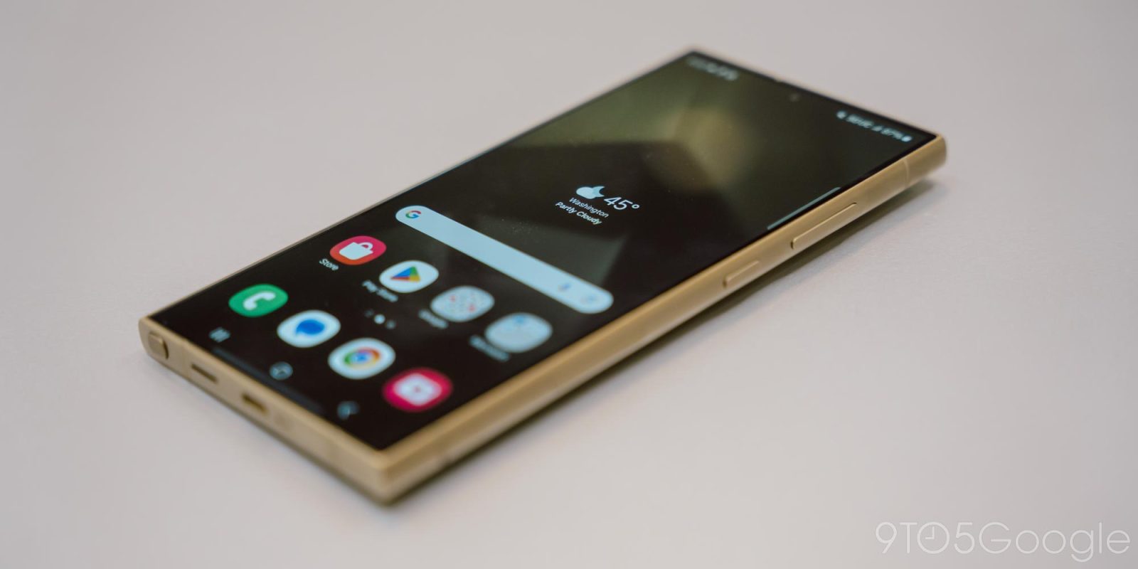
Samsung’s One UI has always been a pretty heavy skin on top of Android, but it sounds like the upcoming One UI 7 update on top of Android 15 will take a lot more… “inspiration” from iOS 18 than from Android itself.
Android 15 is a relatively small update for the platform, devoid of any major visual changes for another year. But just because the underlying foundation is small, that doesn’t stop Samsung from making some big changes, and One UI 7 is said to be “the most changed” version Samsung has ever released since the original One UI revamp several years ago.
But, what’s actually changing?
Thanks to some early leaks we have a better idea of what Samsung has in store for One UI 7 and Android 15, and it does sound drastic indeed.
Most of the early information around One UI 7 is coming courtesy of Chun Bhai on Twitter/X, a fairly reliable Samsung leaker. In several posts over the past few days, we’ve been given an idea of some of the many changes Samsung has in store and, in many cases, it seems like the ideas are straight out of Apple’s iOS.
In an early breakdown of new changes, it’s noted that the default icon pack on One UI 7 is “more rounded” and somewhat 3D, leading to a look that’s closer to what Apple is using on macOS and visionOS. The Gallery app icon is one of the only ones we’ve seen, and it also ditches its red color for a rainbow color on the icon with a white background. The Camera icon, meanwhile, shows some of the 3D design. Ice Universe claims that icons “may” change before the final release, though.


Another screenshot shows “Classic” and “Bold” icon layouts, with “Bold” making the icon slightly bigger and removing the text. This is the same behavior Apple is adding in iOS 18 with “Small” and “Large” icon formats.
Beyond that, Chun’s sources mention that Samsung has a “copycat” design for “Quick Action” on the lockscreen. It’s unclear how this is actually changing, but Android and iOS both have very similar mechanisms for this. The main difference with Samsung at the moment is that you swipe to open the action, rather than using a long-press. Lockscreen widgets are also apparently “more rounded,” akin to how they look on iOS.
Another significant change is that, apparently, Samsung’s Android 15 update will break apart the notification tray and Quick Settings, putting them on two different panes. Like Xiaomi’s HyperOS and Honor’s MagicOS, though, you’d be able to swipe left or right to access the other pane. Android did put these on two different panes in older versions, but Google shifted away from that design long ago, while Apple’s iOS doubled down on the two-pane setup (without the swipe gesture) following the move away from the physical home button on its devices (Control Center used to be accessed through a swipe up from the bottom of the screen). Alongside the two panes, Chun says that settings will be “more rounded” and you’ll still be able to adjust placement (but not size, “yet”).
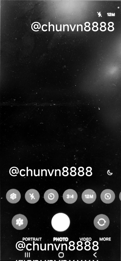
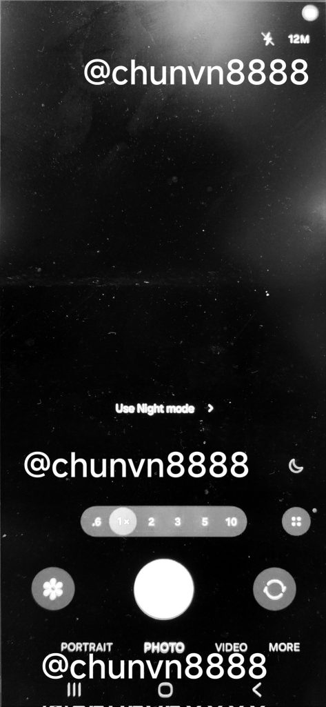
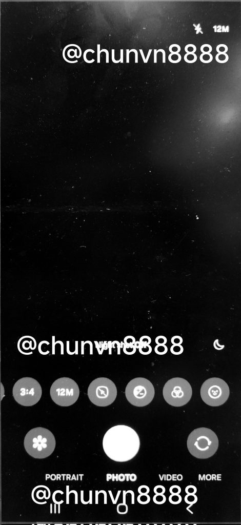
The camera UI is also getting a significant update, moving all of its UI elements to the bottom of the screen, much like Google’s Pixel camera UI.


Other changed noted include “AR Emoji” becoming “Galaxy Avatar” and the battery icon in the status bar getting a percentage inside of the icon itself. But, even with all of that, Samsung still doesn’t seem to have adopted support for a vertically scrolling app drawer.
The first beta of Samsung’s One UI 7 update is expected to arrive as soon as next week, but the final release is probably still at least a couple of months away.
More on Samsung:
- Samsung ups Galaxy Ring production amidst high demand
- Galaxy phones now stop you from sideloading Android apps by default
- Samsung is pouring research into ‘AI phones’ with ‘radically different’ hardware
Follow Ben: Twitter/X, Threads, Bluesky, and Instagram
FTC: We use income earning auto affiliate links. More.


Comments