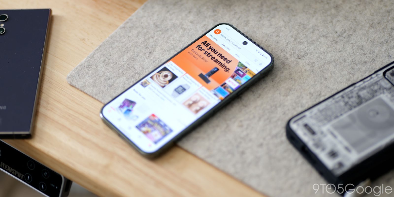
The Amazon app on Android has undergone few changes, but it is now receiving a very minor facelift alongside the integrated Rufus AI shopping assistant.
If you were unaware, Rufus was already rolling out to all US customers in late August. However, it appears that with the updated Amazon app interface, the AI tool is hitting more devices. Over the past few days, we spotted this appearing on more of our own Android hardware. We are seeing this on version 28.17.0.100 and higher,. If you don’t see the changes, force stop the application and relaunch.
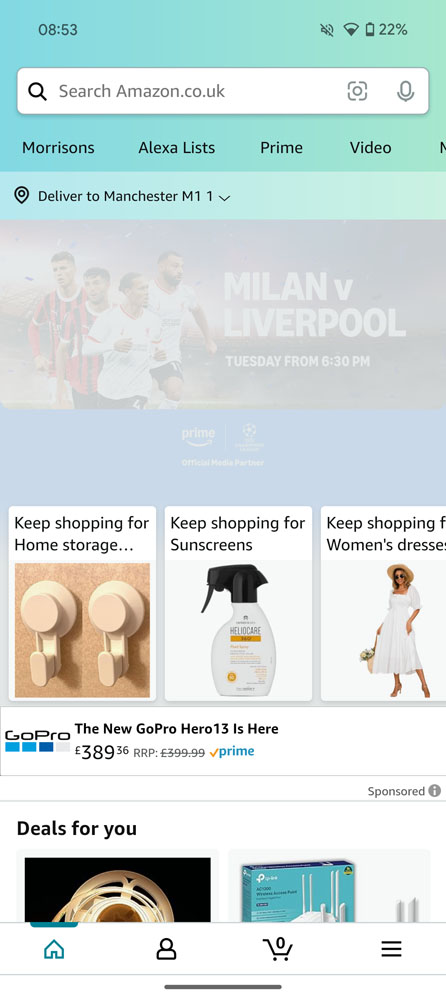
When launching the Amazon app on your Android device, you’ll notice a new search bar and removal of the blue gradient section that has been present for several years. The entire region has been reduced significantly with smaller tabbed sections for various store areas and less prominent delivery location tab.
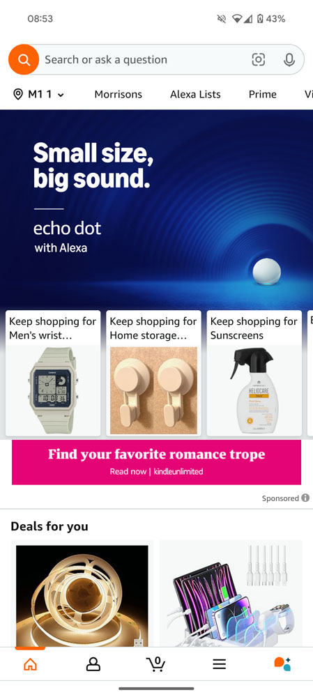
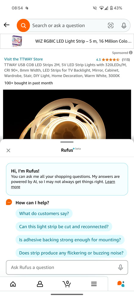
Recently viewed items are more integrated into banner ads, while the bottom navbar also has the extra Rufus icon that, when activated, allows you to get information on products or services. Rufus allows you to compare products quickly, which is useful given the limitations of the single-product view that is a limitation of the Amazon Android app.
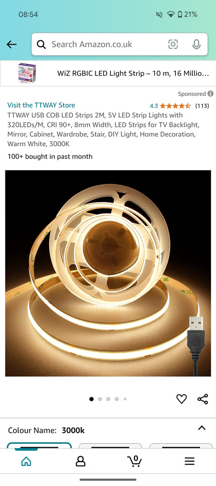
Other changes are fairly minimal and mainly relate to the new AI tool. So, when viewing a product, you may see an expandable tab that lets you pull up to ask or find quick answers about the item in question. All of the core functionality remains the same and other sections such as your account information and more are identical to previous versions of the Amazon Android app.
More on Android:
- Google Search app on Android keeps crashing in widespread bug
- Android is experimenting with replacing status bar notifications with color app icons
- What’s new in the September 2024 Google System Updates [U: 9/11]
FTC: We use income earning auto affiliate links. More.


Comments