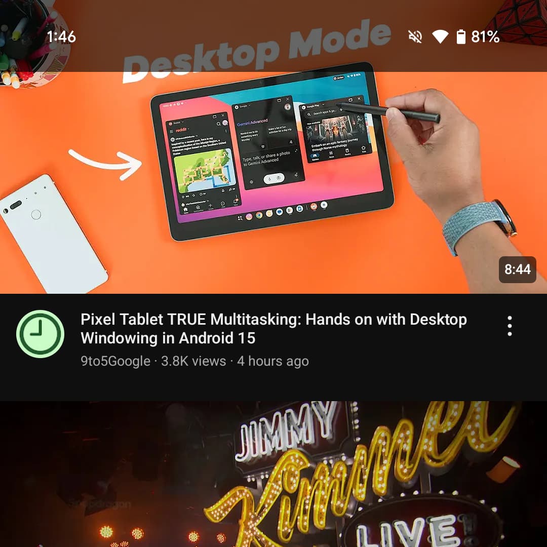
YouTube for Android is rolling out a transparent status bar that makes for a nice qualify-of-life improvement.
Previously, there was a solid status bar when you scrolled through the app’s Home and Subscriptions feeds.
You will now see video thumbnails underneath the time, notifications, and status bar icons for a slightly more immersive experience. It’s in line with Ambient mode in the video player. However, when you’re at the top of those two feeds, it does not look seamless when the system dark theme is enabled.
Old vs. new


We’re seeing this transparent status bar rolled out on several devices today with version 19.37.35 of YouTube for Android (14 + 15), but it’s not yet fully available.
Meanwhile, apps that target API level 35 on Android 15 are “displayed edge-to-edge by default.” The Android team cited how “an internal Google user study found that users significantly prefer edge-to-edge screens over non edge-to-edge screens” as it results in a “more satisfying and premium” experience.

More on YouTube:
- YouTube getting smart TV updates, Communities with posts, and more
- YouTube for Android TV frustratingly fuses the ‘like’ and ‘dislike’ buttons
- YouTube starts showing ads when you pause a video on TV
- YouTube adds QR codes to share channels
FTC: We use income earning auto affiliate links. More.


Comments