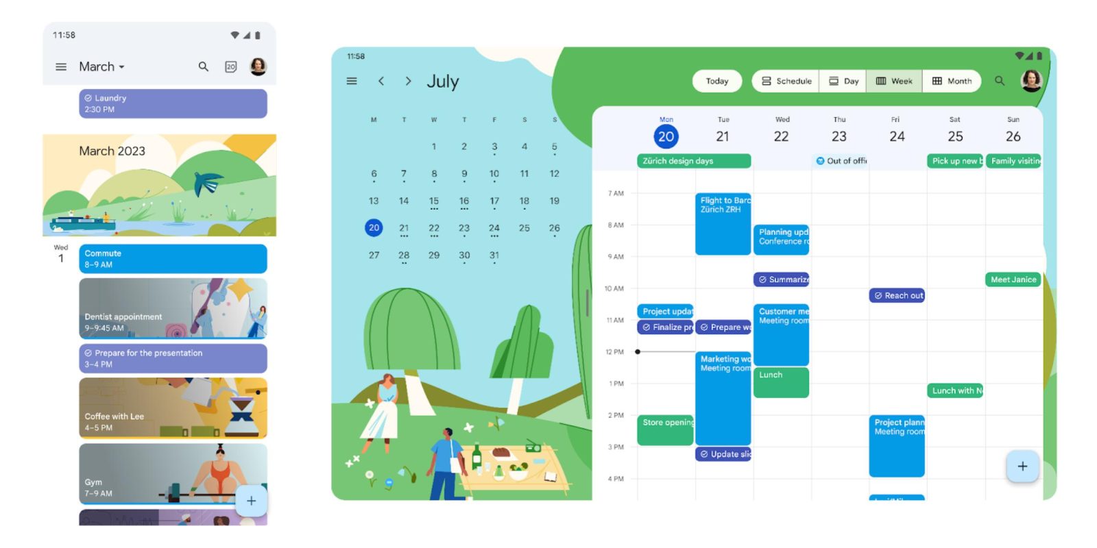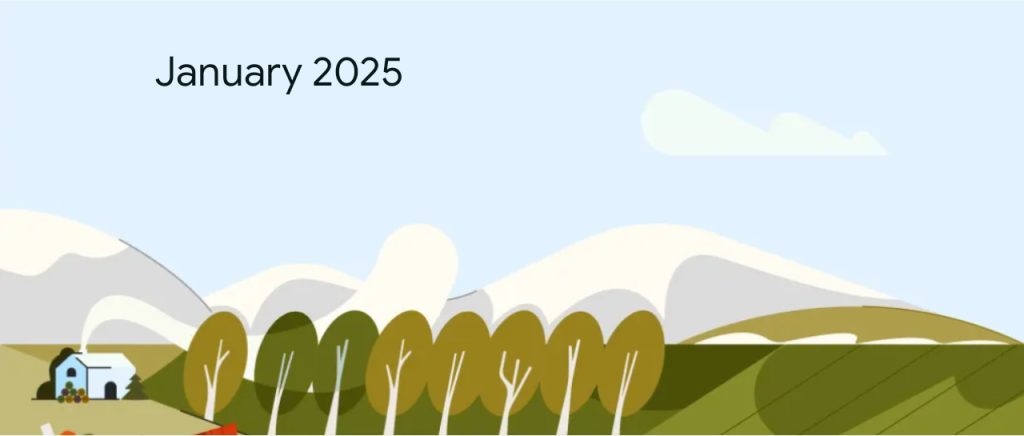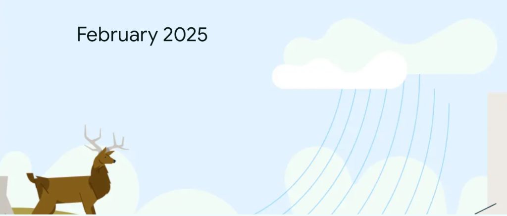
As announced on Friday, Google Calendar for Android and iOS now have “refreshed illustrations.”
There are two sets of updated drawings, starting with the monthly cover images in the Schedule view on phones. This artwork is featured much more prominently as the background on tablets.
Notably, these updated illustrations change/adapt to whether you have the system Dark theme enabled. It’s a rather nice touch.
Top to bottom: Old, new light, new dark


Google Calendar also now features “more modern illustrations” for events like coffee, lunch, doctors appointments, flights, meetings, birthdays and much more. These appear throughout the app.
This is widely rolling out as a server-side update today.
More on Google Calendar:
- Google Calendar Gemini Extension starts rolling out
- Google Calendar for Android will let you manually add birthdays
- Google Calendar coming to Chrome’s New Tab Page for Workspace users
FTC: We use income earning auto affiliate links. More.


Comments