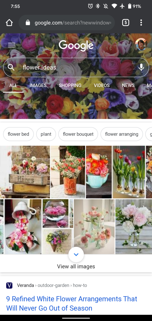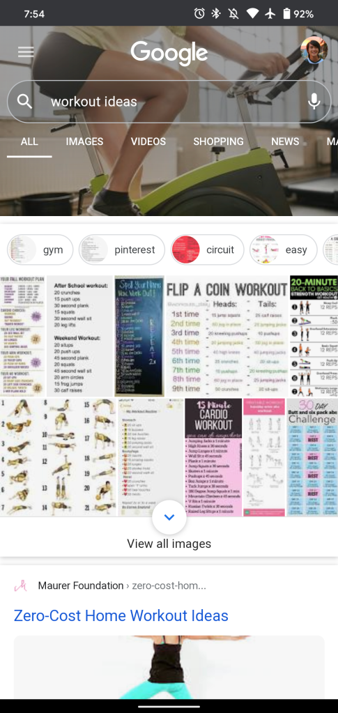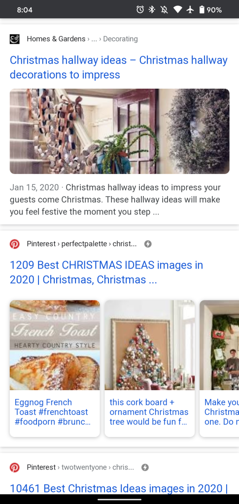
Google is conducting a test on mobile that sees some Search results be accompanied by a very prominent top portion. These Google Search background headers are specifically tied to queries for “ideas” on mobile.
This morning (via SEO Roundtable), Google Search started testing background headers to accompany terms related to “ideas.” For example, this includes: “ideas for Christmas,” “creative ideas,” and even “ice sculpture ideas.”
In addition to an image appearing behind the search field, the top portion of Google Search — which includes the company logo, your profile image, and filter tabs — is significantly taller to fully show the background.
This is a rather bold change that really emphasizes what you’re searching for. Google does not usually like to detract from its logo — with the partial exception of Doodles. You barely see the branding with this design as it somewhat disappears to make way for the tinted background image. The height does mean you have to scroll more, then again this is already an image-heavy page.
Meanwhile, the ten blue links below are all accompanied by featured images in addition to the page name and description.
These Google Search background headers are live on the mobile web in Chrome but not the Google app for Android or iOS. This A/B test is not widely rolled out.
More about Google Search:
- Search activity cards now optimized for shopping, jobs, and recipes
- Google Search ‘what to watch’ recommendations now include what’s live on TV
- Google adds 3D molecules and more to help teach chemistry at home
- [Update: Songs] Google Search now links to albums, artists in YouTube Music
FTC: We use income earning auto affiliate links. More.


Comments