
Last month, we showed you a first glimpse of what Chrome OS will look like when it gains a light mode in the near future. Work has since continued on light theme for Chrome OS, and at the same time the default dark theme has begun to get darker.
For years, Chrome OS’s UI has lived somewhere between light and dark. The app shelf and quick settings have been fairly dark, sharply contrasted by blindingly white elements like notifications, the search card, and the Files and Settings apps.
One of the biggest visual shakeups coming to Chrome OS in the near future is the addition of light theme, which brightens the dark elements to offer a consistently white UI throughout. That said, the toggle for this feature is distinctly titled “Dark Theme,” which could imply that a properly dark version of Chrome OS is coming soon, something many have long been waiting for.
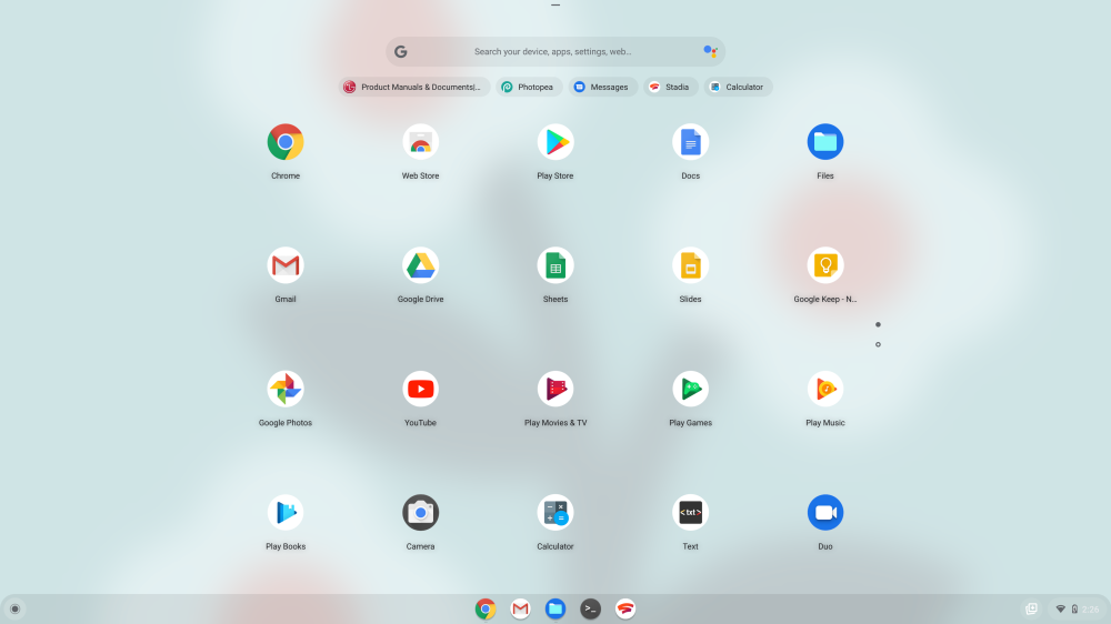
As of the most recent builds of Chrome OS Canary, where we manually enabled the toggle, a few new pieces of the design have gotten lighter, especially the launcher and app drawer.
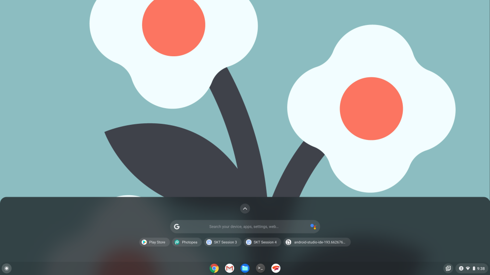
However, with this update, we’ve begun noticing changes to the way the default dark theme looks. The most standout change of Chrome OS’s dark theme so far is that the launcher’s search bar and search results card have both been flipped from light into dark, matching the dark theme of Google Search bar on Pixel phones.
This, along with a wide variety of recent and upcoming code changes related to “dark mode” for Chrome OS all point to the default dark theme getting darker in the coming months. Unfortunately, we’ve yet to see any signs of built-in Chrome OS apps like Settings and Files get the beginnings of dark mode. Similarly, we don’t yet know when Google intends for Chrome OS’s theme toggle to officially launch.
Update 10/26: Over the last few weeks, Chrome OS Canary has steadily improved both its dark mode and its light mode. The most tangible benefit is that there is now a dedicated flag in chrome://flags to enable the light/dark theme switcher in the Quick Settings panel.
Dark/light mode of system UI
Enables the dark/light mode of system UI, which includes shelf, launcher, system tray, etc. – Chrome OS
#dark-light-mode
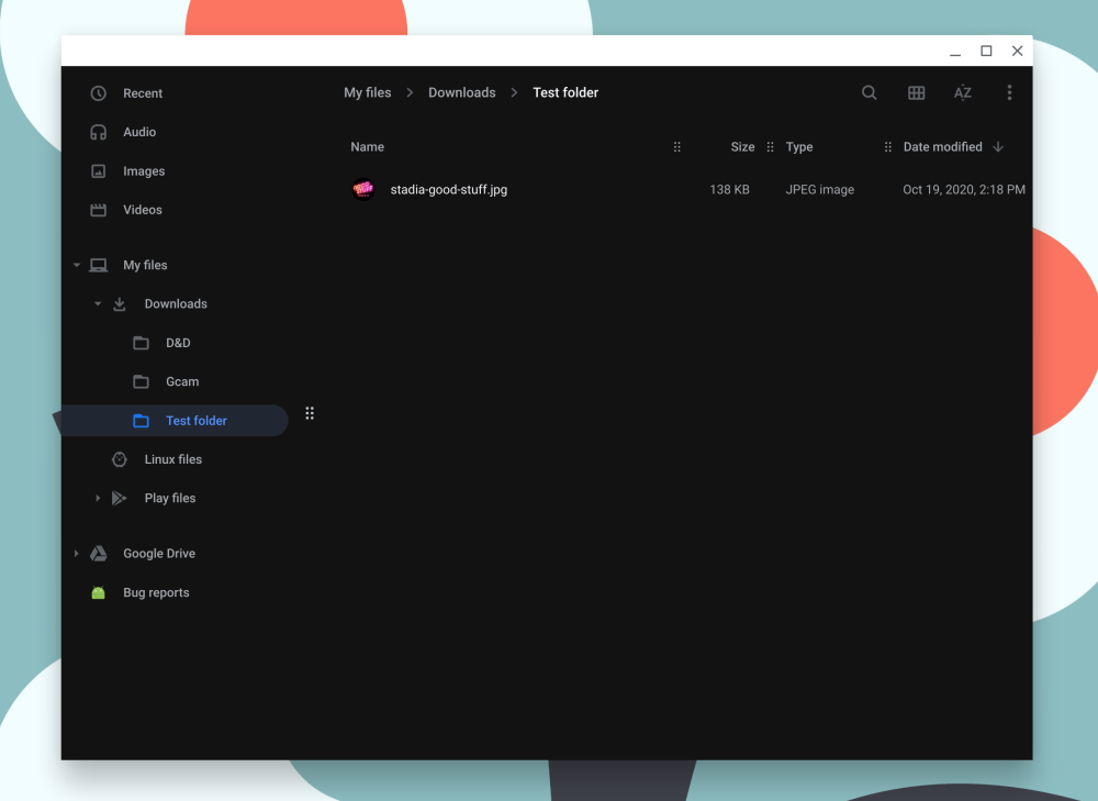
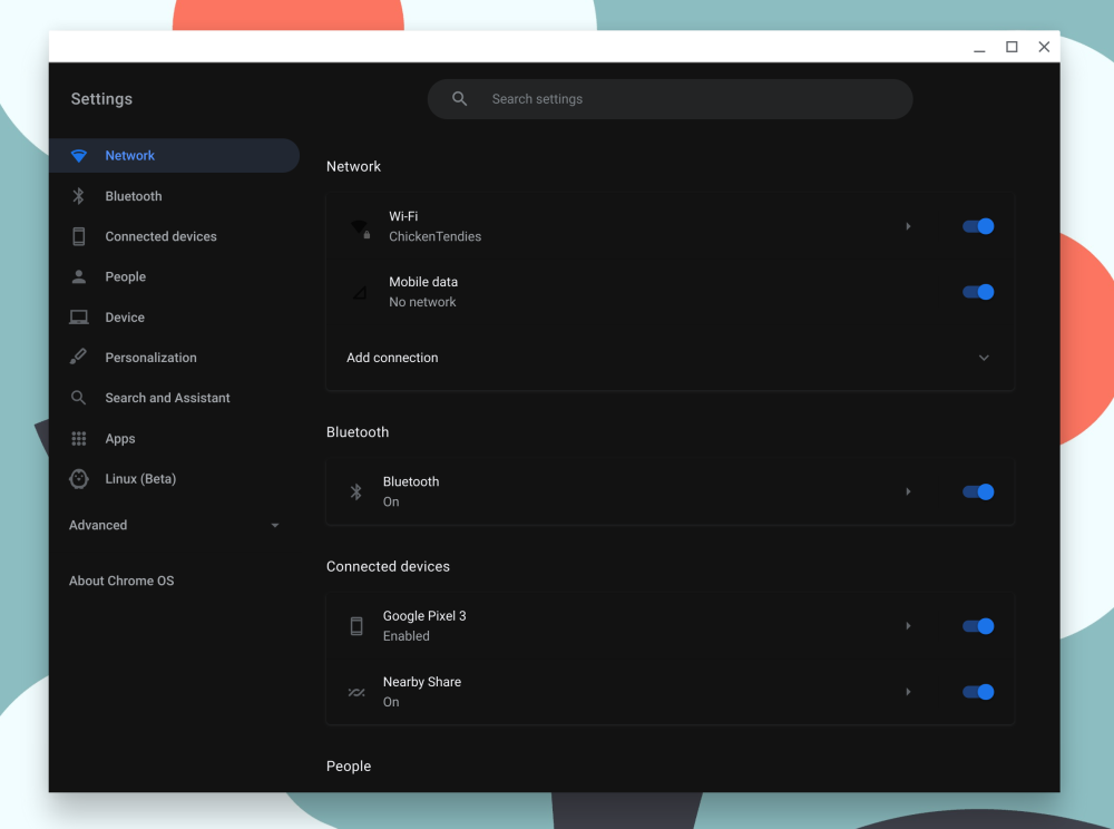
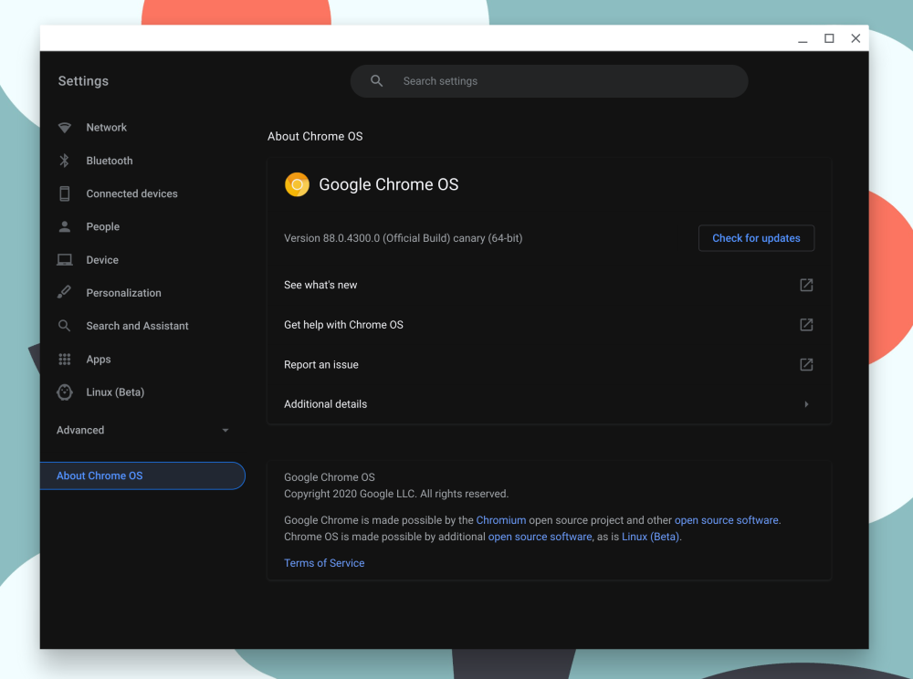
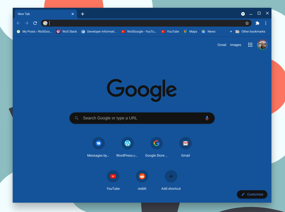
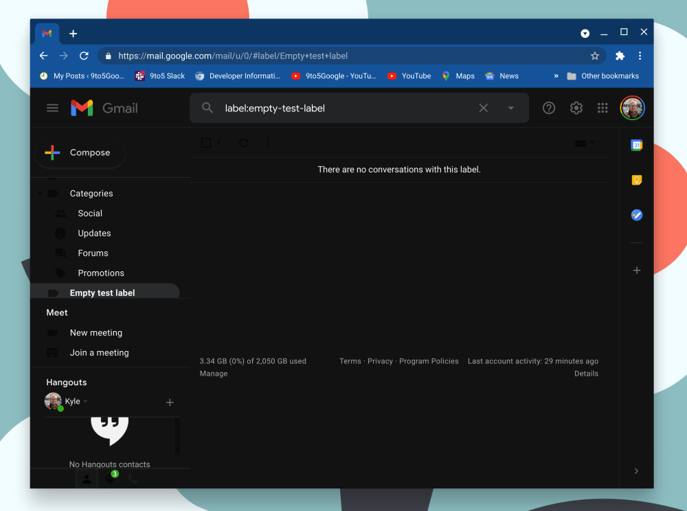
Additionally, the folks at Android Police discovered a way to make far more of Chrome OS appear in a dark theme. By enabling the two flags below, you tell Chrome to darken every web page, including web-based apps like Files and Settings, typically by switching white elements to be black and vice-versa, as well as inverting some colors and brightness levels where it makes sense to do so.
Force Dark Mode for Web Contents
Automatically render all web contents using a dark theme. – Mac, Windows, Linux, Chrome OS, Android
#enable-force-dark
WebUI dark mode
Allows dark mode usage in WebUI. Note that this does not necessarily enable dark mode, which is enabled via the #enable-force-dark flag. – Chrome OS
#webui-dark-mode
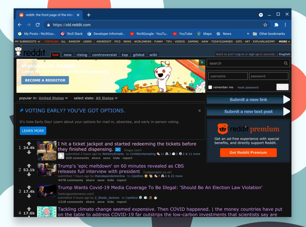
The end result is that the Files and Settings apps are given a coat of black paint, but so also is every website that you may visit. While there’s no denying the general appeal of dark mode, this method is still imperfect as some elements like the various icons on the Settings app homepage are borderline invisible. Presumably, by the time Chrome OS’s dark and light theme launch, various apps will be given native light/dark options rather than relying on a “forced” dark mode.
Another key element of the dark theme equation still missing is that Chrome OS’s Android apps support is still powered by Android Pie, which means it does not yet have native dark mode support. Thankfully, work has been ongoing for over six months to bring Android 11 to Chrome OS.
What other parts of Chrome OS would you like to see get a proper dark theme makeover? Let us know down in the comments.
More on Chrome OS:
- Latest Chrome OS beta, dev channel builds break Android apps with ‘uniform scaling’
- Chrome OS is getting a light theme, here it is in action [Gallery]
- Chrome OS ‘Holding Space’ will make it easy to work with your recent files
FTC: We use income earning auto affiliate links. More.




Comments