
Over the last few years, one of the more major enhancements to operating systems like iOS and Android is the addition of a dark mode. Chrome OS is going in the opposite direction by bringing a dedicated light theme, which we managed to get our hands on early.
With a dedicated system-wide theme switcher, apps for Android and iOS have recently been able to match that desired color theme. Considering Chromebooks are able to run Android apps, as well as the fact that web apps can also respect your light/dark mode settings, it was surely only a matter of time before Chrome OS got a proper toggle between light and dark theme, as Chrome Story recently reported is coming.
Looking at Chrome OS as we have it today, though, there’s no denying that some parts are already essentially in “dark mode,” such as the shelf, quick settings tray, and app drawer. Meanwhile, other parts like the Settings app could definitely use a coat of dark gray paint.
Regardless, more darkness isn’t really what Chrome OS needs in order to launch a light/dark mode toggle. Instead, as noted by Android Police, Google is working on building a brand new light theme to act as the baseline for Chrome OS’s dark mode to contrast against.
With a fair amount of effort, we were able to get Chrome OS’s new “dark mode” toggle to appear in the quick settings panel on the latest build of Chrome OS Canary. As you’d hope, Chrome OS uses “Dark Theme” as its default, with no visible changes from Chrome OS as we know it today. Give the new toggle a click, and a few seconds later Chrome OS is given an unabashedly bright new look.

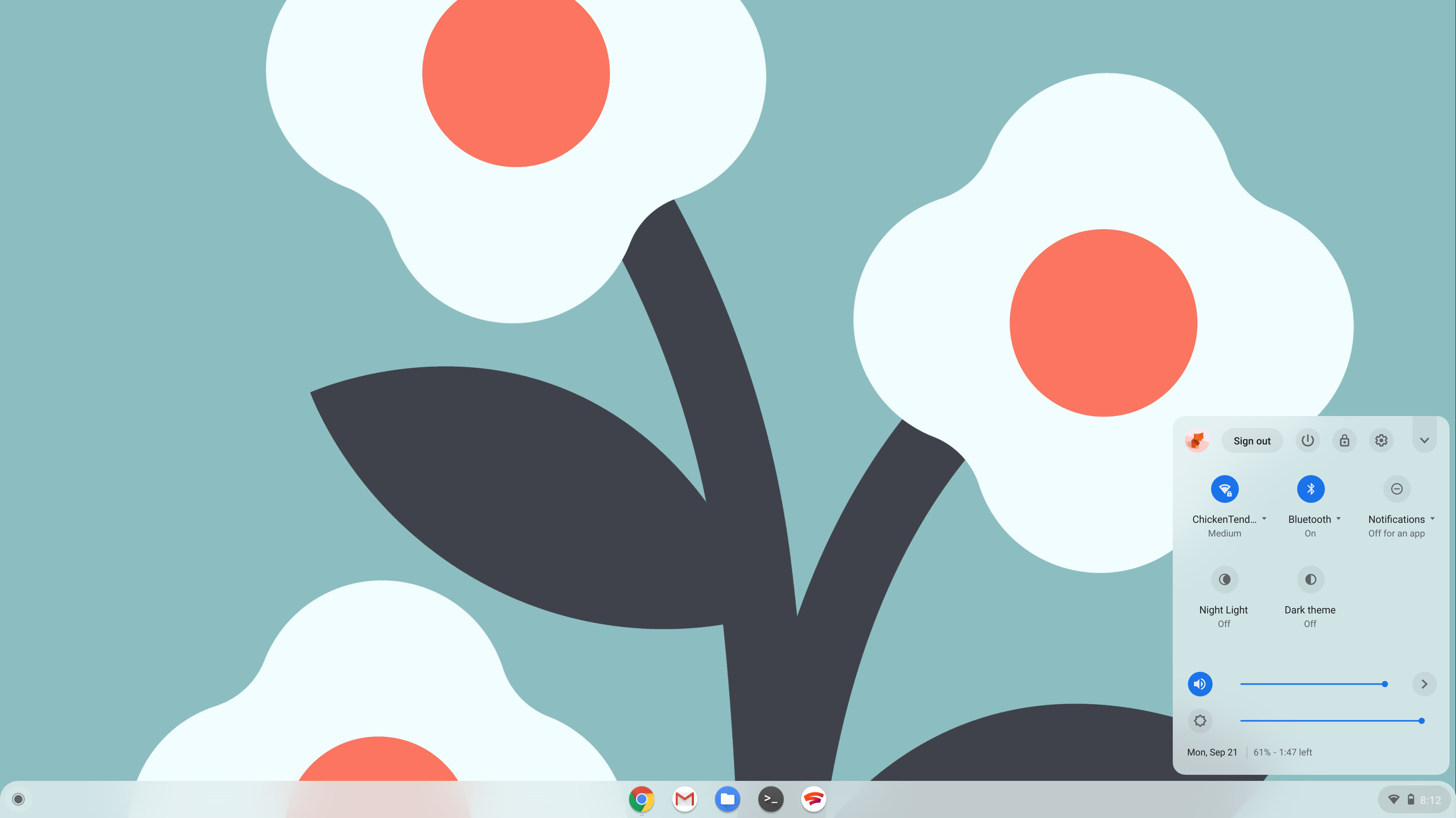
Pretty quickly, you can probably see that Chrome OS’s light theme is still a work in progress. For example, the current time is fairly hard to see, as it still uses white text instead of a black or dark gray. Similarly, the launcher and app drawer do not yet respect the light theme setting.

So far, all that does respect light theme is the app shelf, the quick settings bubble, the quick account switcher, and the tablet mode app switcher. As is also the case in dark mode, many parts of the UI are slightly translucent to let your wallpaper shine through, rather than simply being stark white.

As this is still a work in progress, it’s hard to say when Chrome OS’s light theme could launch in earnest. Until it does, we’ll continue to keep a close eye on things as they develop.
What do you think of Chrome OS’s light mode so far? And conversely, what would you like to see become darker in the default dark mode? Let us know down in the comments.
More on Chrome OS:
- Chrome OS ‘Holding Space’ will make it easy to work with your recent files
- Here’s Chrome OS’s Android ‘Phone Hub’ and everything it can do
- Google wants to separate browser and Chrome OS updates to extend your Chromebook’s life [Updated]
FTC: We use income earning auto affiliate links. More.


Comments