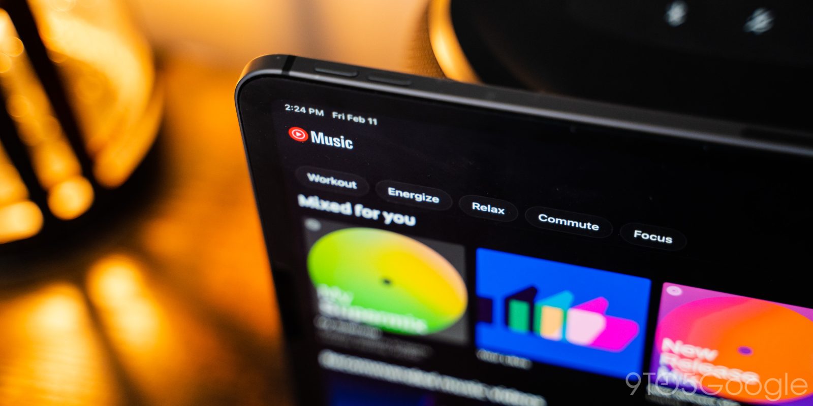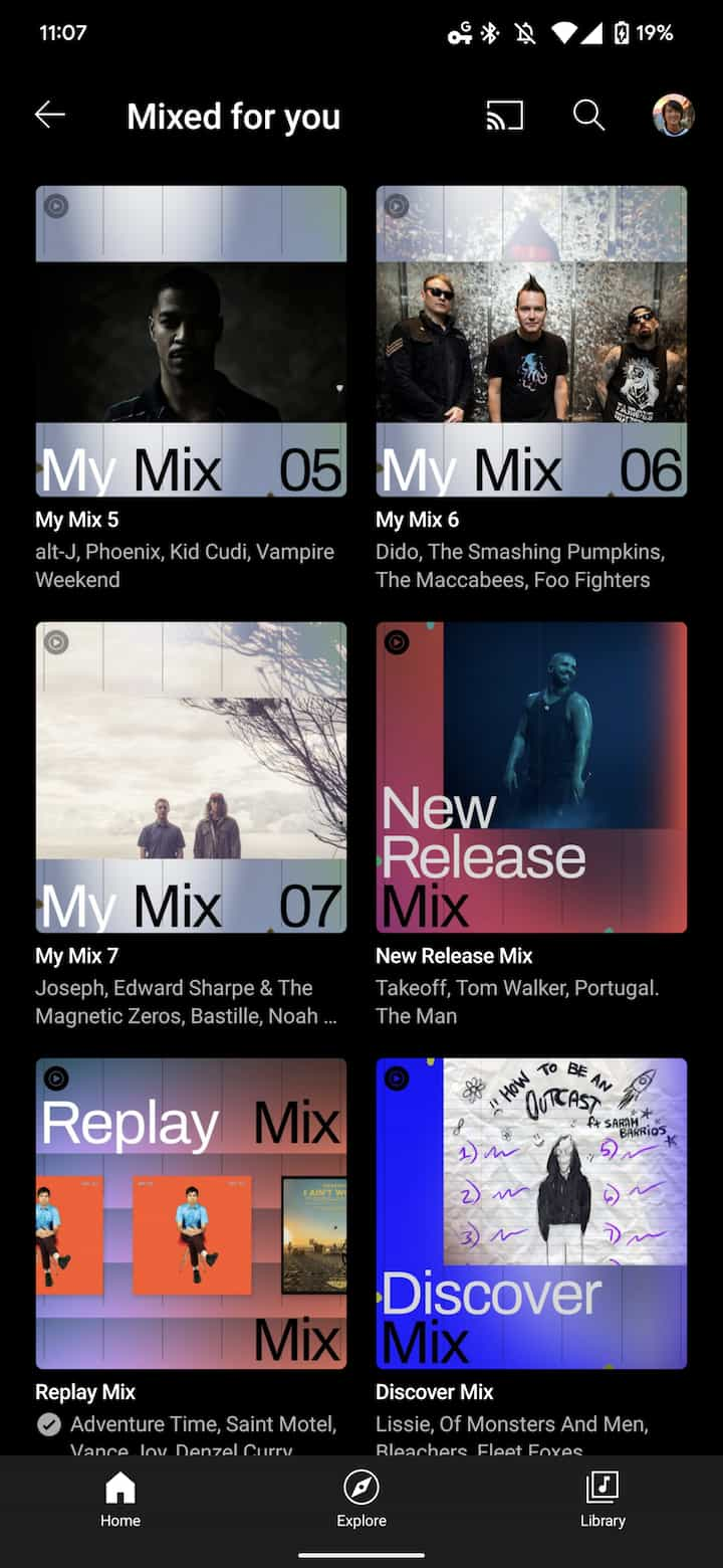
Personalized playlists based on listening history are a big part of YouTube Music, and the app is now giving users a quick way to view every “Mixed for you” creation available to them through a grid view.
The Mixed for you shelf that appears in the Home feed now features a “More” button in the top-right corner. Previously, this default Home carousel would only show My Supermix, My Mix 1-7, Your Likes, Discover Mix, Replay Mix, and New Release Mix.
That shortcut, like with New releases, takes you to a grid view where you can now see supermixes and my mixes for Chill, Focus, Workout, and Energy — there’s no Commute. Previously, you had to view it by switching to the appropriate mood filter and finding the Mixed for you carousel. This makes for better playlist discovery, especially for those that don’t use moods and keep to the main feed.
This change goes hand in hand with the recent addition of personalized cover art that shows what artists are inside. It’s a nice browsing experience, though the grid being slightly more compact wouldn’t hurt and aid density.
We’ve spotted this Mixed for you grid on one YouTube Music account across Android, iOS, and the web – where there’s better grid spacing – today.
More on YouTube Music:
- YouTube Music highlights your ‘Forgotten favorites’ and tweaks web carousels
- [Update: Shuffle] YouTube Music recommendations can now appear in Android 12 Quick Settings
- YouTube Music rolling out Spring Recap ’22 with playlist, shareable stats
- YouTube Music adds personalized ‘Recommended radios’ influenced by multiple artists
FTC: We use income earning auto affiliate links. More.


Comments