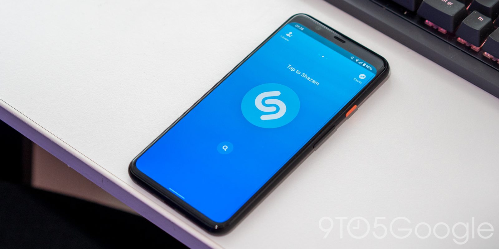
Homescreen widgets have seen a new resurgence in the past year with Android 12+, and Shazam has just revamped theirs to be more than just a shortcut that opens the app.
The old Shazam widget was just a larger shortcut that immediately opened the app on-click to start listening. Version 13.7 introduces a widget that lets you “Shazam music directly from your home screen.”
A “Tap to Shazam” immediately begins the “Listening for music” process with users remaining on their current screen. Once identified, the song, artist, and album artwork is noted right on the widget with a corresponding notification that lets you share.
This widget is less disruptive for fast and casual song identification where you don’t want to leave what you’re doing. You can make a quick ID and then dive into it another time with the alert in the notification shade.
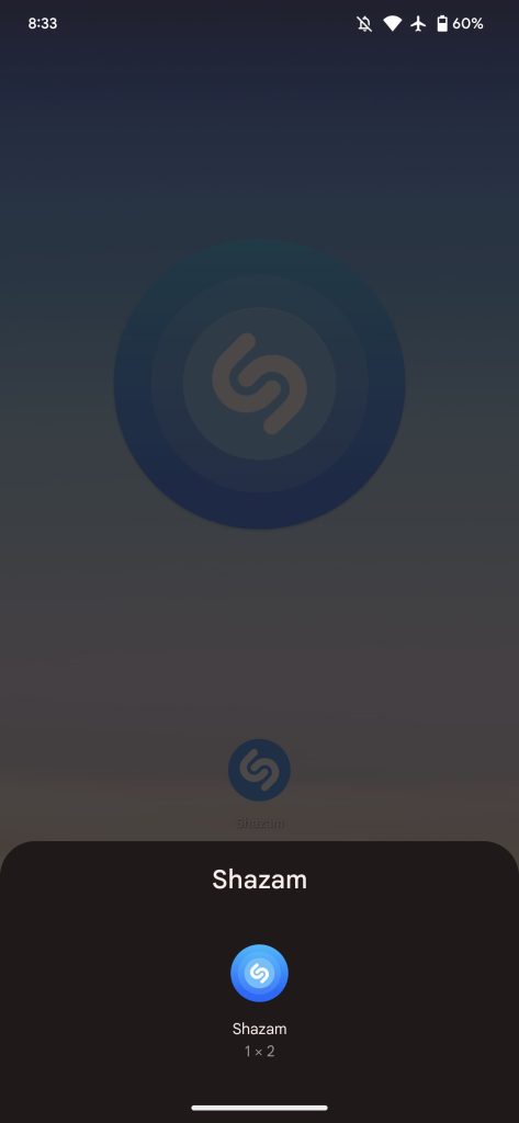
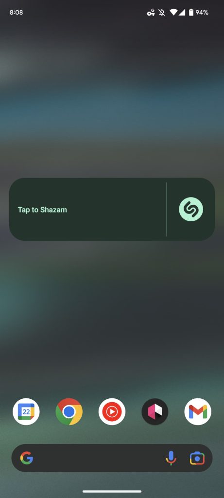
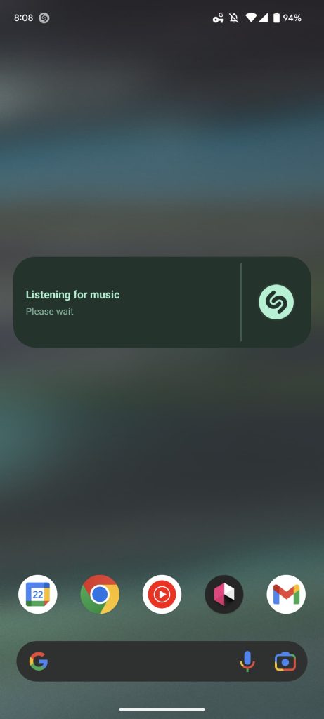
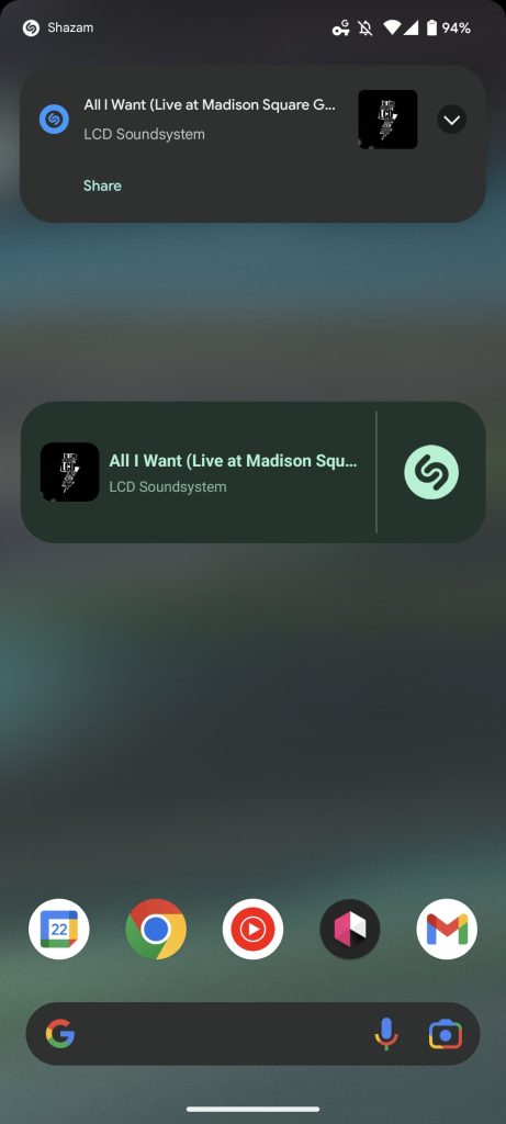
5×1 is the default size configuration with Dynamic Color theming supported, but you can shrink it to 1×1, like before, where it’s just a pulsating circle when active and shows artwork once done. Meanwhile, you can also have it span your entire screen.
In comparison, Shazam’s iOS widgets just show “Recently found” songs, while deeper Control Center integration is also available.
Shazam 13.7 has widely rolled out today via the Play Store with the new Android widget. This follows Apple Music revamping its homescreen objects earlier this year.


More on widgets:
- [U: Pulled] YouTube for Android getting Material You homescreen widgets
- Google Contacts getting a large Material You homescreen widget
- Hands-on with Google lock screen widgets for iOS: What are Android users missing out on? [Video]
- YouTube Music adds ‘Recently Played’ iOS 16 Lock Screen widgets
FTC: We use income earning auto affiliate links. More.


Comments