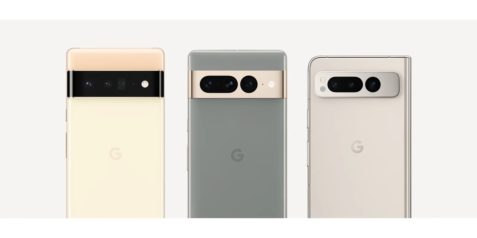
The Camera Bar is a key aspect of Google’s visual reboot of its phones in 2021, and that hardware has evolved with every generation. An interview with the design team today provides some tidbits about the “signature” element.
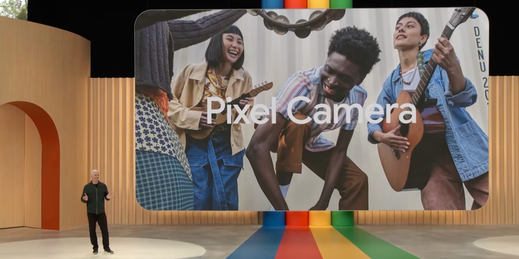
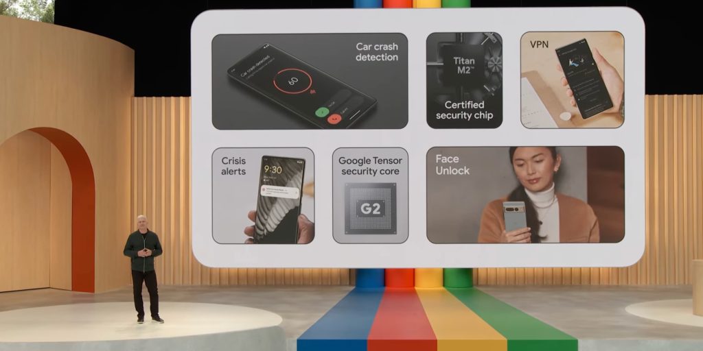
Starting with the name, Google says the Camera Bar “is a nod to Search bar.” It’s interesting positioning in the context of augmented reality and that component being how the phone sees and interacts with the world. Meanwhile, it’s referred to as the “Pixel Camera Bar” throughout. It comes as Google at I/O 2023 started branding major features as Pixel Camera, Pixel Call Assist (Direct My Call), Pixel Speech (Recorder), and Pixel Safe (Car Crash Detection, VPN, etc).
“If you look back at Pixel 5 all the sensors were all grouped into this little square — so when we knew the camera would be greatly improved, we wanted to do something different,” says industrial designer Sangsoo Park. “We didn’t want the phone to be bigger, and wanted to really maintain everything being contained and streamlined, but also celebrated in a way.”
That design direction started with the Pixel 4 until the Pixel 5a, with the 4a notably keeping that visual direction even as it only had one camera lens. In comparison, Apple has retained that design, with the corner grouping growing ever larger from both a surface area and thickness standpoint with each iPhone.
Google said it wanted to “create a camera design that was completely different, something we hadn’t seen,” but there was the Nexus 6P several years earlier with its single camera housed in a rail.
One engineering constraint was how the main and ultra-wide cameras have to be placed side-by-side for portrait mode to work.
“We really wanted to mature the camera bar’s design from Pixel 6 to the 7 and bring more emphasis to the camera,” says industrial designer Jaeun Park. They did this by more fluidly integrating the bar with a metal frame. “We took inspiration from liquid metal surfaces to create this look,” Jaeun says.
The pill and circle look of the Pixel 7 Pro was indeed a nod to Material You, thus “bringing cohesiveness between software and hardware.” That said, the Pixel 8 Pro combines everything into one long pill, which makes it less obvious that there are three lenses. However, it certainly sets the 2023 phone apart from last year’s model, with the differentiation presumably intentional.
On the Pixel Fold, Google made it so that the Camera Bar, which went through several iterations, “lived within the phone’s body instead of spanning from edge to edge entirely.”
“It provides a nice structure that attaches the protective case more firmly. It’s also just the right amount of the space between the hinge and the enclosure, so it’s visually nicely balanced,” Sangsoo says. “Everything became more harmonious with this approach.”
FTC: We use income earning auto affiliate links. More.





Comments