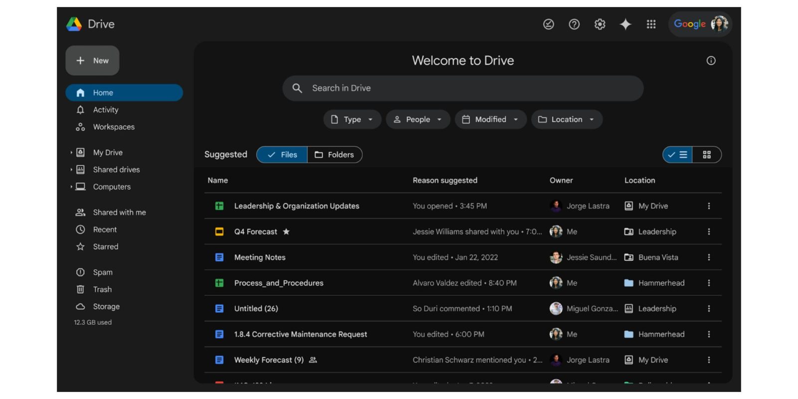
On the web, only a few Google apps and services offer a night mode. Google Drive is now the latest to introduce a dark theme.
Update 4/16: Almost a month after we first spotted, Google today made the Drive dark theme official. This “highly requested feature” provides a “more comfortable, customizable viewing experience for Drive.”
Rolling out starting today, it will be “available to all Google Workspace customers, Google Workspace Individual subscribers, and users with personal Google accounts.” It’s not yet widely rolled out.
Original 3/17: Once available, you’ll be prompted by “New! Dark mode” to “Continue to enjoy Drive in the dark.” Afterwards, tap the gear icon in the top-right corner > Settings > General > Appearance. It does not automatically follow your device theme.
It joins other preferences for Start page (Home or My Drive) and Density (Comfortable, Cozy, Compact).


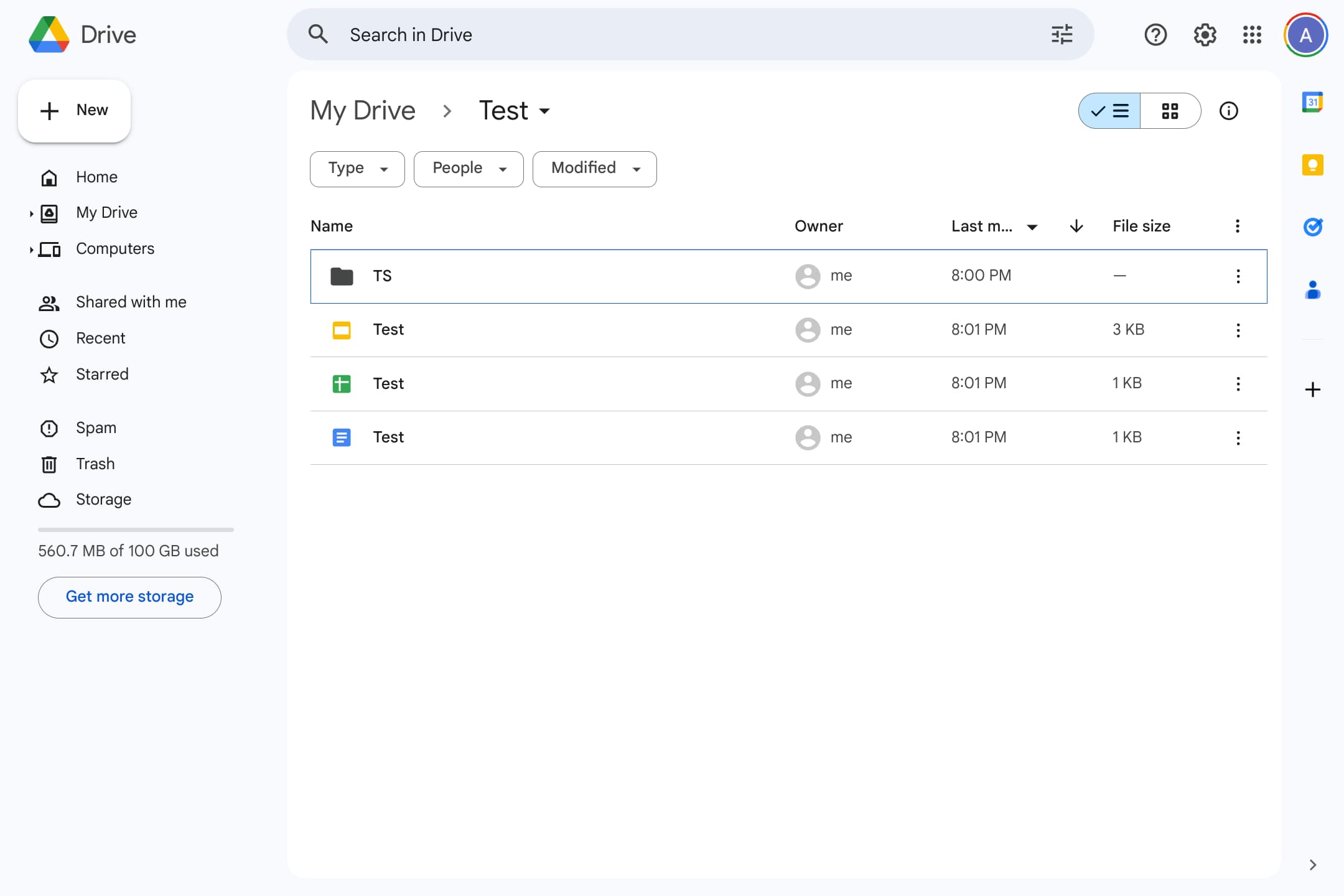
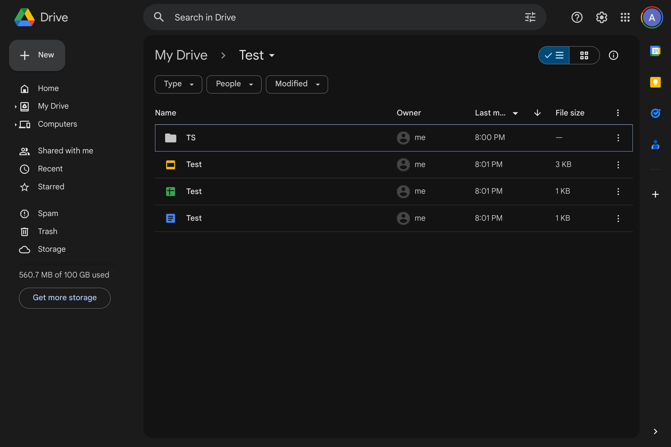
The dark theme is pretty straightforward and only applies to the file view. Docs, Sheets, Slides, etc. are unchanged. The background (sidebar, search bar, etc.) is lighter and somewhat gray, while the inner container is darker/blacker.
Google Keep and Chat also offer dark themes, while Gmail offers something similar, but it does not apply to the actual contents of an email. Beyond Workspace, there’s Google Search and YouTube. Compared to mobile, the availability of night-friendly looks is rather limited.
We’re only seeing this dark theme in Google Drive for one of our accounts today. It is not yet widely rolled out, and hopefully Google will continue to update all Workspace apps in this manner.


More on Google Drive:
- Google Drive speeding up video playback, improving mobile search
- Duet AI side panel appearing in Gmail, Google Drive, and Docs for more testers
- Google Docs is getting a new sharing dropdown
FTC: We use income earning auto affiliate links. More.


Comments