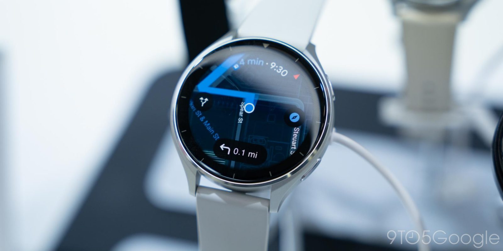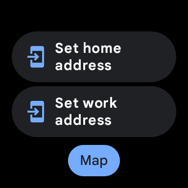
Following the big update that added public transit directions last month, Google Maps has tweaked its Wear OS Tile to provide quick access to the map.
Originally, the Google Maps Tile featured a “Search” button — underneath the Home and Work shortcuts for starting navigation — that would just open the app. That main feed shows recent places you’ve looked at and a “Nearby” categories list (Restaurants, Coffee, Transit stations, etc.)
At the top, you can do a voice or keyboard search, while the last button in that row takes you to the map view.
With the latest Google Maps for Wear OS update (version 11.124.0702.W), “Search” has been replaced by “Map” on the Tile. This opens the aforementioned view directly. You can tap on places to get basic listings, while selecting a transit stop will list upcoming departure times.


Old vs. new
Meanwhile, the map view and your blue current location dot can double as a basic compass, which the Pixel Watch lacks. To get back to the main feed, tap the close ‘x’ at the left.
On a somewhat related note, a recent update to the Google Contacts Wear OS Tile made it so that the “Contacts” button at the bottom now has a gray background. Reading between the lines, this could be an element that will be themed with Dynamic Color once that becomes available. Compared to phones, it remains to be seen how much an impact theming will have on customization given the small screen.


More on Google Maps:
- Google Maps testing Live Activities on iPhone – here’s what it looks like [Gallery]
- How to turn off Google Maps 3D buildings on Android Auto and CarPlay
- Android Auto gets some slight icon redesigns in Google Maps [Gallery]
FTC: We use income earning auto affiliate links. More.


Comments