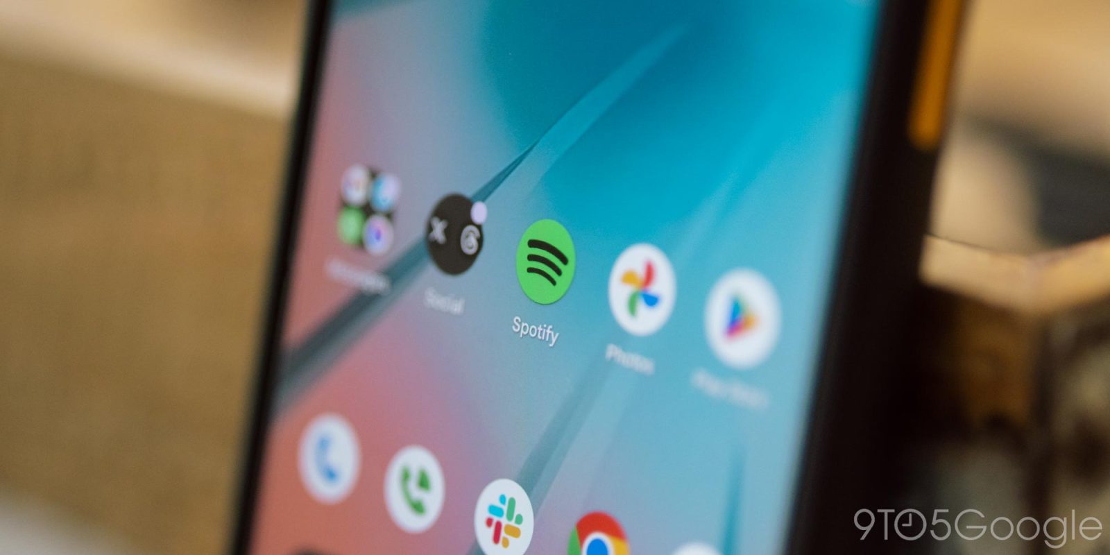
Spotify is rolling out an update on Android that ditches the border on its app icon, bringing back a “normal” icon five years after it was changed before quickly reverting the change.
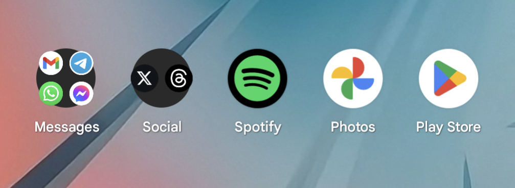
For a long time, Spotify’s app icon on Android was a circle that used the Spotify logo as the entire icon. But, back in 2019, that was updated to include a black border around the icon, a change that was made for the sake of adaptive icons that could change their shape.
It was a change that made sense, but looked pretty silly if your phone used circular icons. It also looked pretty bad following changes to Android Auto that left the Spotify icon tiny compared to other app icons.
But, as adaptive icons have pretty much faded away from Android, Spotify has finally “fixed” the icon.
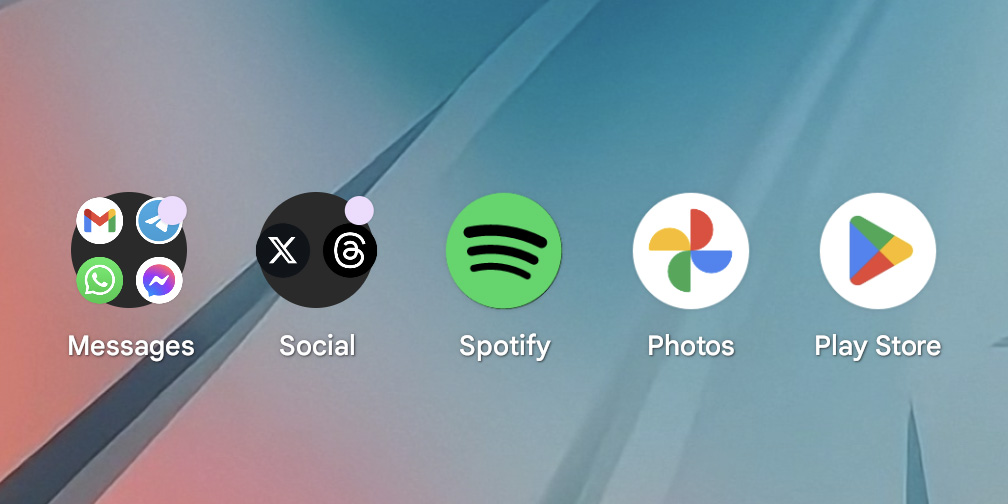
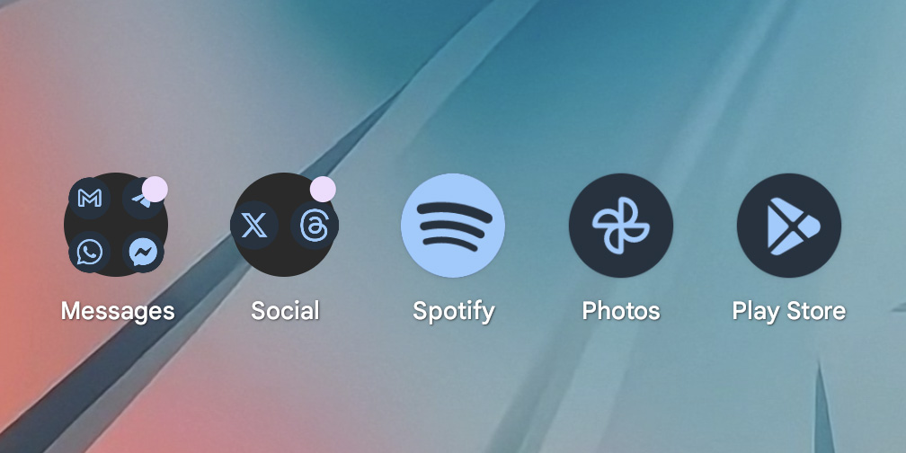
With the latest update, v8.9.44.368 (as first noted by Will Sattelberg at Android Police), Spotify has started rolling out an updated Android icon that ditches that black border. On devices with a circular icon shape, like Pixel, the icon now appears with the Spotify logo taking up the entire footprint. It works in both unthemed and themed icons, though the themed version doesn’t fit in with other icons quite as well (especially in light mode).
But, notably, this change only applies on devices using circular icons. If you have a device, like a Samsung Galaxy, that uses another shape for its icons, the icon will bring back the black border as needed. Sattelberg does note, though, that the icon now looks significantly worse on devices that still use adaptive icon shapes, with alternate shapes having odd black borders and a zoomed-in look for the core icon.
Update 6/11: Spotify has reverted back to the old icon with its latest update, v8.9.46.426. The on all devices, the icon has reverted back to its previous state with a black border around the logo.
Top comment by Benjamin Haube
I don't like it. With the material you themed icons on it looks weird because the colors are inverted from all the other icons.
The new design is probably the best for most users, but it’s clear that there are still some rough edges.
Your move YouTube Music.
More on Spotify:
- Spotify will kill Car Thing units later this year, tells owners to throw them away
- Spotify HiFi shows signs of life as the service locks more features behind subscription
- Spotify adds new ‘AI Playlist’ feature that uses text prompts [Video]
Follow Ben: Twitter/X, Threads, Bluesky, and Instagram
Updated to reflect additional context on themed icons and adaptive icon shapes.
FTC: We use income earning auto affiliate links. More.



Comments