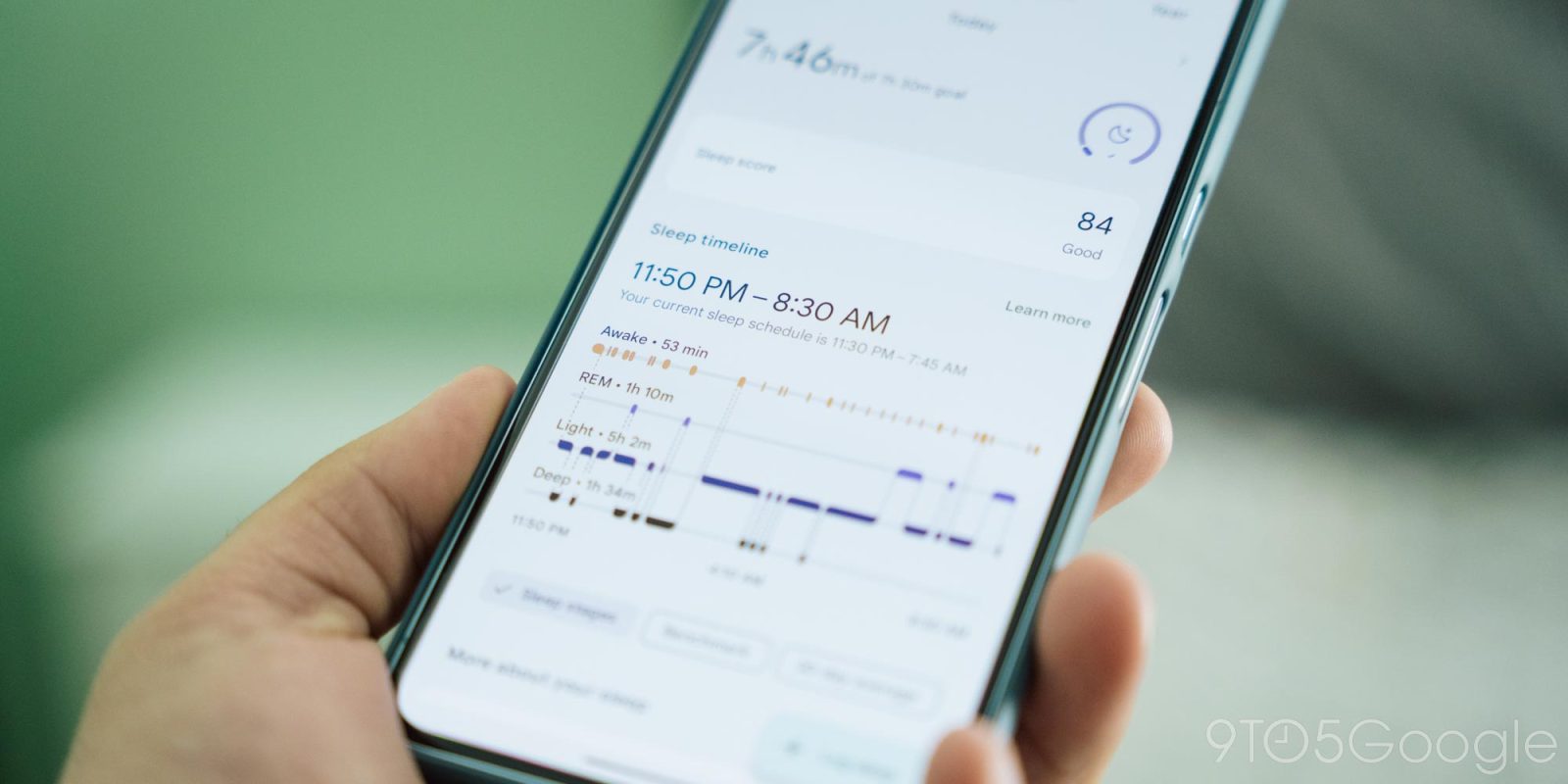
Since the big redesign last year, Fitbit has been updating more and more of the app with Material You. An update today changes the color palette that the Fitbit app uses.
Instead of a white background, all the stat cards are now slightly darker. In response, the actual background of the app is a bit lighter and not as gray, while the bottom bar is much darker than before. The contrast between the background and each card has certainly decreased.
Old vs. new


This is a very small tweak in all the main feeds, stat pages, and other screens as we await the dark theme. Hopefully, these changes are in service of that promised night mode.


Meanwhile, Google continues to update old parts of the app with Material You. The latest is the “Add more device”’” page. Instead of just a long list, you have filters for All, Smartwatches, Trackers, and Scales. Only one modern device can be associated with your account at a time.
With the last release (4.27), Fitbit also made it easier to “Edit profile” from the You tab by tapping that new button in the top cover.
Version 4.28 of Fitbit for Android with these new app colors is rolling out via the Google Play Store.


In other changes this week, the @fitbit account on X (formerly Twitter) is no longer active with announcements now coming from @madebygoogle. That handle is still in use for Instagram and Facebook, while you can still use @FitbitSupport on X.
More on Fitbit:
- Dark theme-less Fitbit app hits 100 million Play Store downloads
- Fitbit redesigns stat pages for Stress management score, Mood, and Mindfulness
- Fitbit․com going away in October, fully replaced by Google Store
- Fitbit app redesigns Heart Rate stats page
FTC: We use income earning auto affiliate links. More.


Comments