
As we reported back in late June, the Chromium team – which creates a public, open-source browser that was forked to create the popular Chrome browser from Google, and who’s updates are regularly merged into Chrome – is working hard on a “Reader Mode” for the Android version of the browser. This mode would recognize articles and pages with lots of text, display a “Make page mobile-friendly” button and, when tapped, strip a page of all extraneous content, leaving just the page’s body text, title, and images. The feature is getting ever-closer to completion, so we’re taking another look at what has changed recently.
In the Chromium issue tracker where bug fixes, changes, and new features are suggested and taken action upon, notes for a new update to the mode have been posted recently, and by downloading Chrome Dev from the Google Play Store we’ve been able to test out the mode and these changes. For those who want to get a better look at Reader Mode but don’t have an Android phone, a Chromium community member has posted a web preview of what the mode would look like in action.
For perspective, here’s what Reader Mode looked like before the most recent changes were pushed earlier this month (these screenshots originally taken by Ghacks):
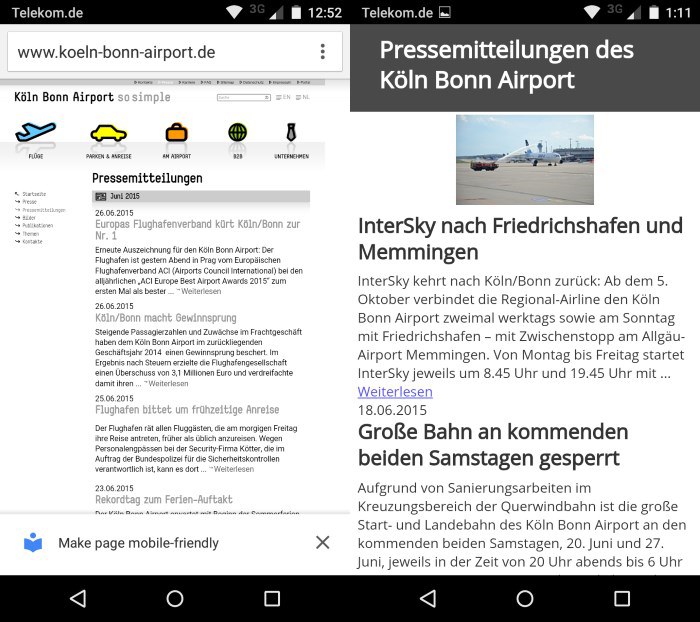
The biggest difference you may notice right away between the new look and the old one pictured above is that the gray background in the title area is no more. The team seems to have decided that it’s better for the background of the whole reader to stay one color, perhaps to avoid inadvertently driving a user’s attention away from what they’re trying to read – that is the whole point of this special mode, after all. They’ve also ensured that the “Close mobile-friendly view” button, pictured at the top of this post, stays the same color as the rest of the viewer.
Another notable change is to the default sans-serif font (click here to learn what sans-serif is) – it’s now Roboto, the font designed by Google that is used as the default on Chrome OS and Android, across properties including YouTube, and as the recommended font for Material Design. It’s hard to tell the difference unless you look closely at the lettering, though. Google has different variants of its Roboto font, including one that is monospaced, but strongly encourages the use of the sans-serif style.
There are some other minor changes that impact the size and spacing of text and images (images stretch the full width of the page whenever possible, for example), all of which you can see in the changelog, but those are the biggest ones. Some interactions that are mentioned in the issue tracker, like swiping down on a title from inside Reader Mode to exit the mode, are not yet live in the developer release version of the mobile browser. We’ll keep watching for more changes.
FTC: We use income earning auto affiliate links. More.


Comments