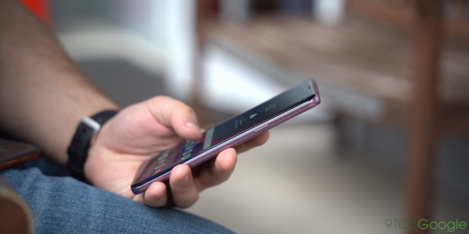
For years now, Samsung’s software has been a point of pain on its various Android smartphones. Slowly but surely, things have been getting much better, though. Now, with Samsung One UI, we’re seeing some big updates and great changes. Here are our top 5 favorite updates so far.
Obviously, One UI is still in beta, so Samsung very well may change things before the public release. In the meantime, you can test out Samsung One UI on the Galaxy S9 and Galaxy S9+ in the US, Korea, and Germany.
Night Mode
The favorite change for, well, just about everyone in Samsung’s One UI is the new night mode. No, this isn’t a blue light filter. Rather, it’s the long-awaited system-wide dark theme that users have been wanting for ages. With the simple flip of a toggle in the settings, Night Mode is activated and immediately themes everything from the settings, notification shade – and the notifications themselves – as well as a handful of first-party apps. It remains to be seen if third-party apps will be able to take advantage of this, but it’s a great addition nonetheless. Plus, it really beats Google to the punch.


Gesture Navigation
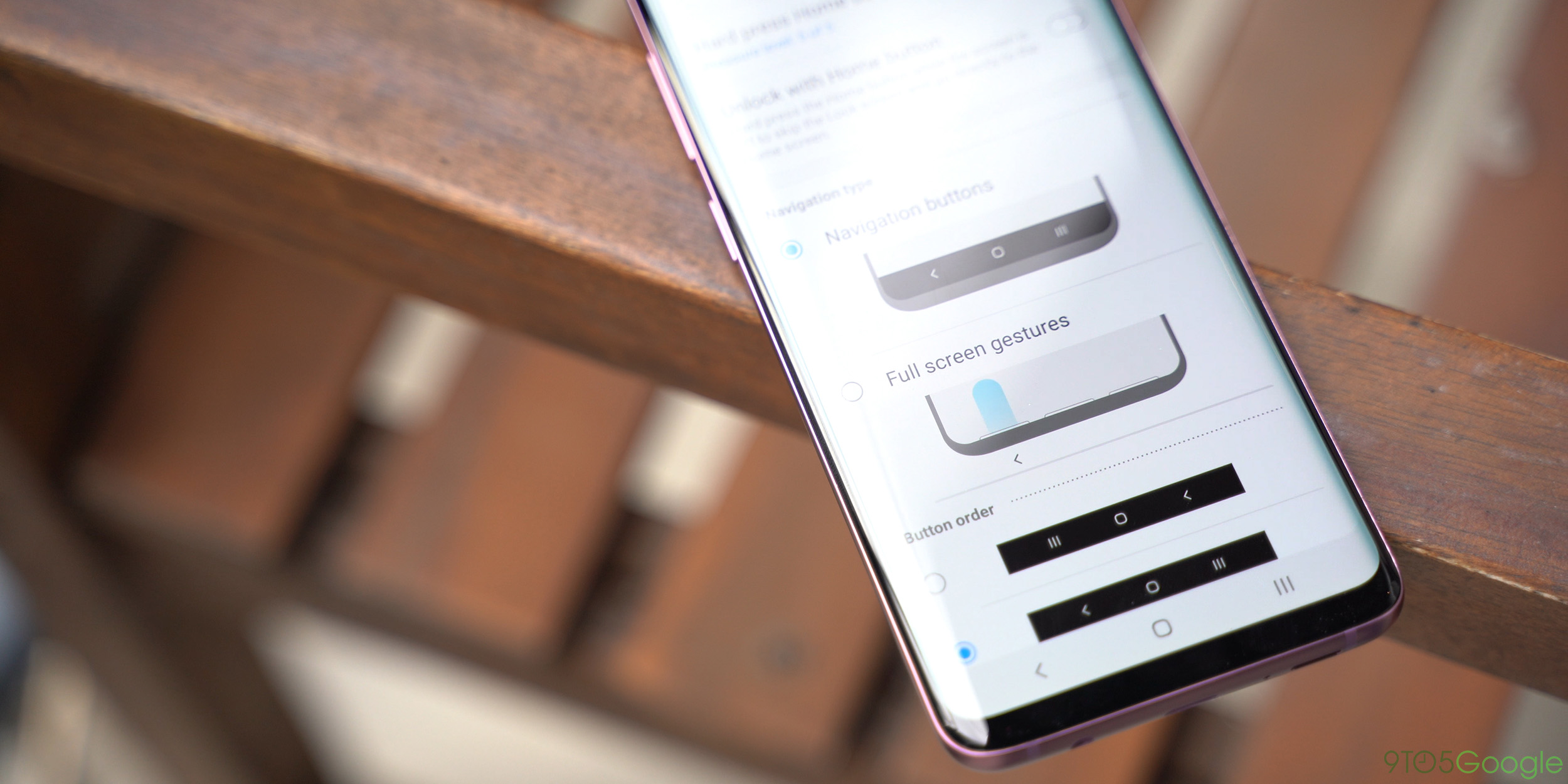
It was pretty much inevitable after the debut of the iPhone X that gesture controls would make their way to Android. Google has an option for this, but Samsung implemented its own gesture system with Android Pie and One UI. These full-screen gestures simply use the bottom of each third of the display to enable swipe gestures which go home, access recents, and go back as well. It’s not really perfect, but it’s very intuitive for sure. Plus, you can still use the pressure sensitive home button.

Better Ergonomics
Phones are really, really big now. As bezels shrink, our phones are getting taller, and that makes it difficult to access certain portions of the display. To help with that, Samsung’s One UI has a huge focus on pushing the content you’ll actually use within reach. This means huge headers and what looks like wasted space, but in practice, it’s actually quite nice. Another benefit here is the bottom-mounted tabs which are much easier to reach one-handed.

Smoother Animations
Samsung’s One UI has a lot of big changes, but some of the subtle ones are also really nice. That includes some tweaks to animations throughout the OS. You’ll find new animations in areas like accessing the recents menu, opening up the weather app, selecting photos in the gallery, and more. It’s a nice tweak that, at least for me, makes the phone feel just a bit nicer to use.
A Cleaner Settings Menu
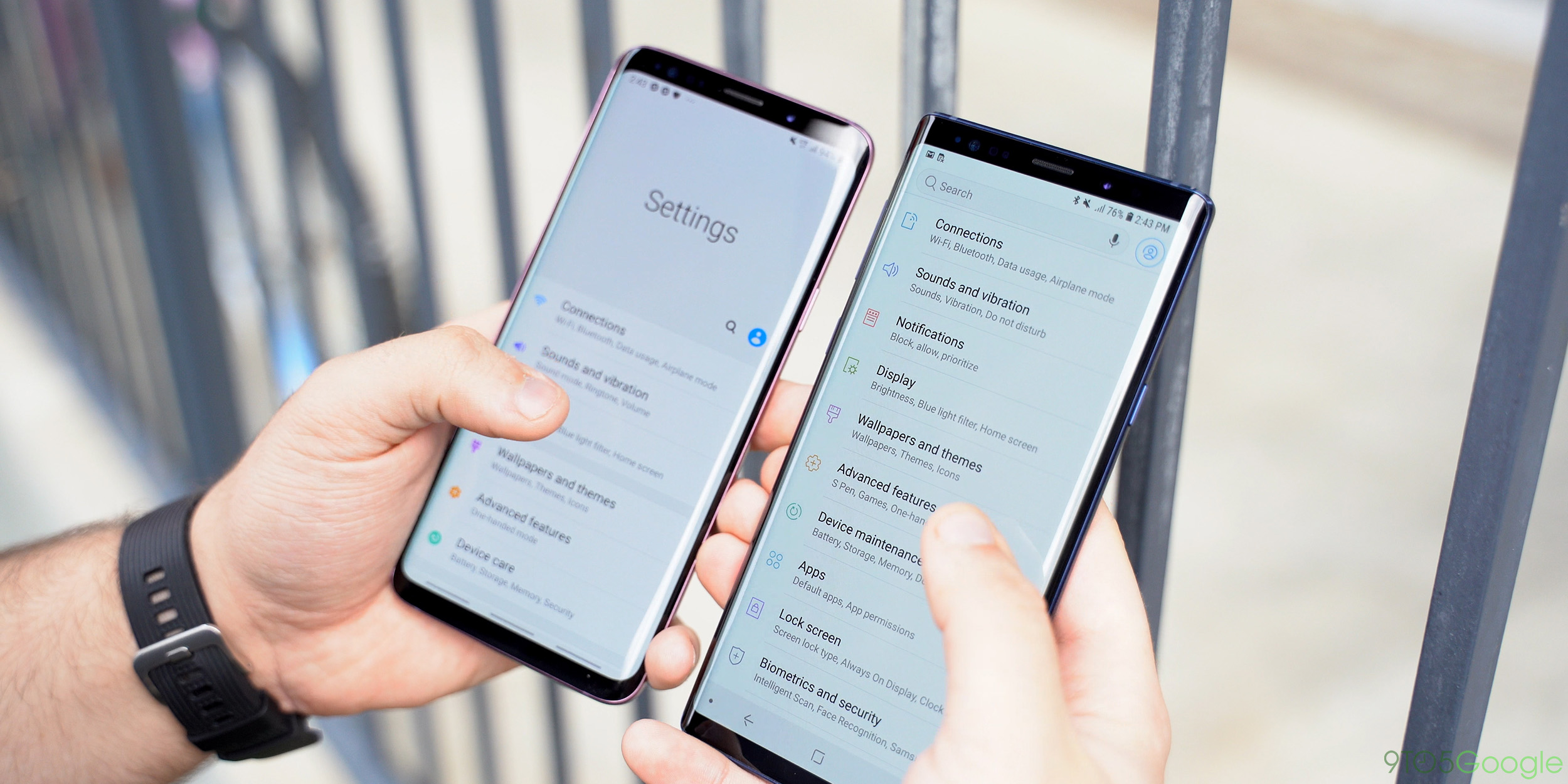
One of my biggest headaches over the years with any Samsung phone has been the settings menu. It’s just been a mess. While One UI, for now, doesn’t do any reorganization in this area, the new design is cleaner. I find myself spending less time hunting and more time actually finding the setting I want with this new design. Plus, thanks to the work Samsung has done with the ergonomics, its way easier to get to some of the settings when the menu is first opened.

What are your favorite changes?
If you’ve already got Samsung One UI installed on your device, what’s your favorite change or new feature? I’d love to hear your thoughts down in the comments.
More on Samsung One UI:
- Samsung One UI w/ Android Pie beta now available for Galaxy S9/S9+ in US, here’s how to get it
- Samsung Galaxy S9 gets One UI beta 2 update w/ tons of bug fixes, latest security patch
- Samsung reveals ‘One UI,’ its new design language, launching w/ Android Pie this January
FTC: We use income earning auto affiliate links. More.


Comments