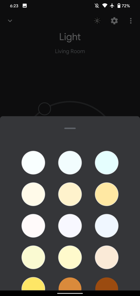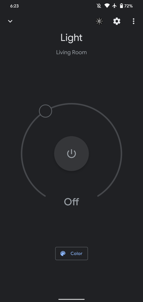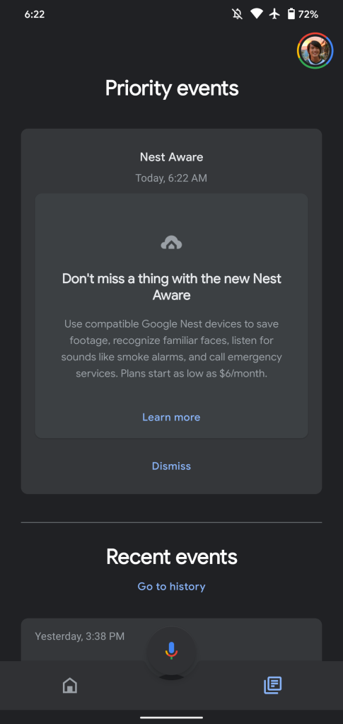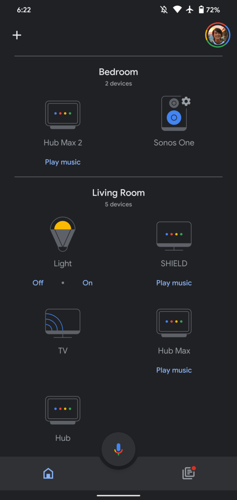
At this point, nearly all of Google’s first-party apps have dark modes. There are some glaring exceptions to this, but fortunately version 2.27 of Google Home today adds a dark theme.
- Android 11’s power menu showing all Nest, Chromecast media devices after Home 2.27 update
- Google Home app gets unified page to show all your Nest Cam feeds
The Google Home dark theme is quite straightforward, with the stark white background turning into the same shade of dark gray used by every other Google app. It makes for a world of difference, given that you’re controlling your smart devices throughout the day and long into the night. It starts at the splash screen.
All icons, including the shortcut rows at the top of the app and device stand-ins, are appropriately adjusted and tinted. The text for room names are now white against the darker background, while devices are gray.
This dark theme spans every menu and screen in Google Home 2.27. This includes the Primary events feed, settings menus, panes, and more. There is no option in app preferences to independently set the dark theme independent of your device’s theme.
In addition to un/locking the Nest x Yale Lock, the Home view of all your devices will soon identify the on/off state of lights, switches, and plugs.
Google Home 2.27 with a dark theme for Android is rolling out now via the Play Store. Version 2.27 is available for iOS today, but the new look is coming via a server-side update.
More about Google Home:
- Google Home 2.26 lets you add/control the Nest Hub Max from Android 11’s power menu
- Home 2.26 adds ‘advanced networking’ settings from Google Wifi app, more
- Google Home app gets ‘more reliable’ control of Chromecast, Nest devices
FTC: We use income earning auto affiliate links. More.


Comments