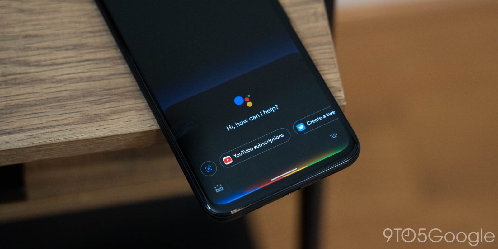
The new Google Assistant has had a look of its own since it launched on the Pixel in 2019. Google looked to be bringing elements of that interface to other devices with a UI that we dubbed as being “compact.” NGA is now losing its original transparent look.
On Friday, the new Google Assistant on one of our Pixel 4a devices stopped using the transparent UI that featured a bottom light bar and two shortcuts on the left and right, as well as a “Hi, how can I help?” prompt.
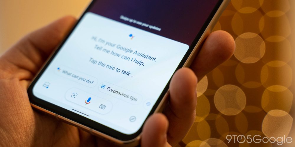
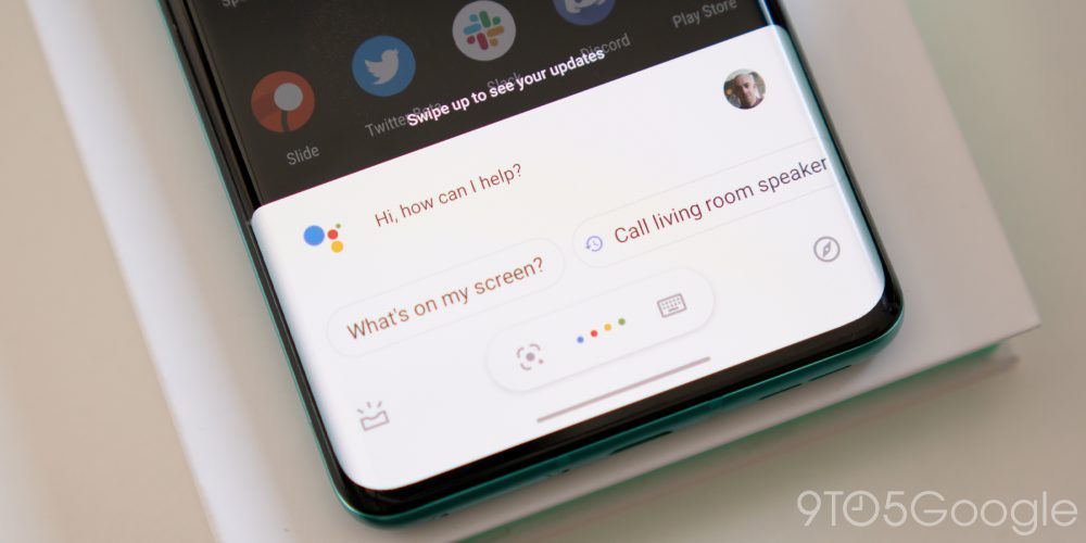
It switched to a rounded sheet that asks the same question but features a giant Assistant logo above. There’s a carousel of suggested chips, starting with one for Google Lens. There was previously no fast way to access Lens with the NGA interface.
Over the weekend, other Pixel 4a and Pixel 4 devices started using this design that features a slick bounce animation on launch. Answers appear in panels that are only as tall as needed. It appears that this is the interface NGA is moving towards rather than Google maintaining an entirely separate one.


Meanwhile, we have two other devices (Galaxy S20 FE and another 4a) that feature this sheet but oddly lack that row of suggestions for in-app actions that Google touted at this month’s developer day.

Looking at other devices today, there is a mix between the compact Assistant and the interface that preceded that, which was marked by fullscreen answers. It is odd for the absolute latest Google Assistant to be so tall when the past direction appeared to be towards near-invisible assistance.

Previous 
Compact
After a weekend of using the newest new Google Assistant UI on a Pixel 4a, the top half with logo and prompt has not disappeared. In the past, those two elements served as introductions for new users and would disappear after repeated usage.
FTC: We use income earning auto affiliate links. More.


Comments