Back in October, YouTube redesigned the video watching experience on Android and iOS. YouTube on the web is now following that revamp by placing the autoplay toggle directly inside the video player.
At the moment, YouTube’s autoplay toggle resides in the right sidebar as part of an “Up next” section that previews what’s coming. The new design brings it directly into the video player. It appears to the left of Closed Captioning and Settings with a play/pause button that reflects the current state and matches the mobile app design.
As part of the player, it disappears when you’re not hovering directly over it, thus resulting in a cleaner interface than today where the blue of the toggle results in a color mismatch. The control might be too hidden for some, while YouTube has stopped explicitly labeling what the next video is.
Rather, it’s separated and appears above a carousel to tune the suggested video feeds. “All” remains the default, with “Related” and “Recently uploaded” also options next to two personalized filters.
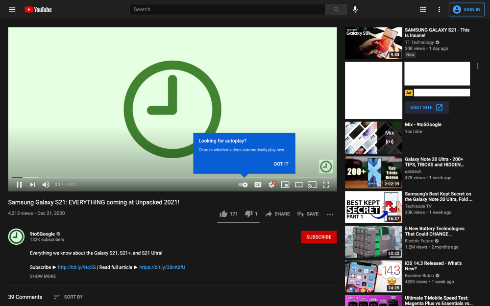

This new autoplay design for YouTube on the web appears to be widely rolling out, though it’s not yet fully available. Once live on your account, there’s a blue “Looking for autoplay?” prompt that explains the new location. Overall, it helps standardize the design between clients.

More about YouTube:
- YouTube Music now shows animated video previews in your Home and Explore feeds
- YouTube Music sending out ‘Your 2020 music journey’ recap with top stats
- New Google settings let you limit alcohol and gambling ads, starting on YouTube
- YouTube now lets you livestream HDR video
FTC: We use income earning auto affiliate links. More.

Comments