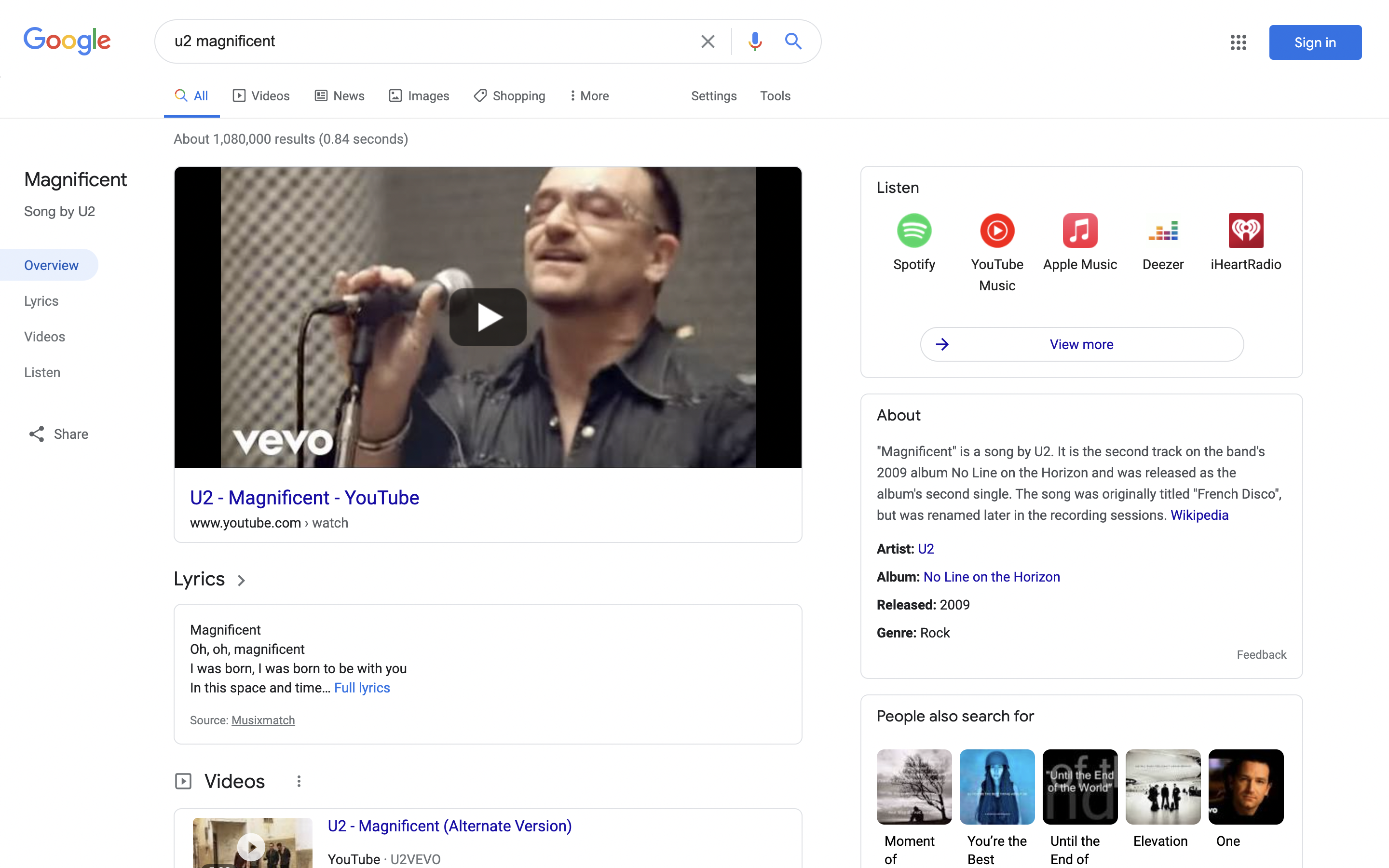
Last month, Google revamped Search on Android, iOS, and mobile with a focus on making results easier to read. A similar look has long been in development for the desktop web, with users able to preview it on COVID-19 queries. Google’s desktop redesign is now also available for music-related searches.
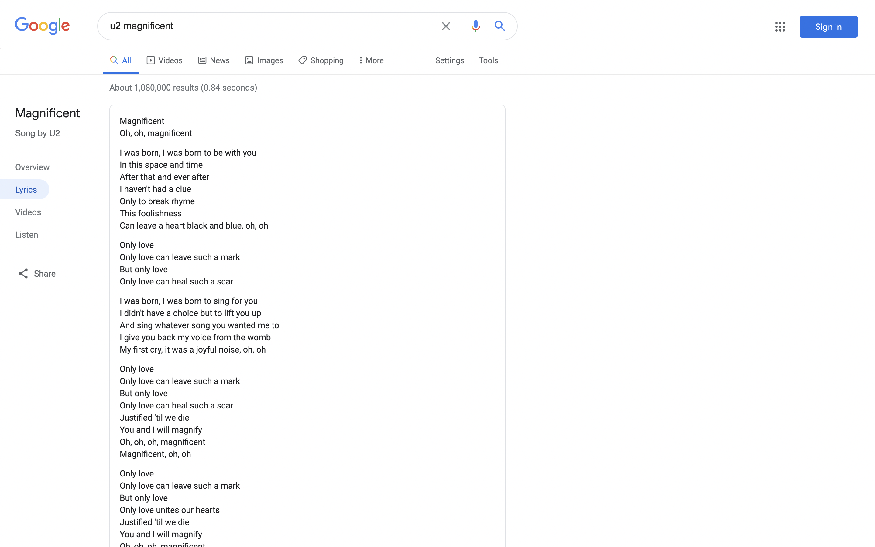
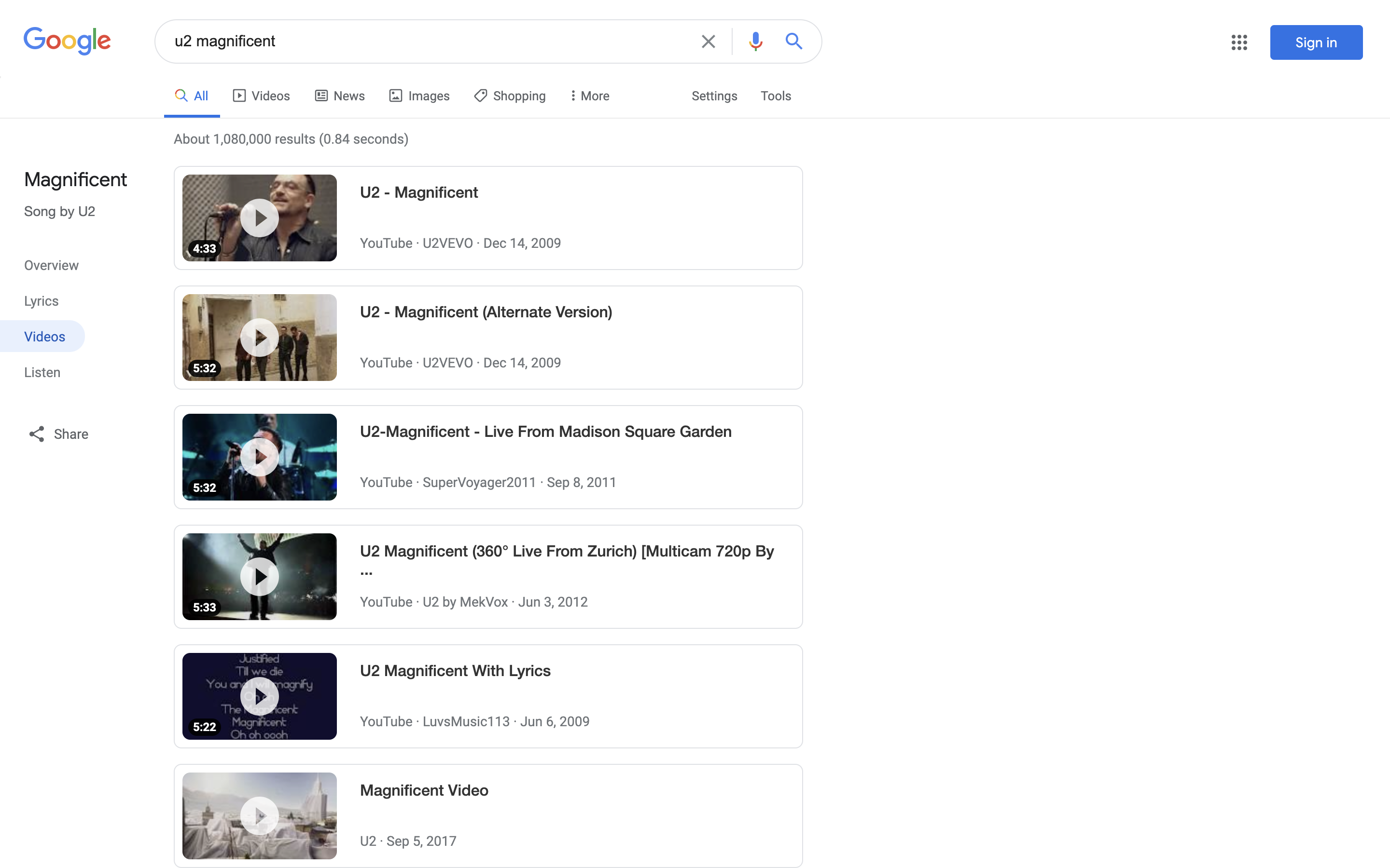
The main component of this redesign is a left navigation drawer. The name of the Knowledge Panel you’re viewing is listed at the top with a description of the query’s nature. In the case of albums, cover art appears. Below are subtopic categories that load new search terms: Overview, Listen, Videos, and Listen. The Share button has also been moved here.
Elsewhere, Google is still relying on two main columns of information. To the right of web results, there’s a prominent “Listen” card, while “About” with the Wikipedia description is next.
The subtopics sidebar, which is not themed by a color in this version, is the biggest change and meant to help users better navigate through dense pages packed with information. Some songs feature different items, like: “Other recordings” and “Analysis.” Google’s intention is to save users from having to manually type out a new search.
As of this evening, the Google Search redesign for music is more widely rolled out than before. It’s been A/B tested for quite sometime now, but this might signal a broader launch for terms beyond the coronavirus last April. However, searching for other types of media, people, places, and news still returns the old design.
More about Google Search:
- [Update: Gallery] Google Search A/B testing full desktop dark mode
- Search Console’s Discover report will soon include Chrome traffic
- Google Search links getting ‘About this result’ panel with website information
- Maps and Search will soon list COVID-19 vaccination locations
- Search now lets you browse and virtually try on lipstick
FTC: We use income earning auto affiliate links. More.


Comments