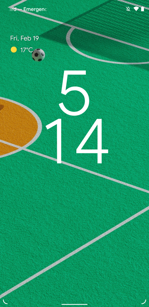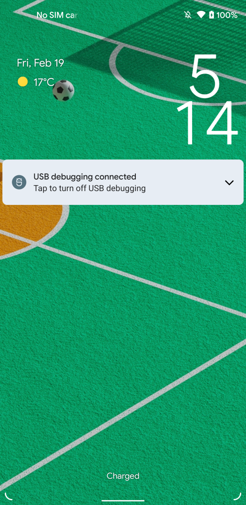
Our latest discovery in Android 12 shows that Google is working on a significant redesign of the lockscreen, including a much larger clock.
Ahead of the launch of Android 12 Developer Preview, leaked design mockups suggested we may see a significant redesign of the OS. On the surface, only a handful of things seems to have changed, but below the surface, our Dylan Roussel has uncovered and enabled quite a few changes that Google has not yet decided to launch.
The latest of these is a revamp of the Android 12 lockscreen, the most obvious change for which is that the clock is significantly larger, using two separate lines with the hour above the minutes. When notifications are visible, the clock moves off to the upper right just above your notifications.
Meanwhile, the date and weather have also gotten a tweak, with the date appearing as a separate line above the current weather. Instead of sitting in the center below the time, these two now appear in the upper left, opposite the clock.
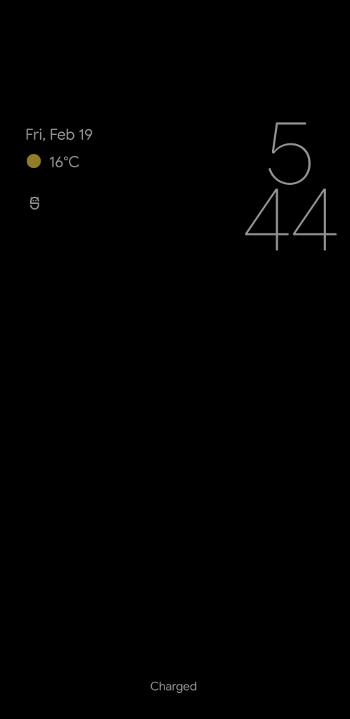
This potential Android 12 lockscreen redesign is even carried through into the always-on display, with the clock and weather being in nearly the same spot. Notably, the notification icons have also been moved, to essentially maintain their position just below the date and weather.
Considering Google hasn’t made this redesign publicly available, meaning we needed to manually enable this change, it’s entirely possible that this Android 12 lockscreen redesign may be scrapped before launch. At the very least, we won’t see the redesign arrive properly until a later Android 12 Developer Preview or Beta release.
Dylan Roussel contributed to this article
More on Android 12:
- Here’s everything new in Android 12 Developer Preview 1 [Gallery]
- Android 12 DP1: Magnification feature now offers a useful floating window
- Android 12 DP1: ‘Reduce Bright Colors’ button quickly tones down screen brightness
FTC: We use income earning auto affiliate links. More.


Comments