Years in the making, Android 12 is bringing a huge visual overhaul to the platform with the biggest impact since Material Design first debuted in Lollipop. “Material You” has some major potential, and we’re seeing the first effects from it in the first Android 12 Beta release, but most of the good stuff is missing.
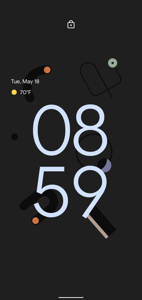
If you install Android 12 Beta 1 on a Google Pixel phone, you’ll be greeted with a huge design overhaul upon boot. The entire operating system has been revamped with a neat new lockscreen, bigger quick settings tiles, and a whole lot more. The lockscreen is perhaps my personal favorite place to see this new design language. The clock is comically huge with no notifications, but it works. When it condenses down, though, it looks even better.
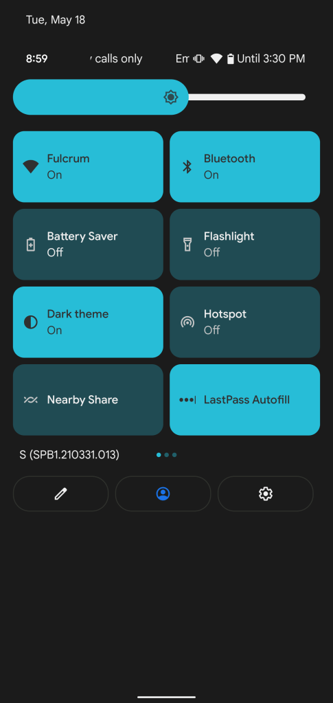
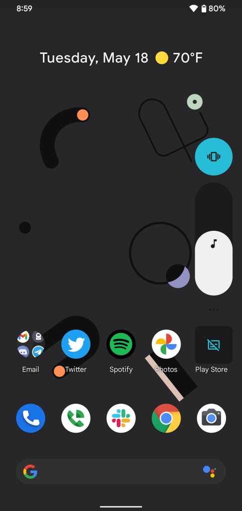
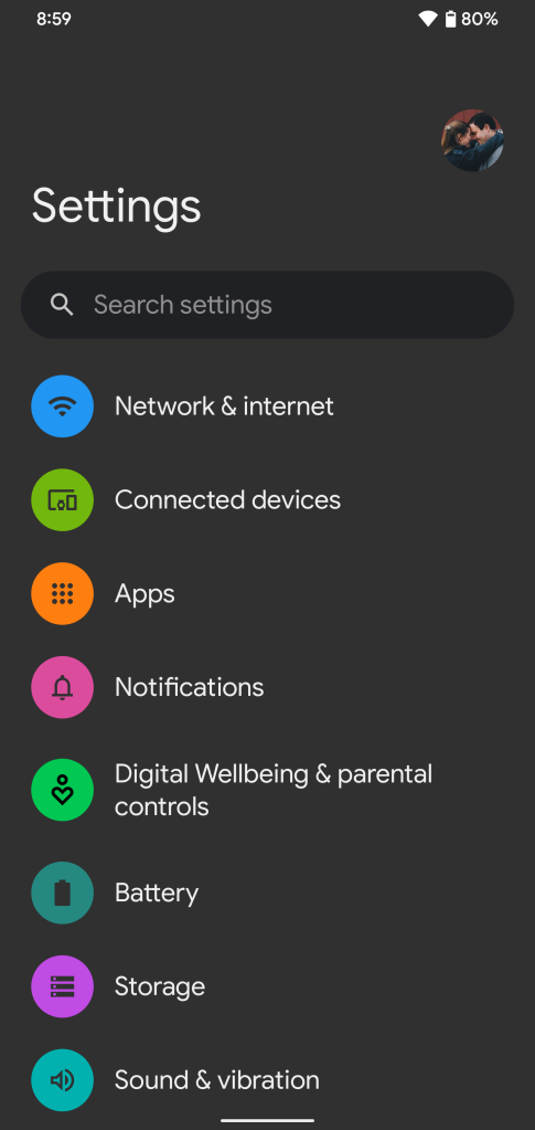
Some of the other places you can see the change include the volume slider, which is considerably bigger, and the quick settings menu. Beyond the bigger overall tiles, the brightness slider also adopts a radical new design. As was live in the third developer preview, too, the Settings menu has been entirely redesigned since Android 11.
For now, though, that’s basically it. Elements Google showed off at I/O aren’t present yet such as widgets, in-app changes, and the color-matching features, too. Many of the privacy features such as the Dashboard and indicators also haven’t arrived. We’ll likely have to wait at least until the second developer preview to check that stuff out, if not the third.
In the meantime, ain’t it pretty?
More on Android 12:
- How to get the Android 12 Beta on Google Pixel
- Here’s everything new in Android 12 Beta 1 [Gallery]
- Android 12 Beta is coming to devices from OnePlus, Nokia, and more
FTC: We use income earning auto affiliate links. More.


Comments