
After a shorter than expected break between the first Android 12 Beta and now Beta 2, we hope that you’re ready for more new features and changes in what promises to be the biggest UI overhaul in years.
We’re only just catching our breath from the first Android 12 Beta release, and we have Beta 2 here to sink our teeth into. If you have already enrolled, you should soon receive an OTA update that contains the latest June 2021 security patch, plus all of the new UI and system-level tweaks coming with this patch.
If you haven’t already tried the Android 12 Beta and want to sign up, we have a short little guide to help you get enrolled, but this process is very quick and easy. Basically, head to the Android 12 Beta sign-up page, and you can opt in — or out — to try the latest pre-release OS build for yourself. That is, provided you have a Pixel 3/3 XL or a newer Made by Google phone.
Summary
- Video — Android 12 Developer Beta 2 hands-on: Top new features!
- Quick Settings panel overhaul continues
- New Power Menu UI
- Wallpaper-based color themes
- Android 12 Privacy dashboard
- Camera/microphone indicators
- More compact volume slider controls
- Media player tweaks
- Wallet lock screen quick toggle
- Wi-Fi/Network quick reset
- More ‘At a Glance’ changes
- Android 12 Developer Beta 2: What is your favorite new feature?
- More on Android 12:
Video — Android 12 Developer Beta 2 hands-on: Top new features!
Subscribe to 9to5Google on YouTube for more videos
Quick Settings panel overhaul continues

A major focus area for Android 12 Beta 2 is in the Quick Settings panel. This is where almost all of the most notable and instantly visible changes are coming, and there is plenty to unpack here. Firstly, Card & Passes is now known as “Wallet” and, along with Smart Home controls, now lives as a toggle within the Quick Settings panel.
This replaces the long-press activation method introduced with Android 11. But it also separates the two distinct sections and makes the process a little less messy — albeit slightly slower to access. Tapping either will just expand these menus out accordingly.
When using the Wi-Fi toggle, this will show a small pop-up menu that will save having to dip into the full “Internet” settings page. You’ll see a few available networks and your current SIM connection status too.
There is also a power button that you can find when fully expanding out the Quick Settings panel. Tapping will just launch the Power Menu, which is another area on the receiving end of an overhaul in Android 12 Beta 2.
New Power Menu UI

Often overlooked, the Power menu is also at the receiving end of some pretty major changes with the Android 12 Beta 2 update. Instead of being directly tied to the physical power button, the power menu now lives behind a Quick Settings panel toggle that will initiate a floating window. If you have “Hold for Assistant” disabled, a regular power button press will bring up the new menu though.
Instead of taking up the full screen and fully obscuring whatever you’re viewing, the power menu now pops up over the screen with four large and distinct buttons, including Emergency, Lockdown, Power Off, and Restart. It’s not groundbreaking, but it’s more cohesive with the Material You theming.
Wallpaper-based color themes
The huge wallpaper-based theming that has been teased, leaked, and then confirmed by Google at I/O 2021 is now officially live in Android 12 Beta 2. So as soon as your Pixel reboots into this latest build, you’ll notice pretty quickly just where the color-matching options start to make a difference to your UI look and feel. The setting appears to be activated by default and will, naturally, pull from whatever wallpaper you already have set on your device.
Prominent areas in which you’ll immediately see this functionality include the Quick Settings and notifications panels, as well as the auto-scaling lock screen clock and even the PIN entry screen when proceeding to unlock your phone.
At the moment, it doesn’t look as though you can disable wallpaper-based theming, but we’re hoping that this isn’t the case in future builds as while it is nice, we can agree that some people will prefer more precise theming controls. That said, having a theme tied to your wallpaper is quite a neat cohesive option.
Android 12 Privacy dashboard
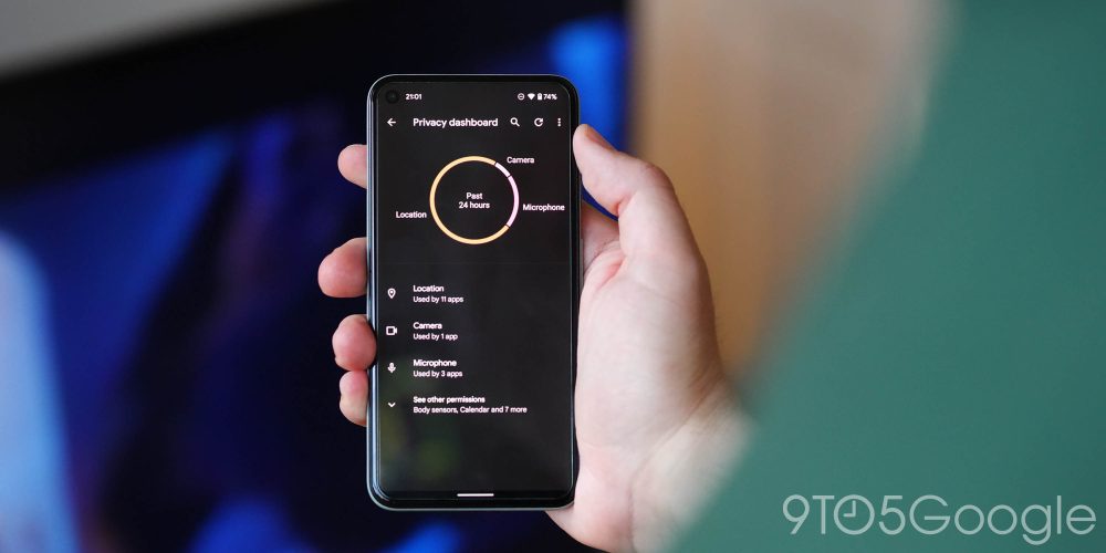
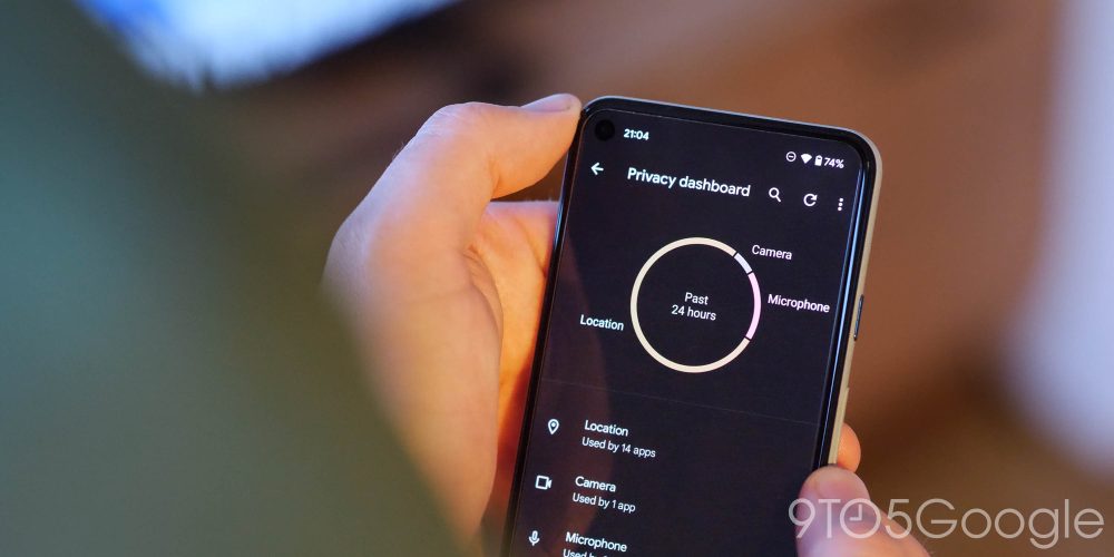
One of the core tenets of Android 12 is the enhanced privacy controls. In Android 12 Beta 2, we’re getting a first proper taste of these added controls and how they will work. The new “Privacy Dashboard” is effectively a single page that shows what apps are using what permissions on your device over the course of a day.
A pie chart or ring gives you a quick visual indicator of what permissions and device sensors have been accessed over the past 24 hours. System apps are actually left out of this chart by default, but you can toggle this on if you want an accurate picture of what apps are accessing specific areas of your device. It’s also worth noting that pre-installed apps such as Google Messages and Maps will automatically be included.
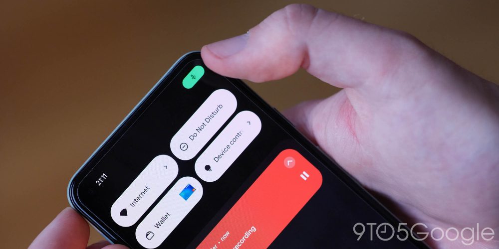
Tied in with Privacy Dashboard are new Quick Settings toggles that can block the camera and microphone system-wide, even for built-in apps like the camera app. Another major part of this enhanced privacy suite includes camera and microphone usage indicators.
Camera/microphone indicators
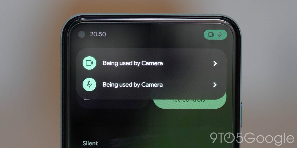
When using apps that have access to your camera, microphone, or both simultaneously, a status bar indicator in the upper right of your display will now inform when they are being accessed or used. This is similar to how iOS handles access to on-device hardware such as the microphone or camera. Like iOS, the icon will minimize to a small dot in the upper-right of your display after the initial pop-up, so you know what an app is accessing on your smartphone.
More compact volume slider controls

Thankfully, Google has ditched the comically massive bubble design on the volume slider controls in favor of a more svelte side panel. The updated design slims down the volume bar and puts it on a floating white or black window. Any subsequent sliders, such as for a Cast device, show up next to the regular volume slider. Only one can be interacted with at a time, though.
Android 12 Beta 2: Volume slider ditches the comically huge bubble design
Media player tweaks
The media player is getting more tweaks in Android 12 Beta 2 too. Firstly, the color of the player is now tied to the Material You theming. Not fully, but it will be a shade or two lighter for greater prominence, while the actual player is now quick substantially smaller with some button rearrangement to account for the smaller overall profile.
Any playing media now has an icon overlaid in a similar manner to that of a notification badge on an icon. At the same time, album art is now smaller and relative to the size of the overall widget.
Wallet lock screen quick toggle

With the loss of Card & Passes in favor of Wallet, Google has added a new lock screen quick toggle to help you make NFC payments even faster than before. If you’ve updated to Android 12 Beta 2 and cannot see the Wallet shortcut, it’s worth noting that you can actually activate the quick toggle by heading to Settings > Display > Lock screen > Show wallet.
All of your Google Pay cards and loyalty cards or coupons will live here. When making a payment will need to unlock your device for security purposes. It’s easy to see why this new toggle has arrived, as it provides a greater visual indicator that Google Pay is available from your lock screen.
Android 12 Beta 2: Wallet toggle comes to lock screen for even faster NFC payments
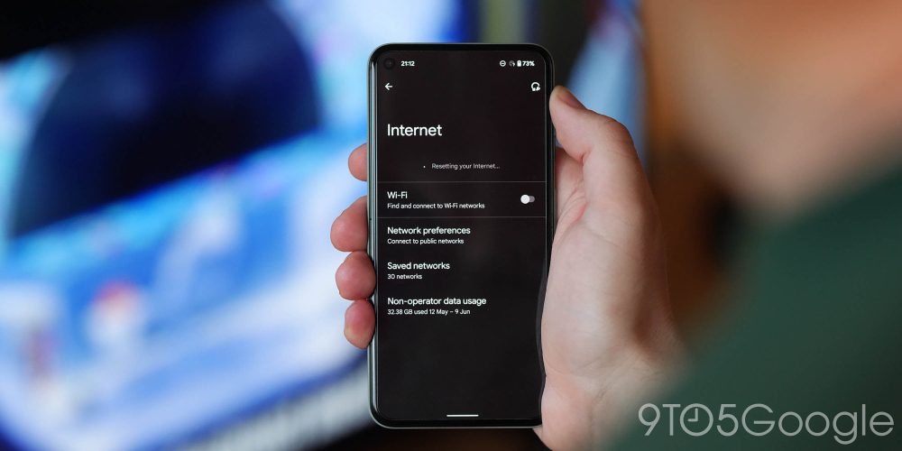
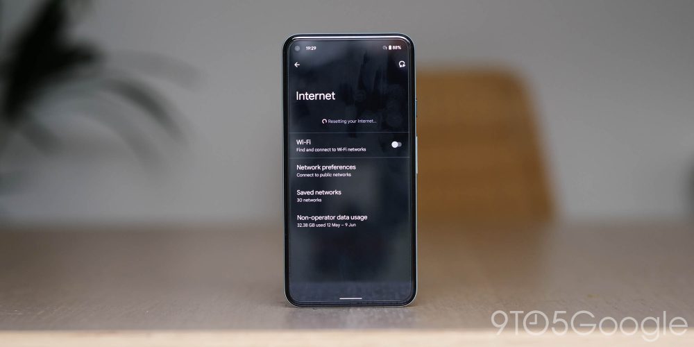
Wi-Fi/Network quick reset
Sure, this isn’t a groundbreaking move, but it’s a neat one all the same and turns a two-step process into a single button press — that is, provided you’re in the Settings menu. I’ll admit that it probably won’t be that much of a timesaver if you’re not in the right place, but by heading to Settings > Network and Internet > Internet, you’ll see a small wrench with a reversed arrow in the top right of this screen.
Pressing will just reset all of your current connection settings and provides a refresh to your Wi-Fi network when using Android 12 Beta 2. Once your device has refreshed, it will just reconnect to the most recently used or preferred local network.
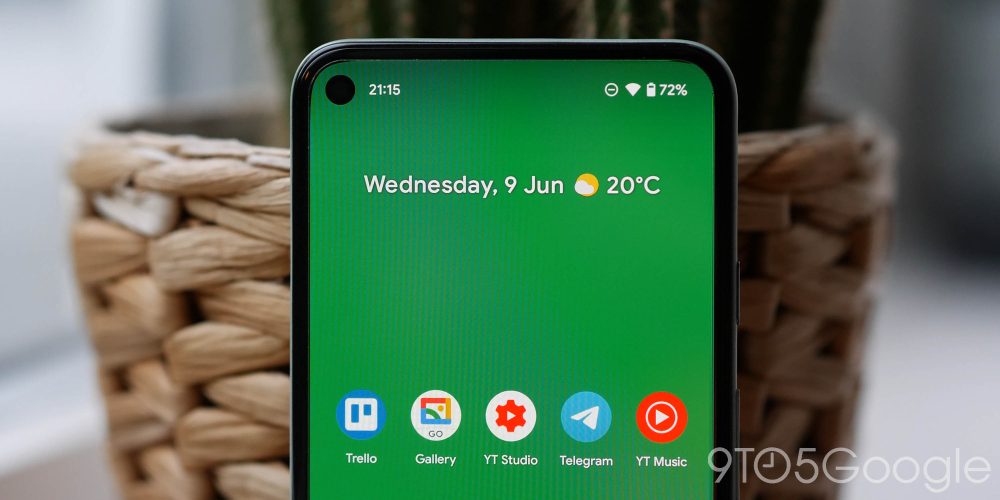
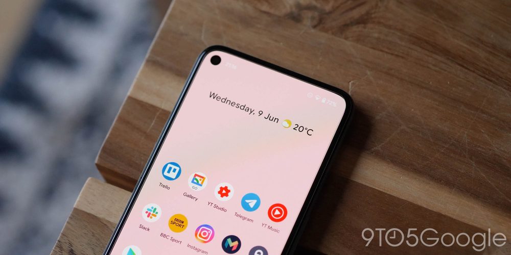
More ‘At a Glance’ changes
Your favorite Pixel Launcher widget is no stranger to tweaks and changes. The text has changed again, and considering this is a big deal to some people, the slightly bolder text has returned. Expect Google to change it again in the future — just like every time before.
Android 12 Developer Beta 2: What is your favorite new feature?
Like any release prior, there is quite a lot to unpack in the Android 12 Beta 2 build. In essence, this makes our small selection likely just the tip of the software iceberg. With that said, these are the most prominent user-facing features that we’ve found after delving in.
We expect to see more little things that might slip through the cracks over the coming days and weeks. We have a deeper dive into everything that has been added, including some features that require a little work to get fully operational in our full overview.
What is your favorite new feature or features? Let us know down in the comments section below!
More on Android 12:
- Android 12 Developer Preview 1 hands-on: Top new features [Video]
- Android 12 Developer Preview 2 hands-on: Top new features [Video]
- Android 12 Developer Preview 3 hands-on: Top new features [Video]
FTC: We use income earning auto affiliate links. More.


Comments