
The stable Android 12 release has inched ever closer, with Android 12 Beta 3 dropping just a month after the second build. Following our other deep dives, we’ve been spending time with Android 12 Beta 3 to find the best new features and changes that you can try right now.
Android 12 is going to provide one of the biggest updates for years. Not only does it look very different from what has been available on many of our favorite devices, but there are also plenty of under-the-hood tweaks to contend with. Because we’re now three builds into the public-facing beta phase, we are tantalizingly close to platform stability, but that doesn’t mean that Google is holding back on new additions.
The releases have been thick and fast, we’re only just catching our breath from the first and second Android 12 Beta releases, and we have Beta 3 to get to grips with. If you have already enrolled, you should soon receive an OTA update that contains the latest July 2021 security patch, plus all of the new UI and system-level tweaks coming with this patch.
If you haven’t already tried the Android 12 Beta and want to sign up, we have a short little guide to help you get enrolled, but this process is very quick and easy. Basically, head to the Android 12 Beta sign-up page, and you can opt-in — or out — to try the latest pre-release OS build for yourself. That is, provided you have a Pixel 3/3 XL or a newer Made by Google phone.
Summary
- Video — Android 12 Developer Beta 3 hands-on: Top new features!
- Scrolling screenshots
- Face detect auto-rotate
- More Material You theming options and new icons
- Disable Assistant corner swipe activation
- One-handed mode tweaks
- Internet toggle tweaks
- Notification shade toggle alterations
- Chrome quick link sharing
- Google Camera 8.3 + Material You tweaks
- Pixel Launcher changes
- Pixel Tips redesign
- Android 12 Developer Beta 3: What is your favorite new feature?
- More on Android 12:
Video — Android 12 Developer Beta 3 hands-on: Top new features!
Subscribe to 9to5Google on YouTube for more videos
Scrolling screenshots
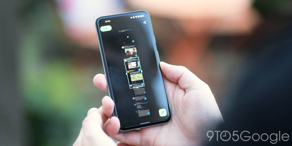
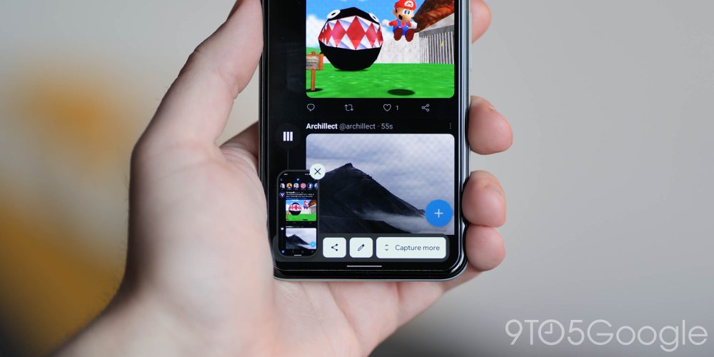
After what feels like an age, Google is finally adding the ability to take scrolling screenshots with Android 12 Beta 3. To say this feature is long overdue is an understatement, and we’ve seen multiple OEMs simply adopt their own implementations to make up for the lack of options within the “core” build of Android.
It’s a fairly standard tool that allows you to expand the regular screenshot option out of your display view. When initiating a screenshot, the floating menu introduced back in Android 11 will now including a “Capture more” toggle that will allow you to expand what else is captured. It’s quite a different way of grabbing the entire fully expanded page view and then just letting you crop to what you want.
There is a caveat, though. At least in Android 12 Beta 3, the scrolling screenshot feature doesn’t appear to work with websites, which is a real bummer. We’re sure that it will be tweaked and tuned ahead of the full Android 12 release in the coming months. Otherwise, it’s not exactly the most useful outside of on-device apps.
Face detect auto-rotate

To help improve auto-rotation accuracy, you can toggle face detection so that when putting your device into portrait or landscape, it will react much faster. It’s hard to say if this new option makes a huge difference, but while it might be the placebo effect in action, it does feel a little bit snappier than previously.
More Material You theming options and new icons

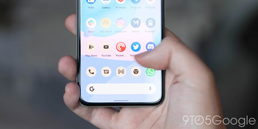
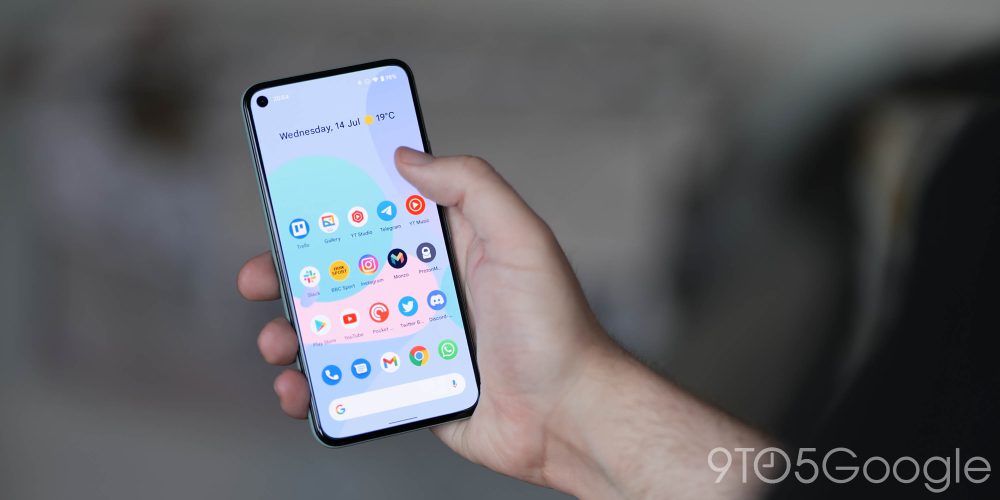
The Wallpaper & style section has been on the receiving end of an overhaul with Android 12 Beta 3. It’s easy to see right away that “Material You” is closer to completion in this release’s latest build of Android 12, with support for choosing the palette of colors the OS picks from and very limited support for automatically themed icons.
Themed icons work in much the same way an icon pack would work on a third-party launcher. Your icons are swapped out with supported applications with a line-based design and background to match the wallpaper or chosen accent color. We are yet to see a single supported third-party apps; almost all of Google’s popular apps will adjust when toggled.
Disable Assistant corner swipe activation
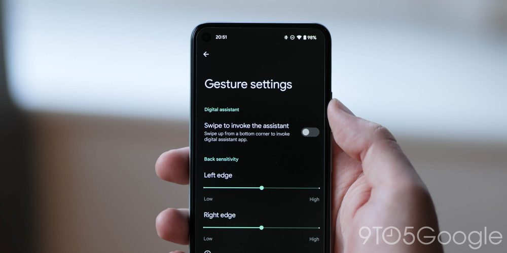
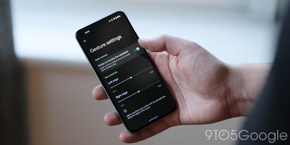
With the removal of the awesome Active Edge in recent Pixel devices, the corner swipe activation gesture was seen as the replacement. In Android 12 Beta 3, you’re now able to completely deactivate the Assistant corner swipe.
For people that might not want to even access the Assistant, this might be the perfect solution as all other methods can be disabled at any time. For some reason, the corner swipe was persistent and could sometimes interfere with the gesture navigation method. Likely because of that, within the gesture navigation settings, you can toggle the activation method — as this does not affect the 3-button navbar.
To enable or disable the Assistant corner, swipe ahead to Settings > Gestures > System navigation > Swipe to invoke the assistant.
One-handed mode tweaks
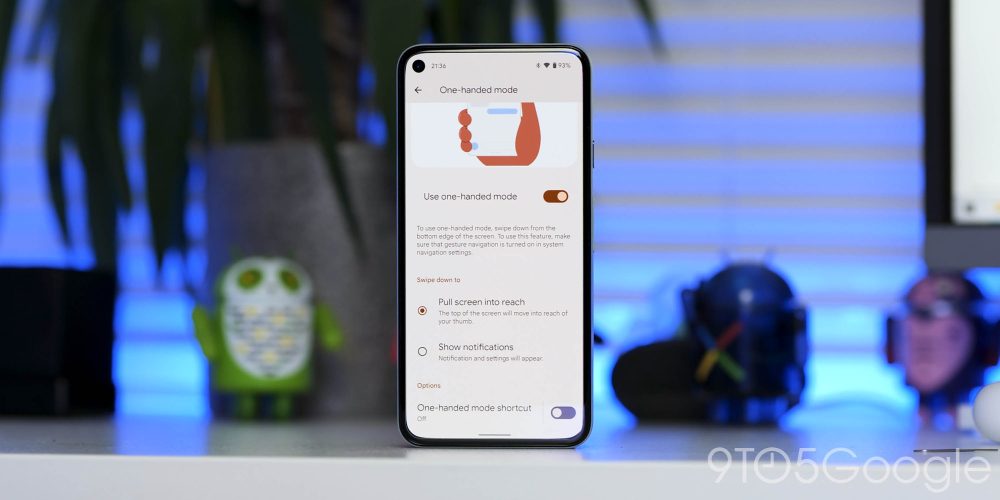
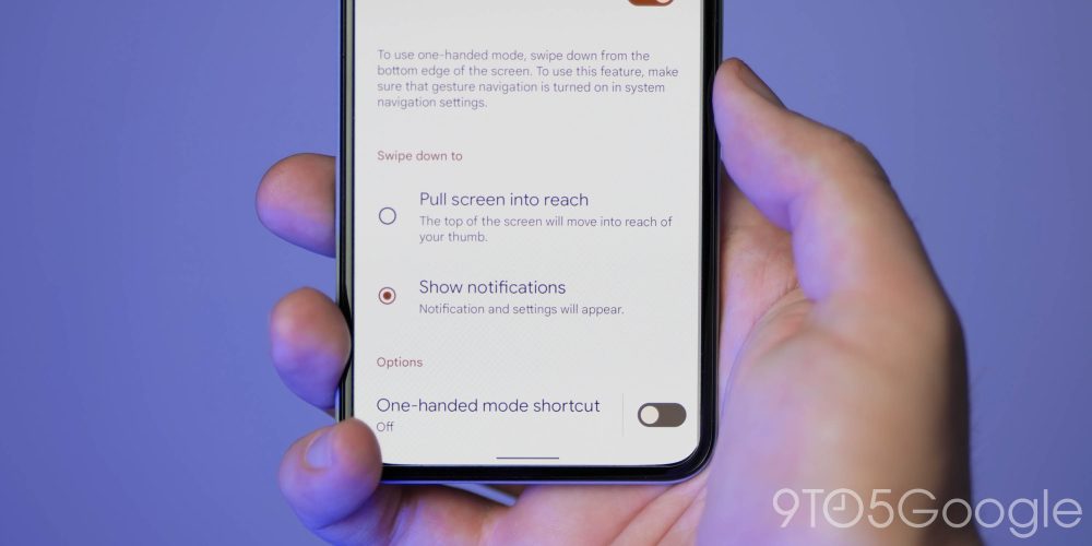
In a similar way to the addition of scrolling screenshots, the one-handed mode was a long-overdue addition in the previous Android 12 Beta updates. Beta 3 just adds another option to expand the notification shade by swiping down in the gesture bar. This might be useful for Pixel 4 owners without a fingerprint scanner or the upcoming Pixel 6, which is expected to come with an in-display fingerprint scanner.
Internet toggle tweaks

One of the more frustrating elements of Android 12 Beta 2 was the removal of the ability to toggle Wi-Fi on or off quickly within the introduction of the “Internet” notification button. Android 12 Beta 3 is sort of fixing that problem with a “turn off Wi-Fi” button as part of the Internet pop-up.
No, this is not a proper solution to the problem, but it does save having to dive into the Settings menu just to turn off or turn on your device’s Wi-Fi connection. When tapping the Internet toggle on Android 12 Beta 3, you’ll get the same pop-up menu with all of your current device data connections, and in the bottom left, you can tap and turn off or turn on Wi-Fi.
Notification shade toggle alterations

Google has moved some of the less prominent notification shade toggles around a little bit in Android 12 Beta 3. We’re talking about the gear, pen, and power icons that allow you to enter Settings, edit the notification shade layout, and access the pop-up power menu.
These toggles have simply been moved, but more importantly, the power option has been moved back to a central position, which is easier to remember for right-handed users. No more accidental presses of the power menu through muscle memory.
Chrome quick link sharing
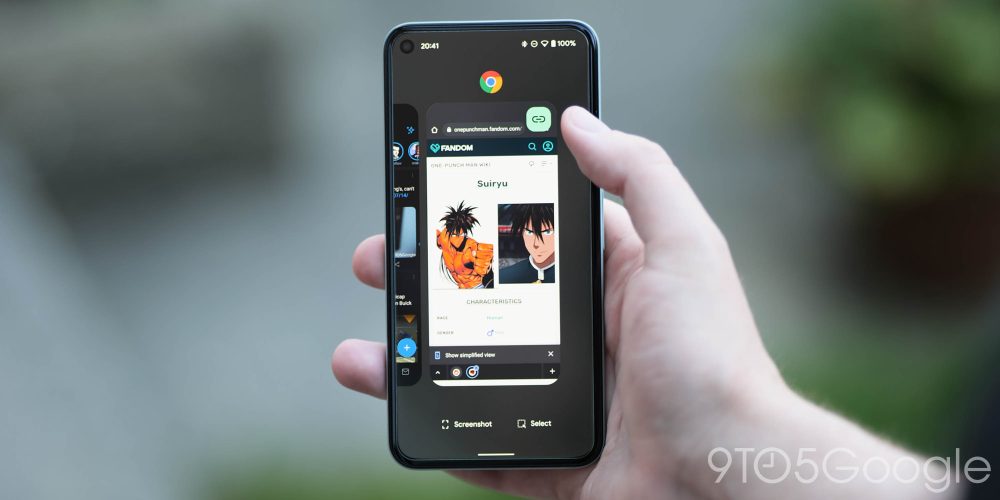
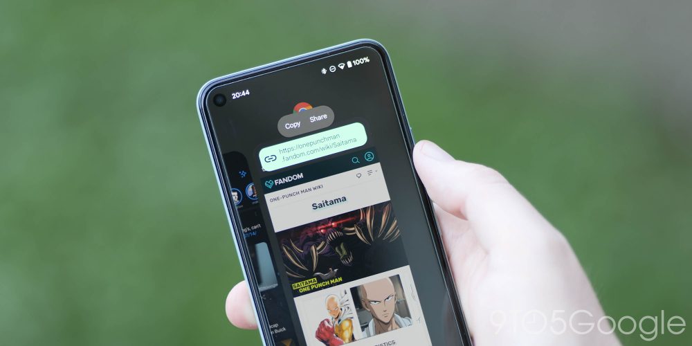
When in the Recents app menu, you can very quickly share websites from Chrome with a new floating quick toggle which will pull the most recent webpage link you’ve viewed and make it easier to directly share with your apps or contacts.
When clicked, this button presents the URL that’s currently open in Chrome along with options to share or copy the link. When you click on it, the bottom of the screen is populated with your recent contacts, so you can easily share that link without jumping into another app in Android 12. There’s also a “more” button to option the full share menu.
Android 12 Beta 3: Chrome gets a slick new link-sharing option from multi-tasking page
Google Camera 8.3 + Material You tweaks

Google Camera 8.3 is bundled with the Android 12 Beta 3 update, and — you guessed it — it has some interesting changes. Most notably is the addition of Material You theming for vast portions of the UI, including the floating settings menu and associated toggles, plus the main control area.
The settings page also does away with the dividing lines between sections, letting the colored text of each subheading act as a separator. Similarly, the text on this page — and the quick settings, but not the main camera interface — has been switched from the previous Roboto font to the newly launched Google Sans Text.
Pixel Launcher changes
The Pixel Launcher hasn’t been left out in Android 12 Beta 3, with quite a few little refinements and alterations, including to the search bar. It’s now thicker and more prominent, while the Assistant logo has been replaced with a microphone icon. When long-pressing an app shortcut menu, there is now a prominent link to the “Widgets” for that specific app too.
Although not a big change by any stretch of the imagination, but the popular “At a Glance” widget from the Pixel Launcher has been renamed “Live Space.” However, if you expand the settings for this homescreen widget, it’s still hasn’t been fully renamed. Not a big change but one to note if people mention Live Space and you’re wondering just what the heck they’re talking about.
There is the most minor of minor tweaks to the font, too, that sees it get ever so slightly bolder and a little broader. Pop-up menus have had a more obvious tweak with Material You-themed colors that match your chosen settings or wallpaper.
Pixel Tips redesign

You may never have even launched the Pixel Tips app before, but it hasn’t escaped the Google developer and design team in Beta 3. The app has seen some fairly fancy renovations with a new tiled layout that has icons for specific on-device sections — likely to make things easier to find or understand for newbies.
Android 12 Developer Beta 3: What is your favorite new feature?
Like any release prior, there is quite a lot to unpack in the Android 12 Beta 3 build. In essence, this makes our small selection likely just the tip of the software iceberg. With that said, these are the most prominent user-facing features that we’ve found after delving in.
We expect to see more little things that might slip through the cracks over the coming days and weeks. We have a deeper dive into everything that has been added, including some features that require a little work to get fully operational in our full overview.
What is your favorite new feature, or do you have multiple features that you like? Let us know down in the comments section below!
More on Android 12:
- Android 12 Developer Preview 1 hands-on: Top new features [Video]
- Android 12 Developer Preview 2 hands-on: Top new features [Video]
- Android 12 Developer Preview 3 hands-on: Top new features [Video]
- Android 12 Beta 1 hands-on: Top new features [Video]
- Android 12 Beta 2 hands-on: Top new features [Video]
FTC: We use income earning auto affiliate links. More.


Comments