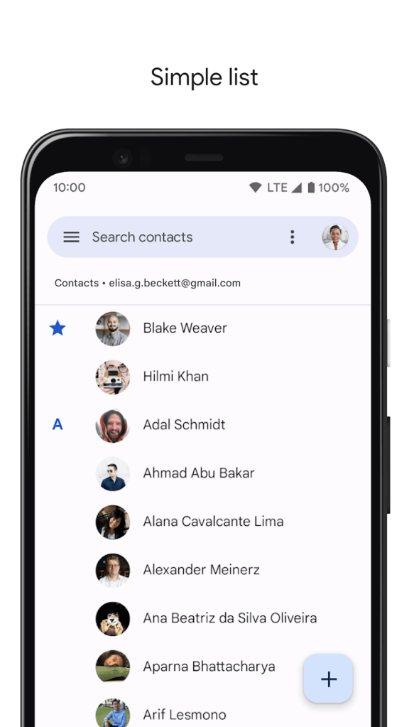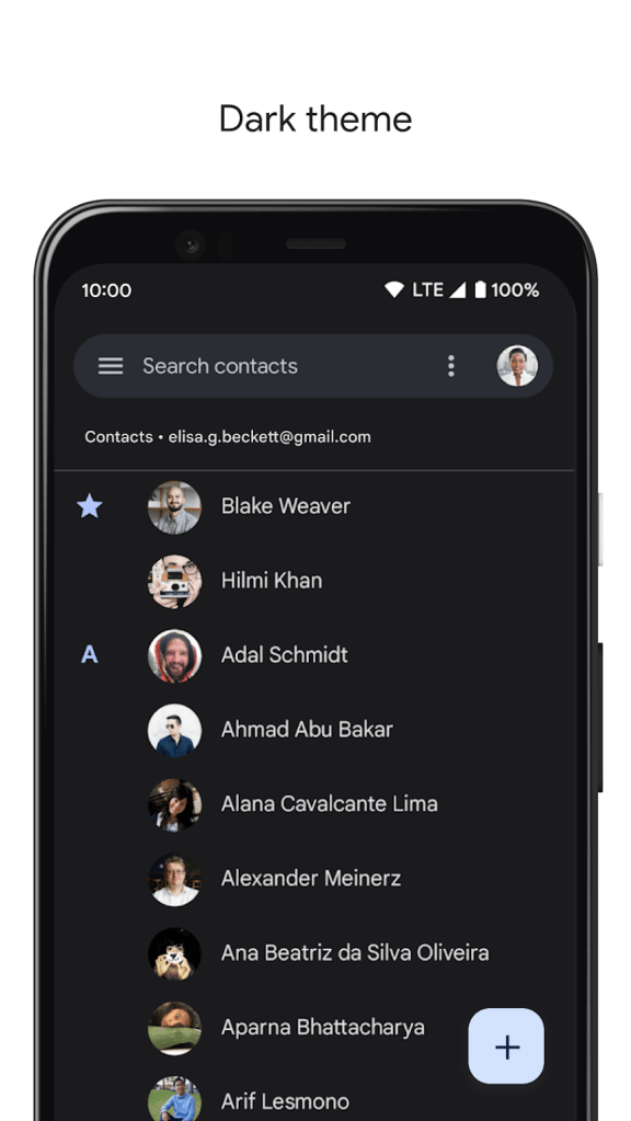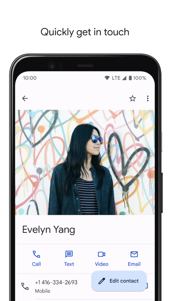
Material You can be seen in various parts of the system on Android 12. The next big step for the company’s new design language is app updates, and that started with Google Camera seeing some tweaks this month. Google Contacts is now the inaugural first-party app to get a sizable Material You redesign.
Update 8/16: Just over two weeks after the Google Contacts Material You redesign started rolling out, it’s now widely available for all Android users with version 3.51.1.388199234 this morning.
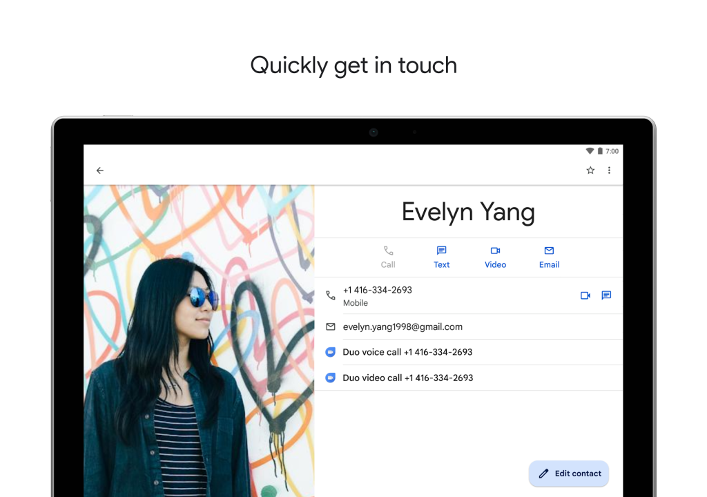
The Play Store changelog officially refers to it as a “Google Material Design update,” while listing screenshots have been updated to show the tablet/large screen UI.
On Android 11 and below, Dynamic Color is not available and Google Contacts sticks to a light blue accent throughout the app, including the search field and FAB.


Original 7/29: Material You in Google Contacts starts with a pill-shaped search field up top that replaces the previous rounded rectangle shape. This element, along with the background and a non-circular FAB that is much more raised with a prominent shadow, adapts to your Dynamic Color. The tinting is very prominent in the bar and FAB, while subtler in the background. The hue differs depending on whether the system light or dark theme is enabled.
Other places you see Dynamic Color include the alphabet letters organizing people and when you open a particular contact. When you scroll up to hide a person’s image, the Call/Text/Video bar is tinted.
Elsewhere, the Material You redesign of Google Contacts changes the shape of various buttons. The “Save” button is now a large pill, while the “Edit contact” FAB is similarly shaped to the one on the main list and shrinks when you scroll.


Google Contacts also has an updated splash screen on Android 12 that animates the icon in from the left.
This Google Contacts Material You redesign is rolling out with version 3.50 via the Play Store. The best way to experience the update is with Android 12, but the shape changes are also live on Android 11.
Contacts is the most sizable Material You app release to date from Google. Files (Go) has an MY bottom bar, while Google Camera and Gboard mostly take advantage of Dynamic Color.


More about Material You:
- Here’s the delightful and timely Android 12 Easter egg with Material You
- It looks like Android 12 won’t bring back font, icon customization because of Material You
- Gboard redesign with Material You theming rolling out for more on Android 12 [Update: Google Sans]
- [Update: Tasker] First apps w/ Material You support are already arriving for Android 12
FTC: We use income earning auto affiliate links. More.


Comments