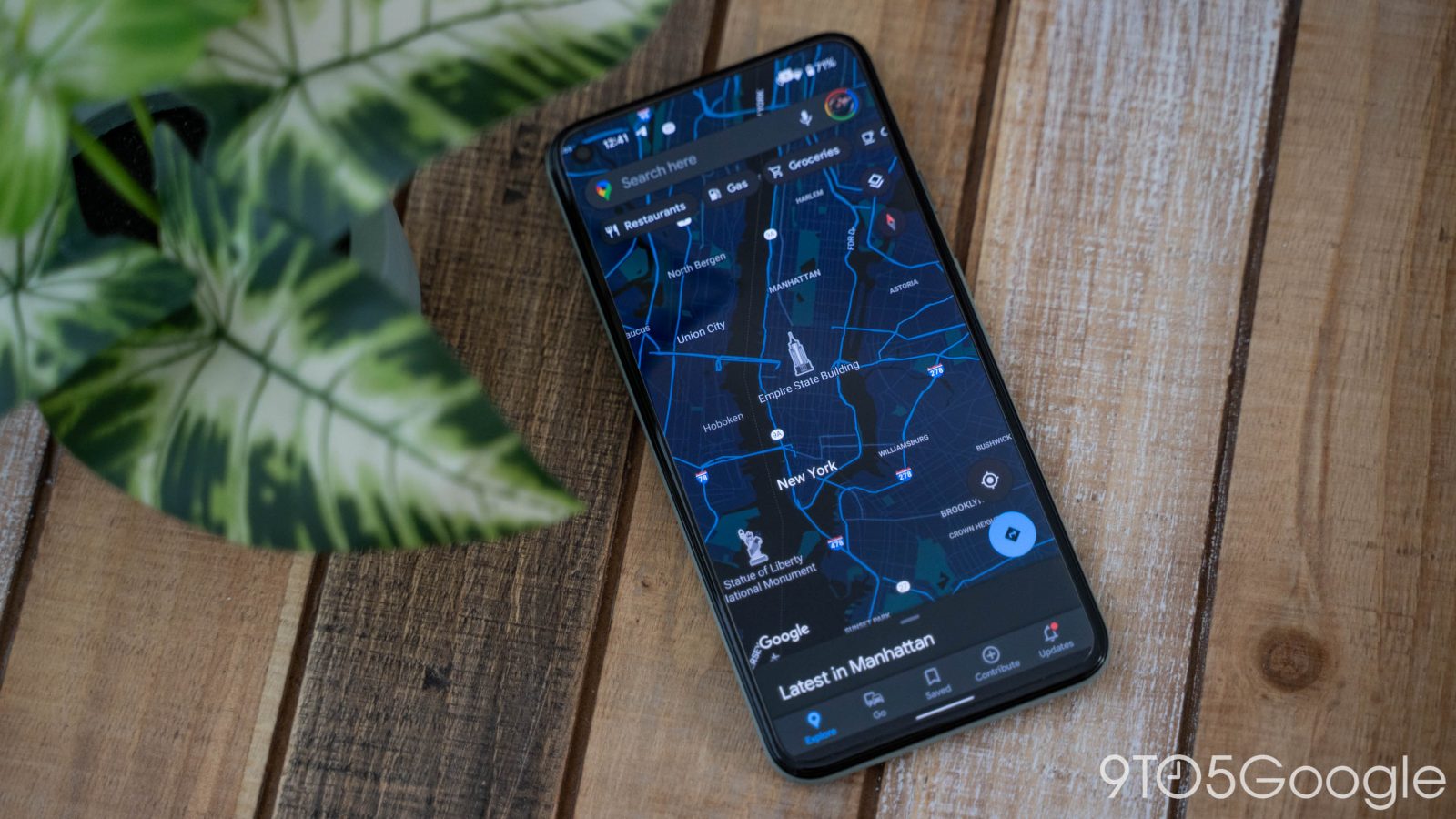
Recent Material You rollouts have primarily focused on introducing new widgets, like Drive’s Suggested files, or updated widgets, like shapes for Photos. That said, some apps have yet to be redesigned, but Google Maps now has a Material You bottom bar.
Now in Google Maps, pill-shaped highlights are used to note what tab you’re currently viewing, but the bottom bar does not appear to be as tall as other implementations and is closer to Gmail’s post-release modification. Meanwhile, Dynamic Color is not yet leveraged, with a blue tint used instead. Like with past redesigns, this should change over the coming days/weeks.
Another recent Material You tweak switched the navigate FAB to a rounded square from the regular circle, though the locate button is unchanged. This was done via server-side update a few days ago. Meanwhile, Maps for Android has a pill-shaped search field.
Other tweaks moving forward could switch the carousel of suggestions to use more squarish chips, like in Assistant, while various menus and features should see better spacing. A more unifying change would be Dynamic Color theming throughout.

The biggest part of the app is, of course, the map layer. It’s unclear how that realistic interpretation of the world could be modified to be more Material You while also preserving information density.
The Material You bottom bar in Google Maps for Android is now widely available.
More on Google Maps:
- Google Maps reaches 10 billion Play Store downloads
- Google Maps gets eco-friendly routing in the US, bike-optimized ‘Lite Navigation’ coming soon
- Maps readies Android homescreen widget w/ dynamic colors
- Google Maps adds ‘Fire’ as a top-level layer, bringing ‘Tree Canopy’ tool to 100 cities
FTC: We use income earning auto affiliate links. More.


Comments