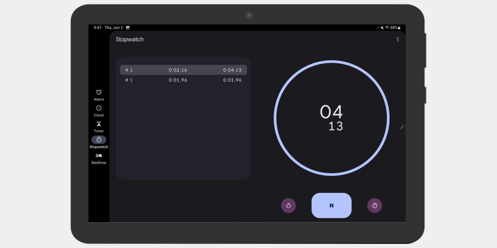
The latest first-party app to get an Android tablet-optimized redesign is Google Clock with version 7.2 today. This follows Google Lens and Calculator, which widely rolled out earlier this week.
Update 6/8: A new version of Google Clock 7.2 (450575037 vs 453315463) is widely rolling out to phones today via the Play Store. Tweaks for non-large screen devices include pill toggles getting an inversed color palette, while the keypad in the Timer tab has bigger numerals, just like Calculator.
Original 6/2: As briefly previewed during I/O 2022 last month, the big change to Google Clock is a navigation rail that replaces the bottom bar. The app’s five key sections are now located on the left side of the screen and vertically centered with Material You’s pill-shaped tab indicators leveraged.
Google Photos is the only other app with a rail today and its tabs are not centered, but it uses the extra screen real estate to surface many other parts of the app directly for a UI that matches the website.
Before


After


Beyond the revamped navigation that sees you get more vertical space as there’s no longer a bottom bar, Google is now using two-column layouts throughout the Clock app when your tablet is in portrait orientation:
- Alarm tab: Bedtime prompt/card and lists of set alarms
- Clock: Current time/date and other saved cities with FAB (floating action button) centered to the right column. UI was previously unoptimized.
- Timer: Countdown centered, but controls placed towards the right
- Stopwatch: Split times at the left and counter with counter at the right. The best UI in this update.
- Bedtime: Heavy use of cards
Screens in portrait mode match their phone counterparts, though the navigation rail remains at the left. Meanwhile, the rail does not appear on phones in landscape orientation.
Google Clock 7.2 is not yet widely rolled out via the Play Store, but you can manually sideload it today to get the tablet updates.
Update: We’ve seen one report so far that Clock 7.2 is visually buggy on foldables, specifically the Galaxy Z Fold 2 running Android 12 (One UI 4.1). Some layouts are blank depending on the orientation, while other elements appear offscreen.
More on Google tablets:
- Google unveils Android-powered Pixel tablet coming in 2023
- Google’s first new tablet update lets Google Lens work in landscape orientation
- Calculator 8.2 adds two-column UI for tablets and Quick Settings tile [U]
- Here’s every Google app getting an Android tablet UI [Gallery]
FTC: We use income earning auto affiliate links. More.


Comments