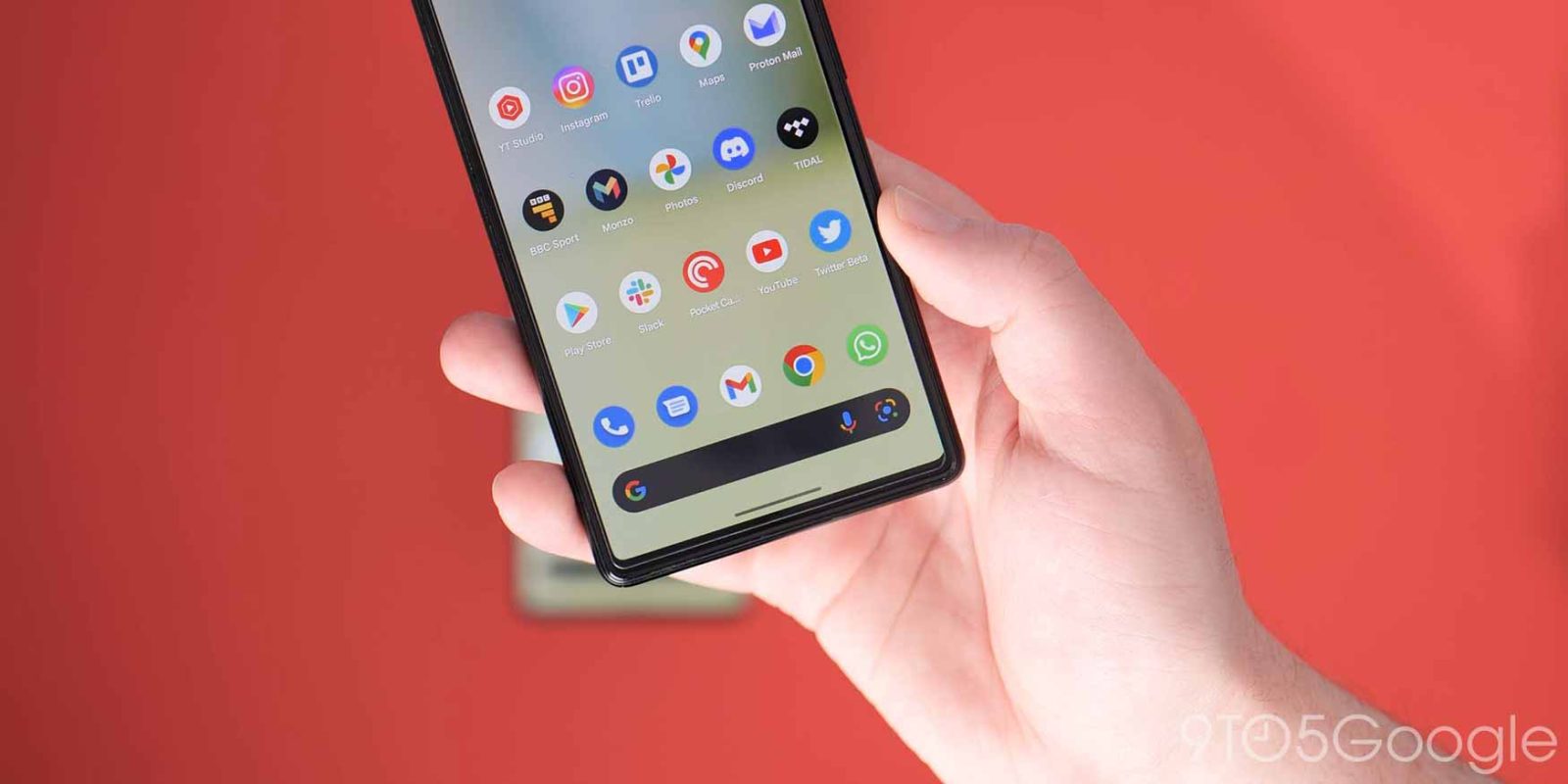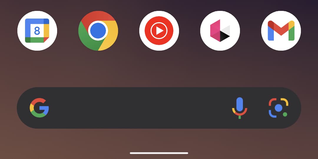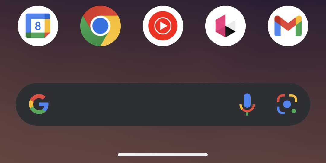
The latest Android 13 Beta 3 build has tweaked the gesture navigation bar to be more prominent with a larger, bolder “pill” to help make it stand out. It appears that this change has been fairly divisive, but what do you think?
If you didn’t know or haven’t tried the recent preview build on your own device, then you may have missed that the Android 13 Beta 3 introduces the first cosmetic change to the gesture navigation bar since it was first added with gestural navigation back in Android 10. It certainly looks like the navbar utilized by iOS.
For those of us deeply ingrained in all things Android, it’s hard to imagine that someone wouldn’t understand what this UI portion means. A visual indicator is always helpful for people that are not versed in everything their smartphone can do. Especially for those switching across the device and mobile OS divide, this seems like a sensible design update for what feels like a normally inconsequential area of the Pixel Launcher.
There’s absolutely no effect on the functionality or the accessibility of gesture navigations with this change. It’s merely a way to give the gesture bar more prominence. It could change again in an upcoming Android 13 Beta build too — something that often happens in these early public previews. You can see just how minor the gesture navigation bar change is from Android 12 to Android 13 Beta below:


Some people have complained that you can’t hide the navigation bar at all on Pixel phones. We think that is a fair complaint, and it would be great if Google could add a toggle to enable or disable the gesture navigation bar in Android 13 (or later) as we can see why some find this UI portion a little distracting.
As it stands, it looks like we’ll be seeing a larger gesture navigation bar within Android 13 when it arrives later this year. We want to know if you love it, hate it, or feel completely indifferent. Let us know via the survey down below.
More on Android 13:
- Samsung’s skin for Android 13, One UI 5.0, reportedly brings better animations
- Android 13 Beta 3: In-display fingerprint setup gets updated enrollment UI
- Android 13 Beta 3 hands-on: top new features and functions [Video]
FTC: We use income earning auto affiliate links. More.


Comments