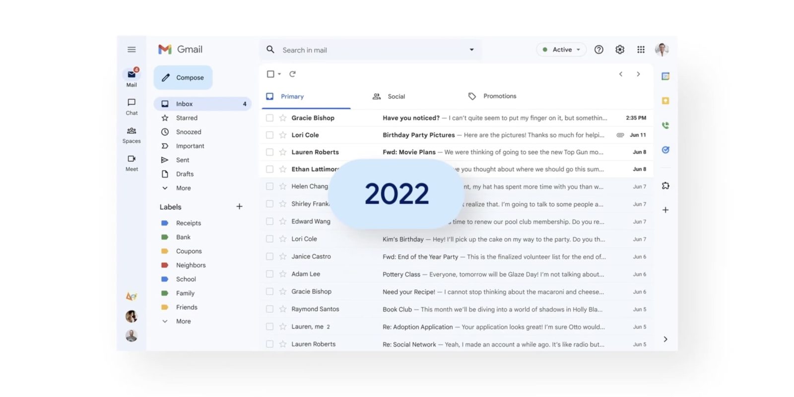
Google is now more widely rolling out Gmail’s Material You redesign – first announced last month – on the web while also teasing that a tablet revamp is coming later this year.
Update 8/2: Many more people are now seeing the Material You redesign in Gmail on both personal and work accounts. One telltale sign — besides the default background going blue and the bolder left sidebar — is the Compose FAB (Floating Action Button) turning into a rectangle with rounded corners, instead of being a pill.
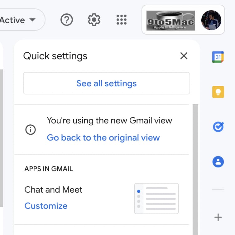
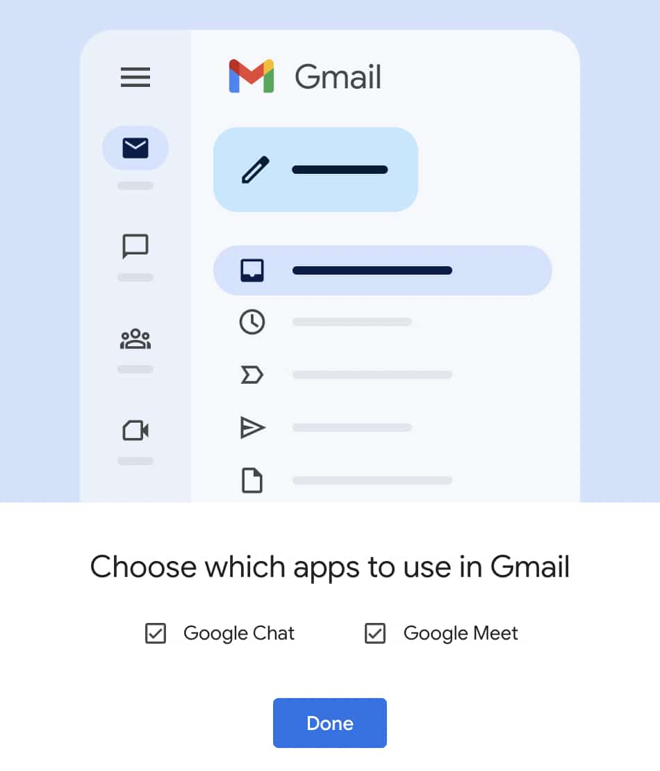
You can tap the settings gear icon in the top-right corner to “Go back to the original view,” while “Apps in Gmail” lets you remove Chat, Spaces, and/or Meet.
Original 7/27: The company is using today’s public push to emphasize the “unified” nature of having “Gmail, Chat, Spaces and Meet in a single, unified view.” Following the preview earlier this year, Google “will begin to roll out for all Gmail users who have turned on Chat.”
You’ll see a clean, streamlined way to move between apps that you can customize based on what works best for you.
Using Quick Settings, you can select apps you’d like to toggle between on the left side of your window, whether it’s Gmail by itself or a combination of Gmail, Chat, Spaces and Meet.
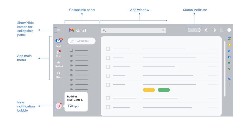
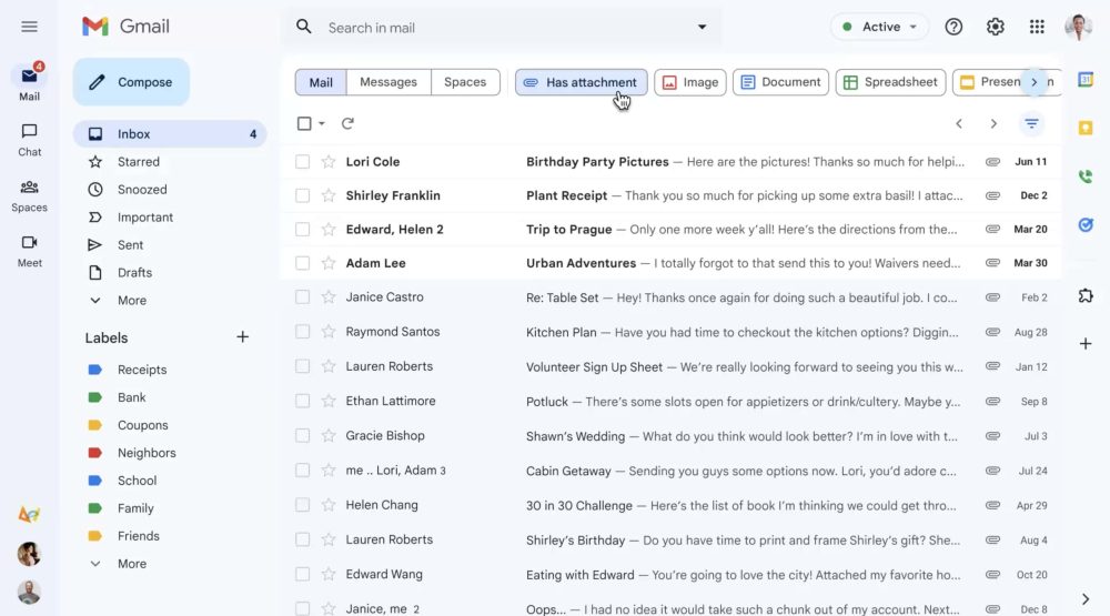
The primary change is an “App main menu” at the left to switch between the various Workspace apps, while Chat notification bubbles will appear at the bottom of this strip. The next column over (the “Collapsible panel”) depends on which application you’re in, with folders and labels appearing for Gmail and people/previous conversations while you’re in Chat.
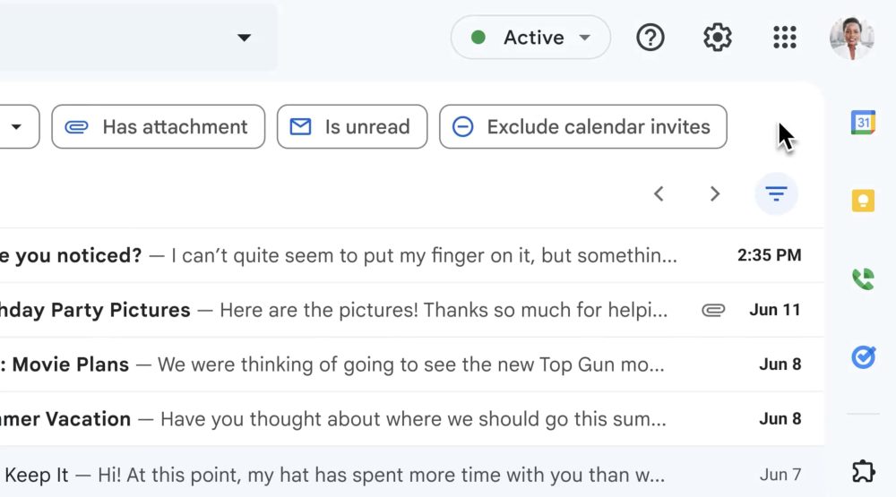
In terms of what’s new, Google is adding a filter button to the top-right corner of your inbox next to the page switcher/arrows. This drops down a row of search chips to refine results. These filters already exist in search today, but Gmail is now also surfacing them before you have to enter a query.
- Type: Mail, Messages (Chat), or Spaces
- From: Sender
- To: Recipient
- Anytime: Date range
- Has attachment: With image, document, spreadsheet, presentation, etc. filters
- Is unread
- Exclude calendar invites
This feature is not rolled out yet even for people who have been using the Material You redesign in recent weeks.
Material Design 3 takes the form of a blue background (though themes are available, as seen below) to replace the previous white one, and updated buttons, like “Compose,” being a rectangular with rounded corners instead of a pill.
Lastly, Google teased some upcoming capabilities for “later this year”:
… an improved experience for tablet users, better emojis, new accessibility features and a whole lot more.
The first item should be Android-focused and leverage a navigation rail, but it will be interesting to see if Gmail for iPad also gets these updates, given the popularity.
More on Gmail:
- Gmail getting better search suggestions due to updated ML models
- Gmail Compose window update adds profile avatars, right-click menu, and more
- Google One 2TB+ plans add premium Meet video features, like no 1-hour group limit
- A look at Gmail’s Material You redesign on the web: Google Sans, themes, and more [Gallery]
FTC: We use income earning auto affiliate links. More.


Comments