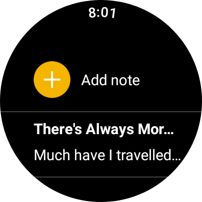
Following Camera for Wear OS last month, Google Keep is rolling out a Material You redesign that modernizes the app and joins its just-added Tile for faster note-taking.
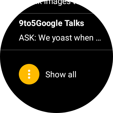
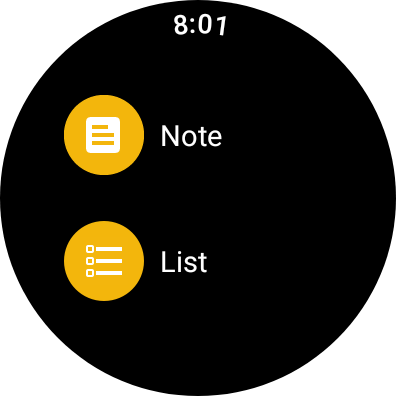
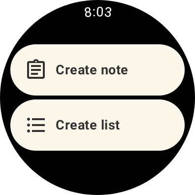
Everything is ever so slightly more compact, with users able to see two notes instead of just one when scrolled up to the very top of the homepage. You’ll also find a pill-shaped FAB that lets you “Create note” or “Create list,” which is similar to the Camera app’s new layout. Gone with this redesign is the yellow accent color.
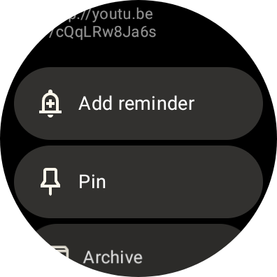
Notes in the main view are housed in gray pills that contrast nicely to the black background – this provides better separation and is one of the redesign’s subtle improvements. The app was previously just white text on black, and the new approach makes Google Keep feel less utilitarian, which defined many original apps on Wear OS.
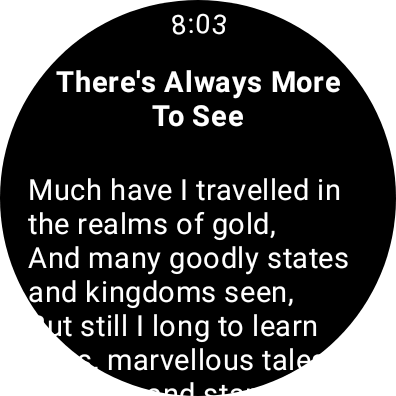
The shrink continues when viewing a note with users able to see slightly more text per screen, which is always a plus.
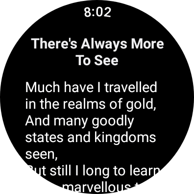
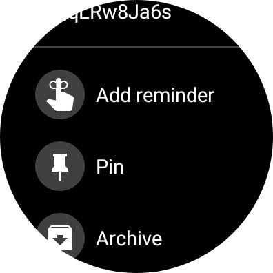
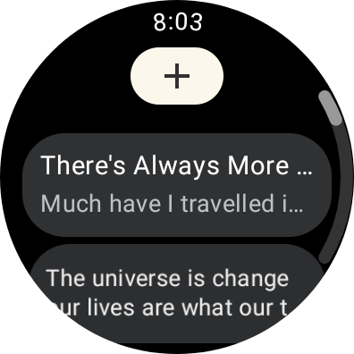
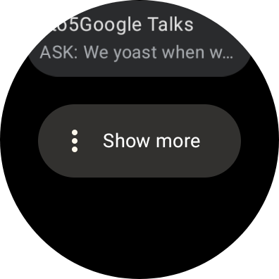
Version 5.22.342.03.97 Google Keep for Wear OS brings this Material You redesign and is rolling out today via the Play Store, with that revamp also more widely available. This modernization comes ahead of the Pixel Watch launch next month where Google very much has a chance to make a second impression with its wearable platform.
More on Wear OS:
- Wear OS gets a dynamic Bitmoji watch face, exclusive to Wear OS 3
- SoundCloud’s Wear OS app is now available for all watches in beta – here’s how to get it
- Galaxy Watch 4’s Wear OS 3.5 beta is over, stable update starts rolling out to testers
- WhatsApp voice call support comes to Wear OS 3 w/ app beta update
FTC: We use income earning auto affiliate links. More.


Comments