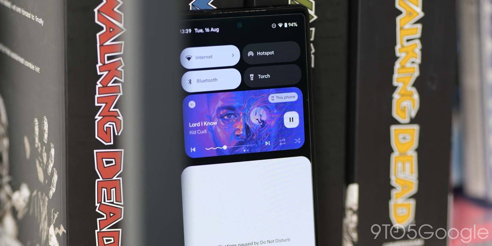
Android 13 QPR1 Beta 2 is rolling out to Pixel phones today and continues to make UI tweaks, most notably to the media player.
The progress bar’s scrubber is no longer a circle and therefore not sperm-esque in visual appearance. It’s now a vertical pill that is tall and narrow. The visual touch target is slightly too small, but it does work fine and addresses people’s complaints about the design.
It’s interesting that Google acquiesced to making a change following the stable launch in August but not during the beta period.
Meanwhile, Settings app > Sound & vibration > Media (or long-pressing an active media player) reveals a new “Show media on lock screen” settings. It’s toggled on by default, but disabling lets you hide the card and see more notifications when audio is streaming.
Even with this setting off (and a song is playing), the tall clock is minimized to a single line. As always, you can swipe down for player controls.
In a related change, adjusting volume with the physical rocker and tapping the overflow menu no longer opens “Sound & vibration” as a bottom sheet. Rather, it’s now centered, which makes it feel less integrated as a system element in my opinion.
Android 13 QPR1 is expected to hit stable in December with all these media player tweaks, though things could change with one more preview next month.
More on Android 13:
- Google brings back in-person Android Dev Summit in SF and London for 2022
- Most Google apps don’t actually support Android 13’s themed icons outside of Pixel phones
- These Samsung devices are reportedly getting Android 13 by the end of the year
- Google fixes nine Android 13 issues for Pixel with October update
Dylan Roussel contributed to this article.
FTC: We use income earning auto affiliate links. More.


Comments