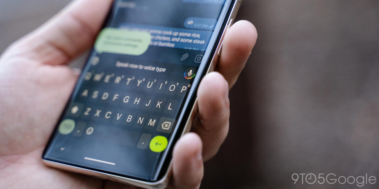
For some, if not most, Gboard’s emoji picker is likely one of their most heavily used interfaces on their phone, and Google is redesigning it today.
This modest redesign applies to all of Gboard’s emotive features with a top bar that includes a back button, page name, and pill-shaped search field, which mostly appears in the same fixed position compared to before.
The “All” tab is otherwise unchanged, while “Emoji” gets the bulk of the upgrades. Namely, the Emoji Kitchen carousel now appear underneath that top bar and appear less tacked on, especially for such a heavily-used feature. As such, search and the category pickers are the first thing on the panel.
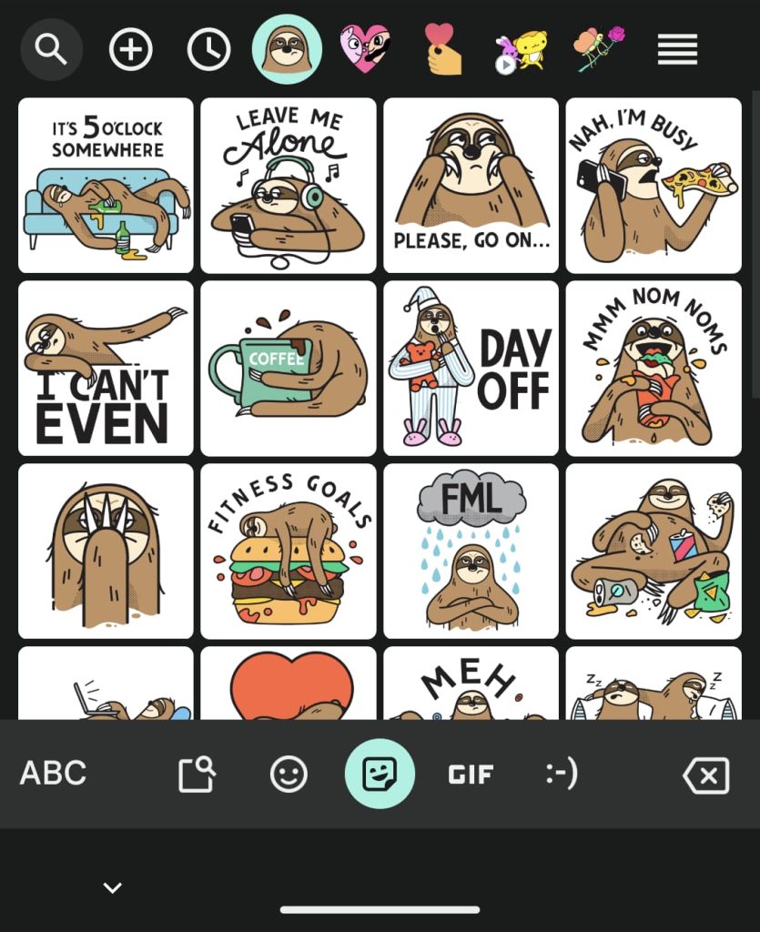
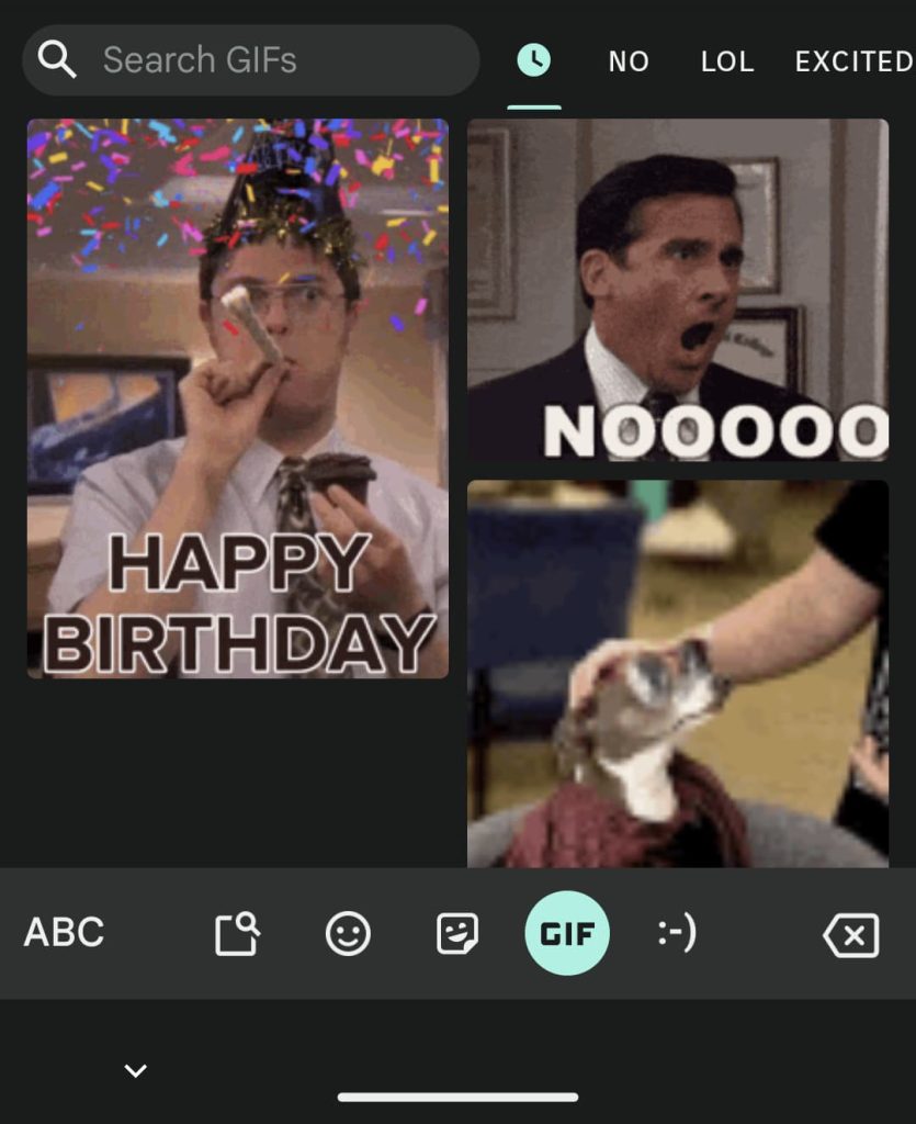
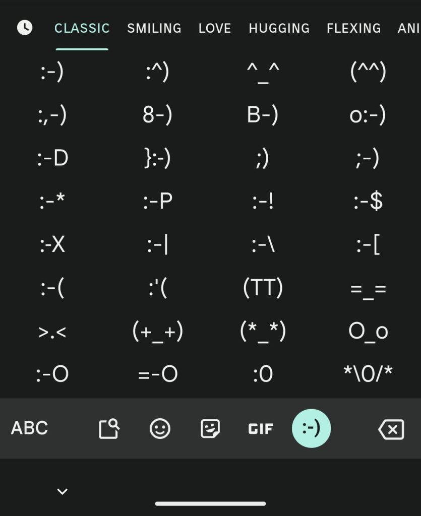
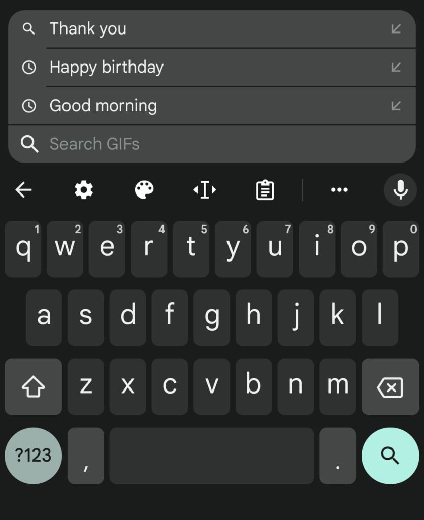
Moving on, the “Stickers”’ top bar is now less crowded thanks to this redesign, while the “GIFs” and “Emoticons” tabs benefit from the UI consistency. Gboard has also modernized the search lookup and results UI with the same design principles.
Gboard redesign
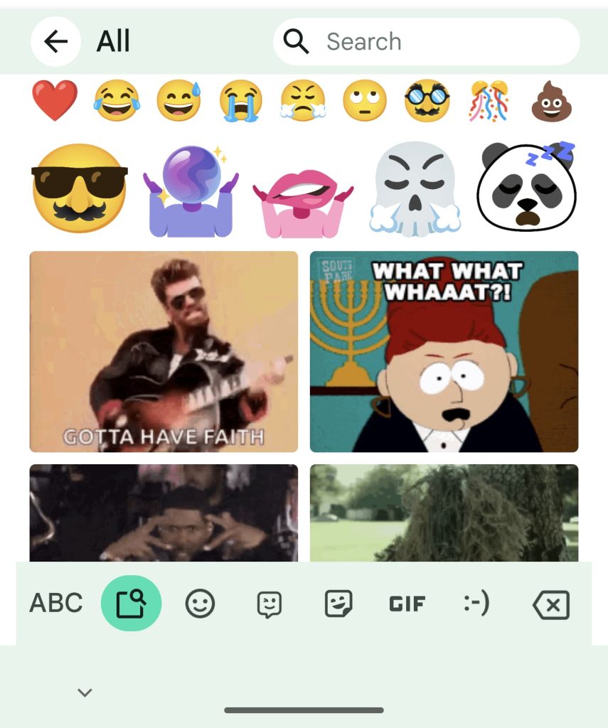
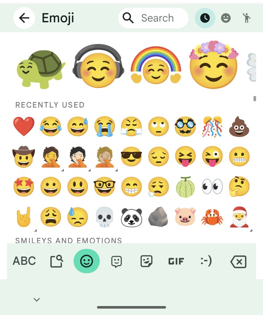
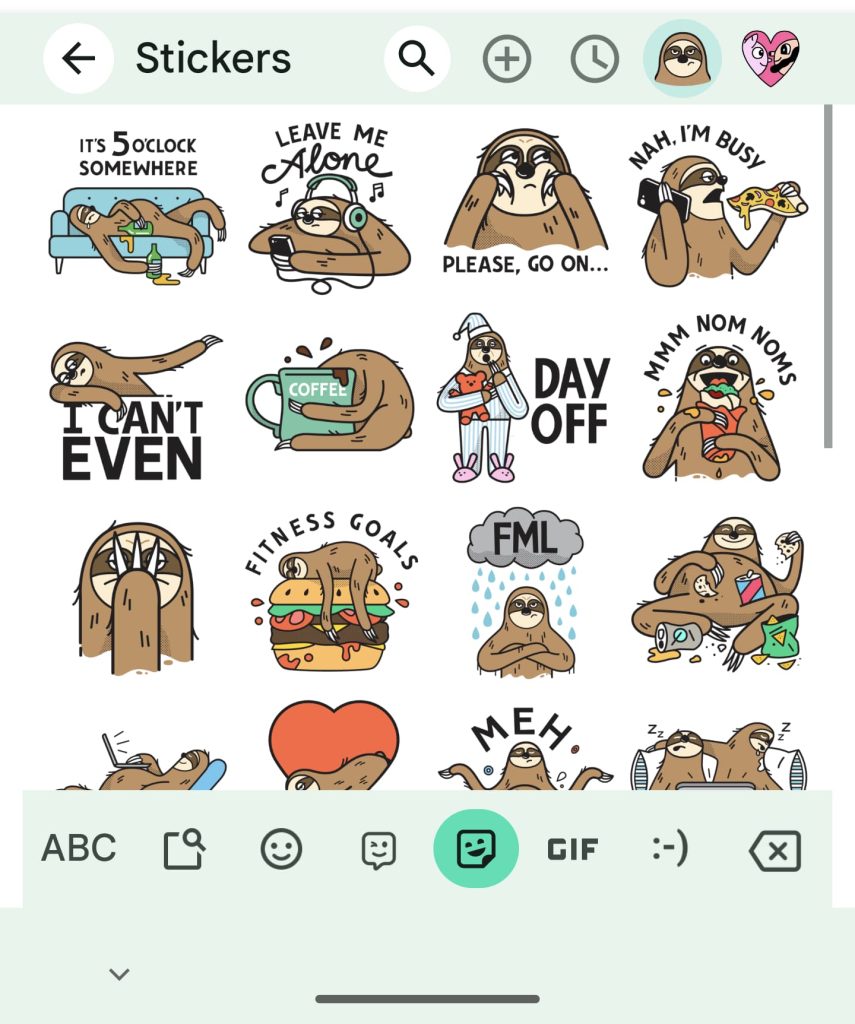

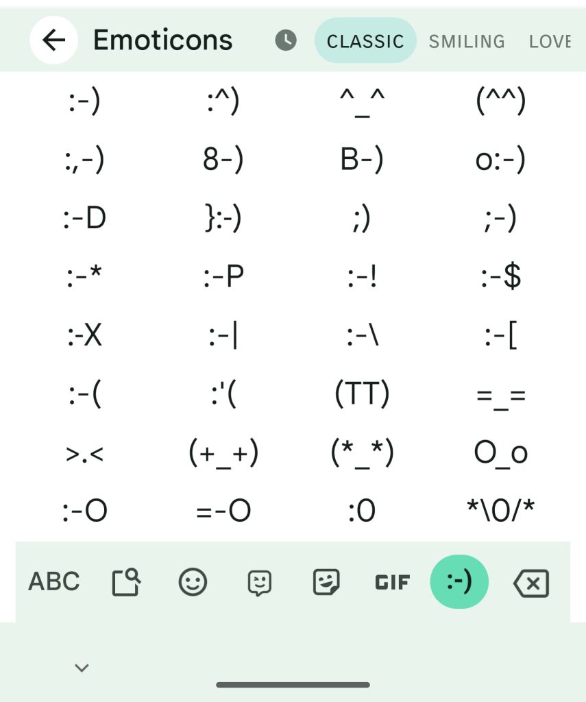
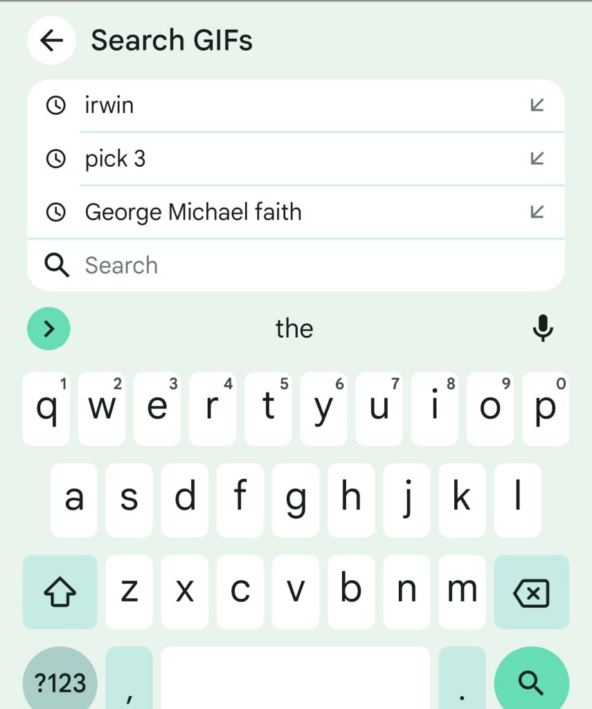
One odd quirk we’ve encountered is the absence of the “ABC” button in the bottom-left corner to quickly return to the keyboard. This happened to just one user and it requires them to return to letter keys by tapping the top-left back button. It’s a rather stark change that greatly affects muscle memory. Hopefully, Gboard keeps the ABC placement/behavior unchanged.
This Gboard emoji picker redesign is appearing for a lot of beta users this morning, but it’s not yet widely rolled out.
Gboard today
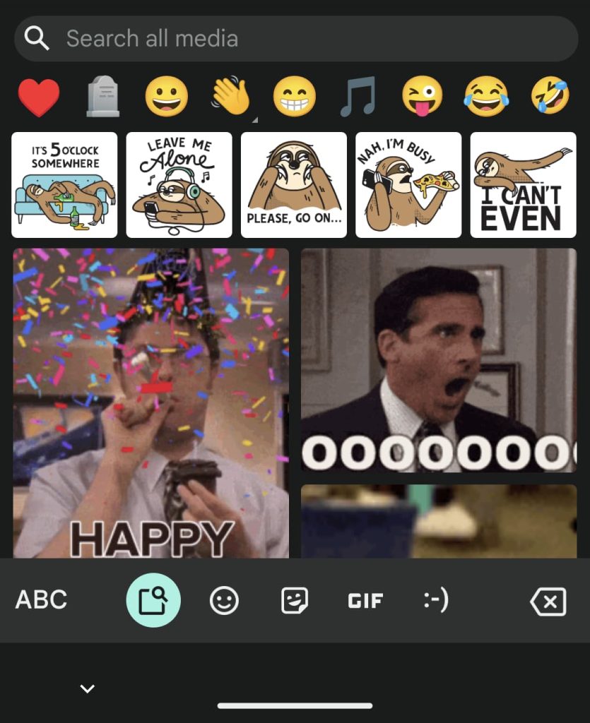
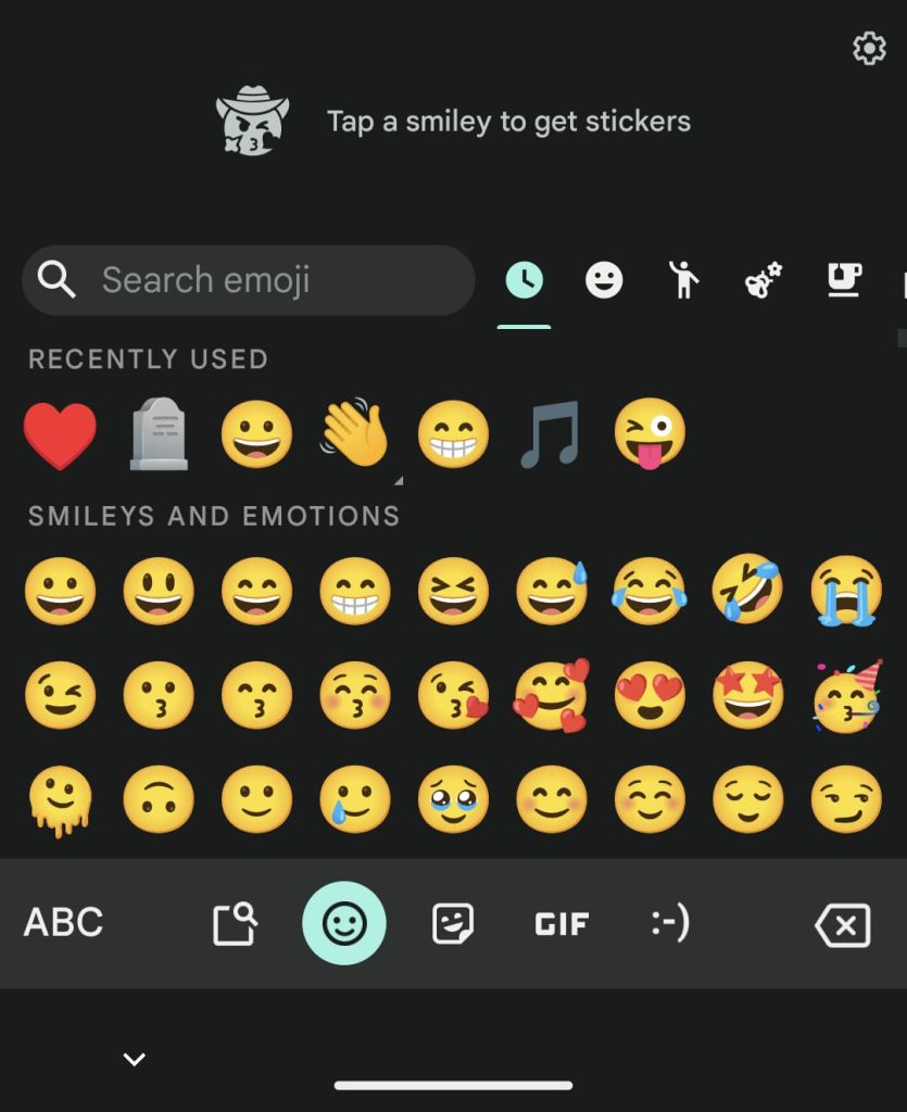
More on Gboard:
- Google finally updates Gboard with Android tablet layout [Gallery]
- Pixel 7 and 7 Pro using personalized speech recognition to improve Google Assistant
- Every Google app with an Android tablet UI [U: Gboard, Play Store, Chrome, and Sheets]
- Gboard is available in a new physical form factor, courtesy of Google Japan [Video]
Dylan Roussel contributed to this article.
Thanks all!
FTC: We use income earning auto affiliate links. More.


Comments