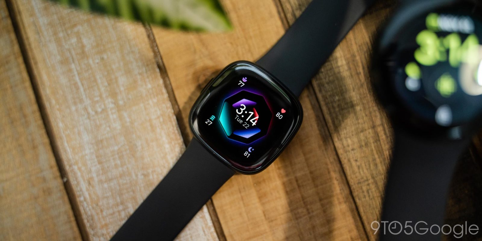
The Fitbit Sense 2 and Versa 4 are the first smartwatches released since Google took over, and while there’s still a lot to love, these smartwatches are major downgrades from their predecessors that are hindered by a focus on the Pixel Watch.
From a hardware perspective, the Fitbit Sense 2 and Fitbit Versa 4 are virtually identical to their predecessors.
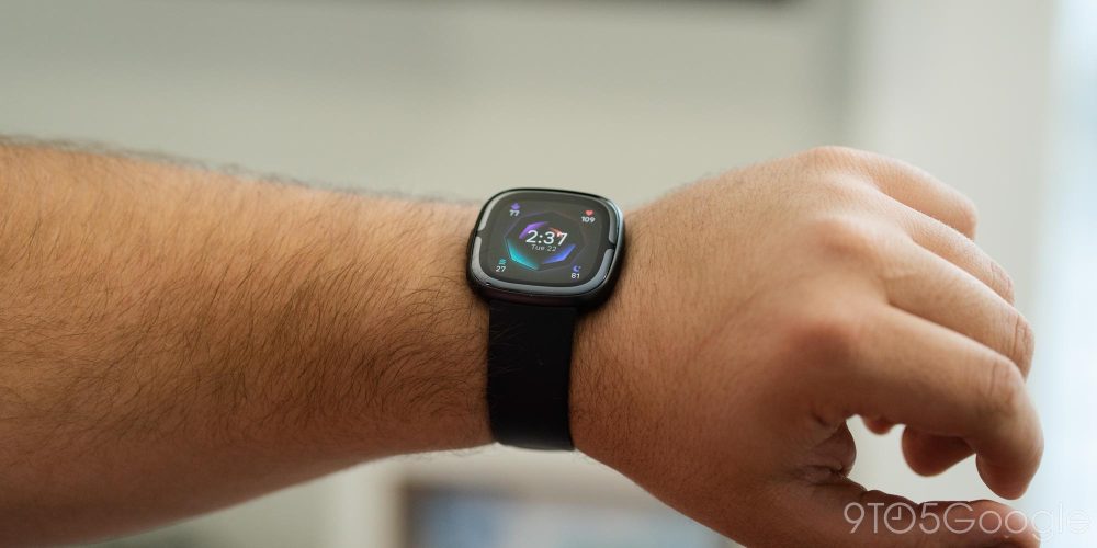
The relatively slim metal-bodied squircle shape is a good look on the whole. This time around is also even thinner than the previous generation. It fits in well both in sporty and dressy situations, and Fitbit’s band mechanism makes it easy to switch between the right band for those scenarios. That said, I did quickly notice that the third-party bands I was using with the Versa 3 wouldn’t connect to either the Sense 2 or Versa 4. It’s probably just a quirk, but it might be something to keep in mind.
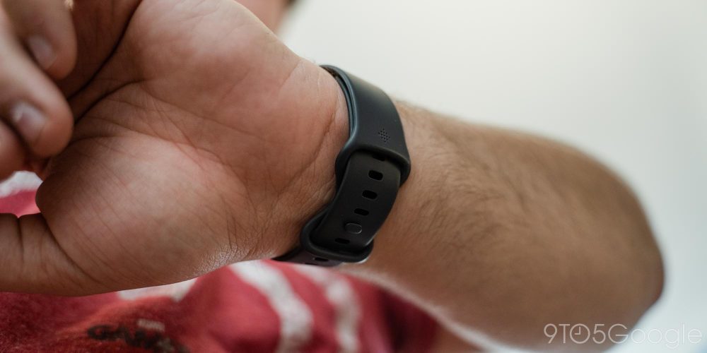
The included band is the same silicone option as was available on the Sense and Versa 3, and similar to what most smartwatches ship with nowadays. It’s not quite as comfortable as the default band on the Google Pixel Watch, but I like it, and after over two weeks of near-24/7 use, it hasn’t resulted in skin irritation.
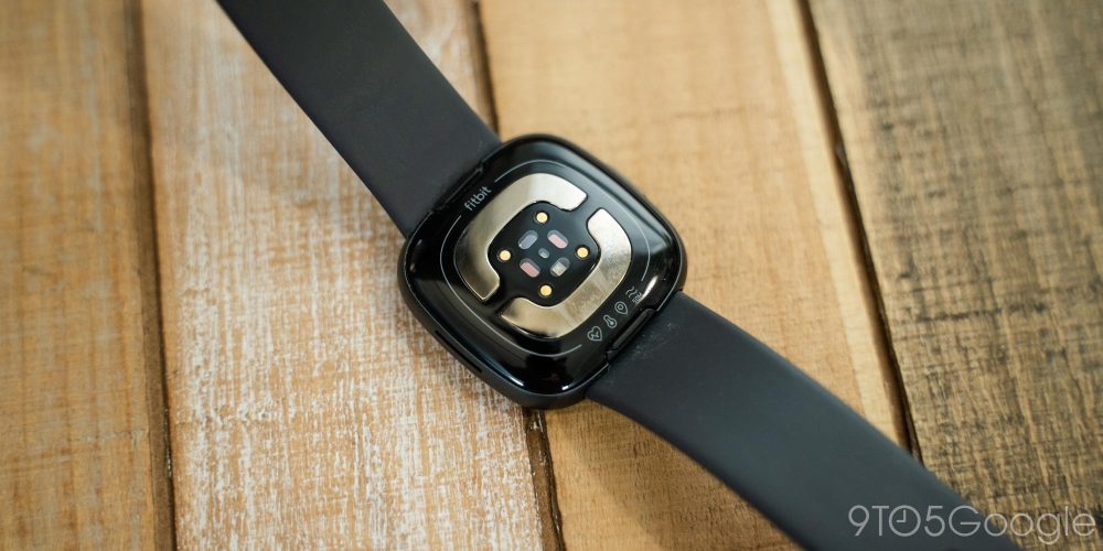
Looking at the Fitbit Sense 2, there’s a clear visual difference in the hardware. The ECG sensors used for capturing data about your heart rhythm are moved into the glass display, rather than being under the metal frame. This results in an ECG setup that’s easier to use, though the results are probably equally accurate. The visual look of these sensors is striking, but it’s something you’ll either like or not. It breaks the immersion of the dark interface on the OLED display blending into the bezels, but it still looks pretty good on the whole.
But easily the biggest upgrade on the hardware front of the Fitbit Sense 2 and Fitbit Versa 4 is the hardware button on the side of each watch. This replaces the capacitive sensor that was used as a “button” on the Sense and Versa 3, which was a pain to use. The sensor was unreliable, hard to reach, and I never found it comfortable to use even after months of use. The physical button on this year’s release is dramatically better, though its feature set is a bit limited.
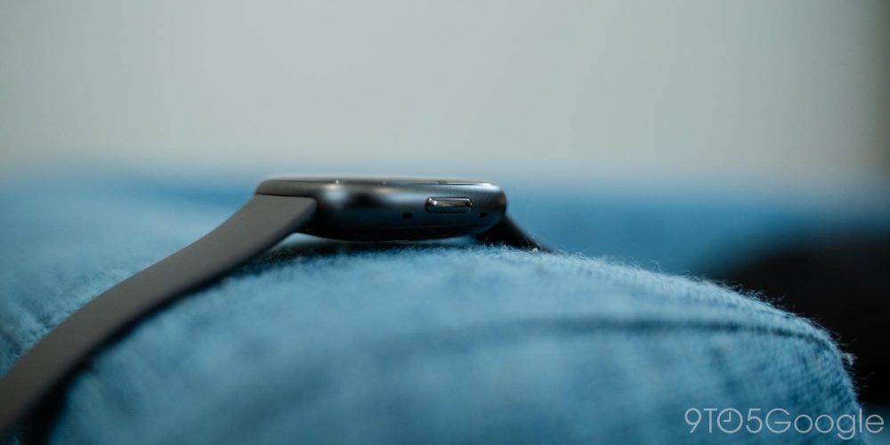
Pressing the button on the side once turns the display on or off, or goes back to the watch face if you’re in an app. A long-press brings up the quick settings menu, while a double-tap opens up a menu with shortcuts to Alexa, notifications, Fitbit Pay, and quick settings. It’s a largely redundant menu, a leftover from the older Fitbit OS design for smartwatches.
The new Fitbit OS is designed to look a whole lot like Wear OS 3 and while that sounds rather good, it’s just an absolute mess when it comes to performance, probably due to the more resource-hungry design.
The Fitbit Sense 2 and Versa 4 both ship with a revamped look and feel for Fitbit OS. The new UI shows quick settings with a swipe down, notifications with a swipe up, and tiles that can pull fitness data and more with a swipe in either direction. Pressing the side button then pulls up the app drawer. This is exactly the same layout that Wear OS 3 uses on the Pixel Watch and, technically, it’s fine! I like how the software feels and it’s very intuitive.
It’s just super laggy and inconsistent. Software performance on the latest Fitbit smartwatches has been dreadful, to say the least. The video above shows the software at its best, but lag and stutters are super common in everyday use.
Something as simple as swiping up to see my notifications or accessing the app drawer is full of stutters and slowdowns. The worst bit by far is dealing with an incoming notification. It takes a few seconds for the interface to transition from the notification preview to its contents, and scrolling within is super slow. Fitbit smartwatches have always been underpowered for the sake of focusing on battery life, but this experience has been bordering on unusable for me.
And just on top of that, the design feels half-baked. As mentioned earlier, the several ways to access the notification drawer and quick settings are redundant and unnecessary, and there are bits like that throughout the software. At one point the Steps tile even got stuck over the watch face and required a reboot to fix the problem.
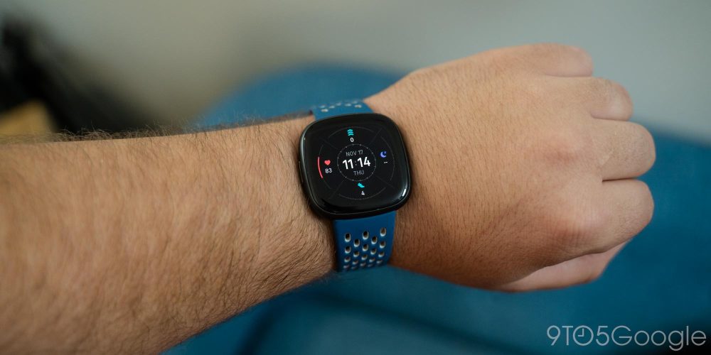
Fitbit also pulled the rug out on these watches when it comes to some other basic functions. Wi-Fi support is gone, making updates a huge pain as they can only be downloaded very slowly over Bluetooth. Worse yet, third-party apps on Fitbit Versa 4 and Fitbit Sense 2 are essentially gone. There are a few pre-loaded apps, and Google Wallet thanks to the latest update, but others like Spotify are simply gone. Even Google Assistant has disappeared with no plans to restore it, which seems crazy with “by Google” on the packaging for these smartwatches. You can use Alexa, but not Google Assistant.
There’s really no rhyme or reason to these decisions, except for the timing. These smartwatches were released just ahead of the Google Pixel Watch, the first Wear OS smartwatch with Fitbit integration and the culmination of Google’s $2.1 billion purchase of Fitbit. While the company would probably never admit to it, it feels abundantly clear that the Sense 2 and Versa 4 were hindered to improve the sales pitch of the Pixel Watch. Want a fitness-focused experience with better battery life? The Versa 4 and Sense 2 are great choices. Want a smartwatch with most of the same features, but also third-party apps and more watch faces? The Pixel Watch is it.
It’s really a shame to see. The Fitbit Versa 3 and Sense already weren’t great in the smartwatch department, but the Versa 4 and Sense 2 are just shells of even that experience. Things will get a bit better when Google Wallet is fully available – as of November 2022 it has launched, but isn’t showing up for most users – and Google Maps arrives too, but there are still some glaring holes in the smartwatch side of these products.
But the fitness experience makes up for it, right?
Honestly, I haven’t felt any more fulfilled on the Versa 4 or Sense 2 compared to my time on the Pixel Watch. It’s been great not having to charge my watch once or twice a day, but The Pixel Watch was already doing everything I needed it to in terms of health and fitness tracking. Sure, it’s missing proper automatic workout tracking, Irregular Heart Rhythm Notifications, and other bits and pieces of the Fitbit experience, but the core functionality is still there.
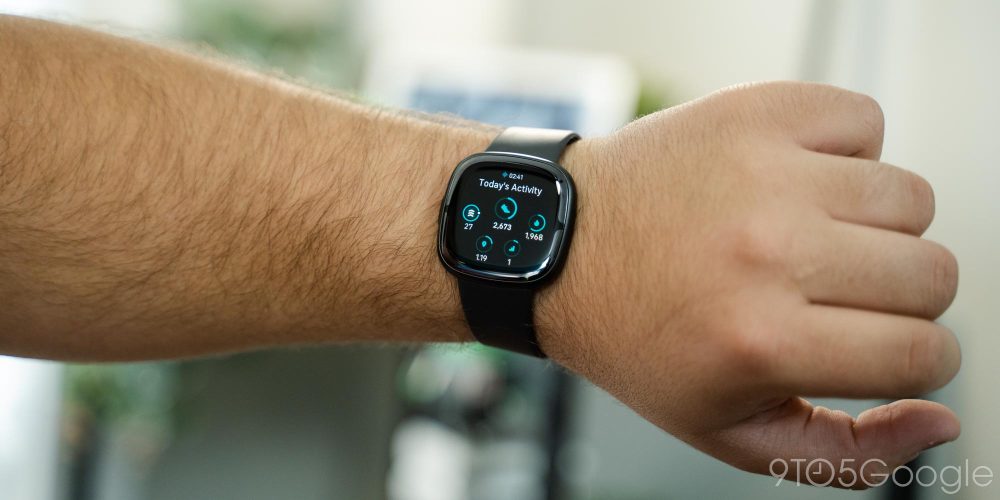
Our sister site Connect the Watts has a deeper breakdown of the fitness tracking experience on both Sense 2 and Versa 4 below.
- Fitbit Versa 4 review: the good, the bad, the ugly
- Fitbit Sense 2 in-depth review: Everything you need to know!
Really, the biggest advantage the Fitbit Sense 2 and Versa 4 have over the Google Pixel Watch is battery life. I was easily able to get over a week out of the Sense 2, even on a trip. The Versa 4 was giving me very similar results, averaging around a week before fully dying. Charging felt a little bit slow to me, but a quick charge during a shower every once in a while kept battery anxiety as something that I never had to think about at all.
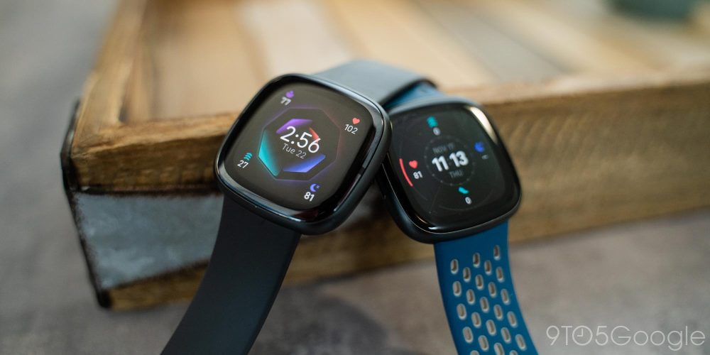
At their normal prices, I think it’s a really tough call to buy either the Fitbit Sense 2 or Fitbit Versa 4.
The $299 spent on a Sense 2 is far better spent on a $349 Pixel Watch. The $229 price of the Versa 4 makes it an easier option to recommend, but you’re still giving up quite a few features for that. But as of the time this review is going live, holiday deals have a hefty discount. The Sense 2 is $199 and the Versa 4 is $149. That makes either option a killer Pixel Watch alternative.
Buy Fitbit Sense 2
- Fitbit.com
- Google Store
- Best Buy ($199 for Black Friday)
- Amazon
Buy Fitbit Versa 4
- Fitbit.com
- Google Store
- Best Buy ($149 for Black Friday)
- Amazon
More on Fitbit:
- Google Maps for Fitbit smartwatches will integrate some workout stats, still ‘coming soon’
- Report: Fitbit working on cellular wearable for kids after canceling camera smartwatch
- Fitbit ‘by Google’ previews what’s next from TV & smart home availability to affordability
FTC: We use income earning auto affiliate links. More.


Comments