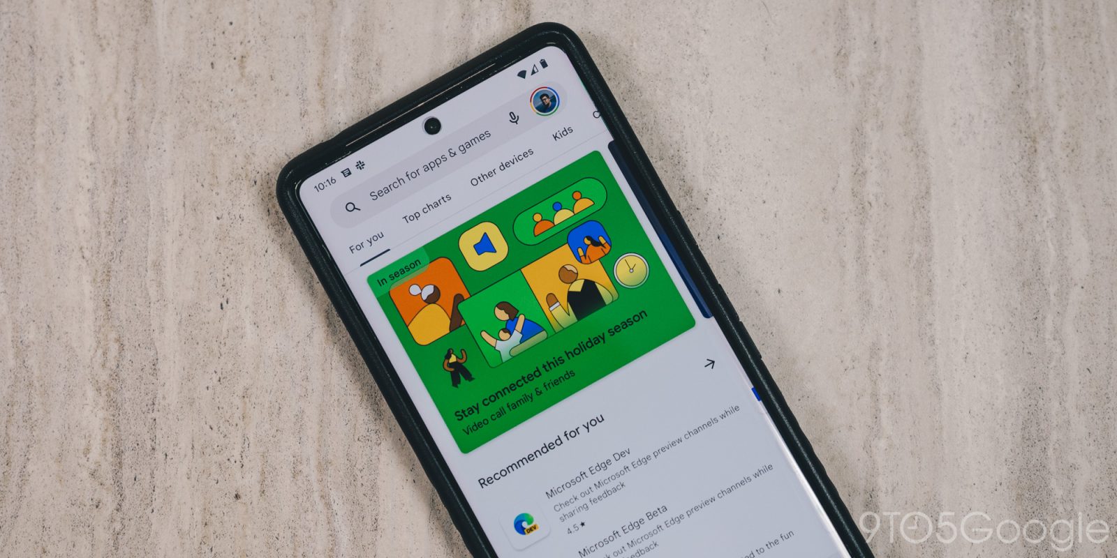
Following Messages, Google TV, and Google Search, the Play Store is the latest app to get a Material You Google Account switcher.
It starts with more rounded corners and Dynamic Color theming. There are two containers, with the background being lighter and housing the close button, Google logo, Privacy Policy, and Terms of Service.
The interior shape houses everything, with Google making no changes to the list order, which is different from the approach taken by the account switcher in Messages.
Elsewhere, Google TV’s switcher was just updated (4.39) to the latest version with Dynamic Color. Settings and Help & feedback are part of the background container, while items related to your account are grouped together.
Previously, Material You in the Google Play app was mostly confined to the homescreen (bottom bar and Dynamic Color). The Play Store’s Material You switcher is not yet widely rolled out.
In other recent Play Store changes, “Kids” has been added to the navigation rail on tablets and Chromebooks. This is ahead of an upcoming redesign to the main feeds that can show more content.
More on Play Store:
- Google Play Store emphasizes notifications in search bar tweak
- Play Store letting you rate and review apps by form factor on the web
- Android phones sold in India will only be required to pre-load the Play Store according to leaked terms
- March Google System Updates: Wallet loyalty card tweaks, more [Updated]
FTC: We use income earning auto affiliate links. More.


Comments