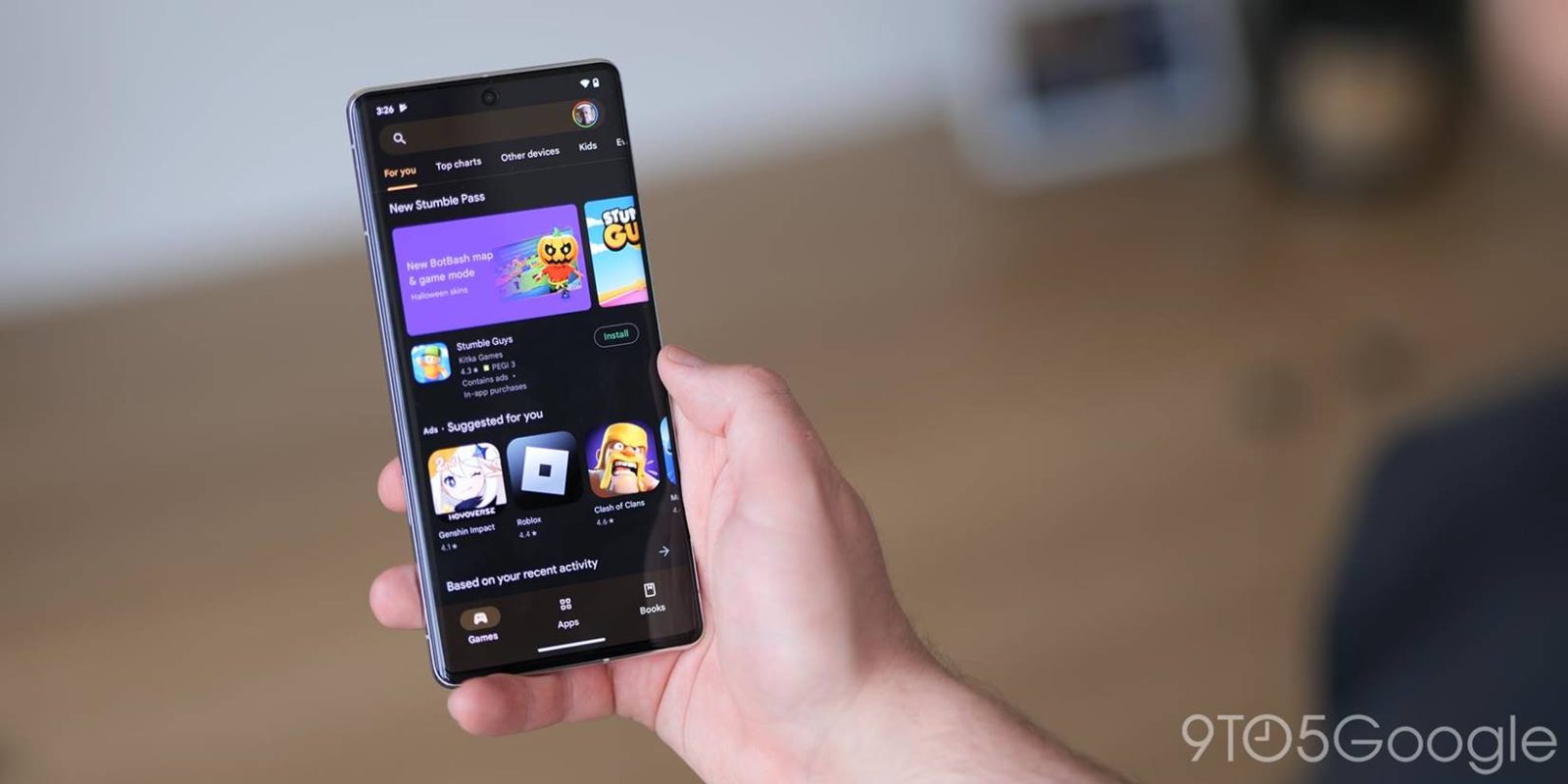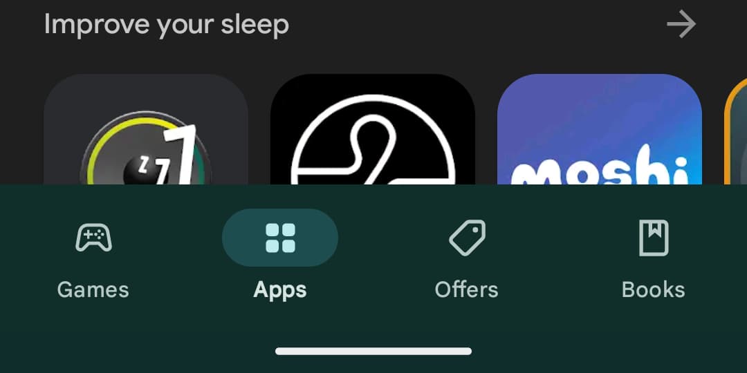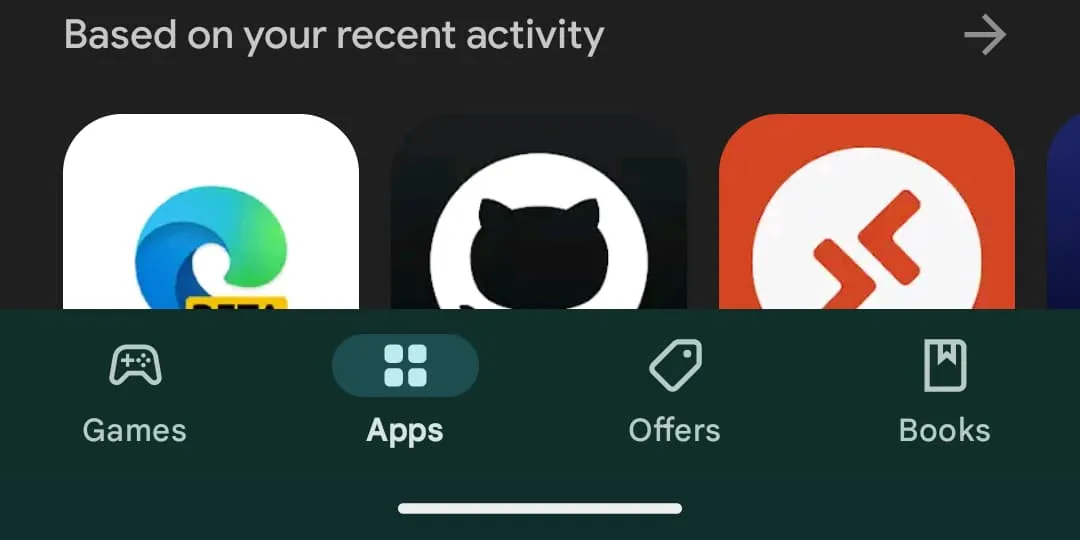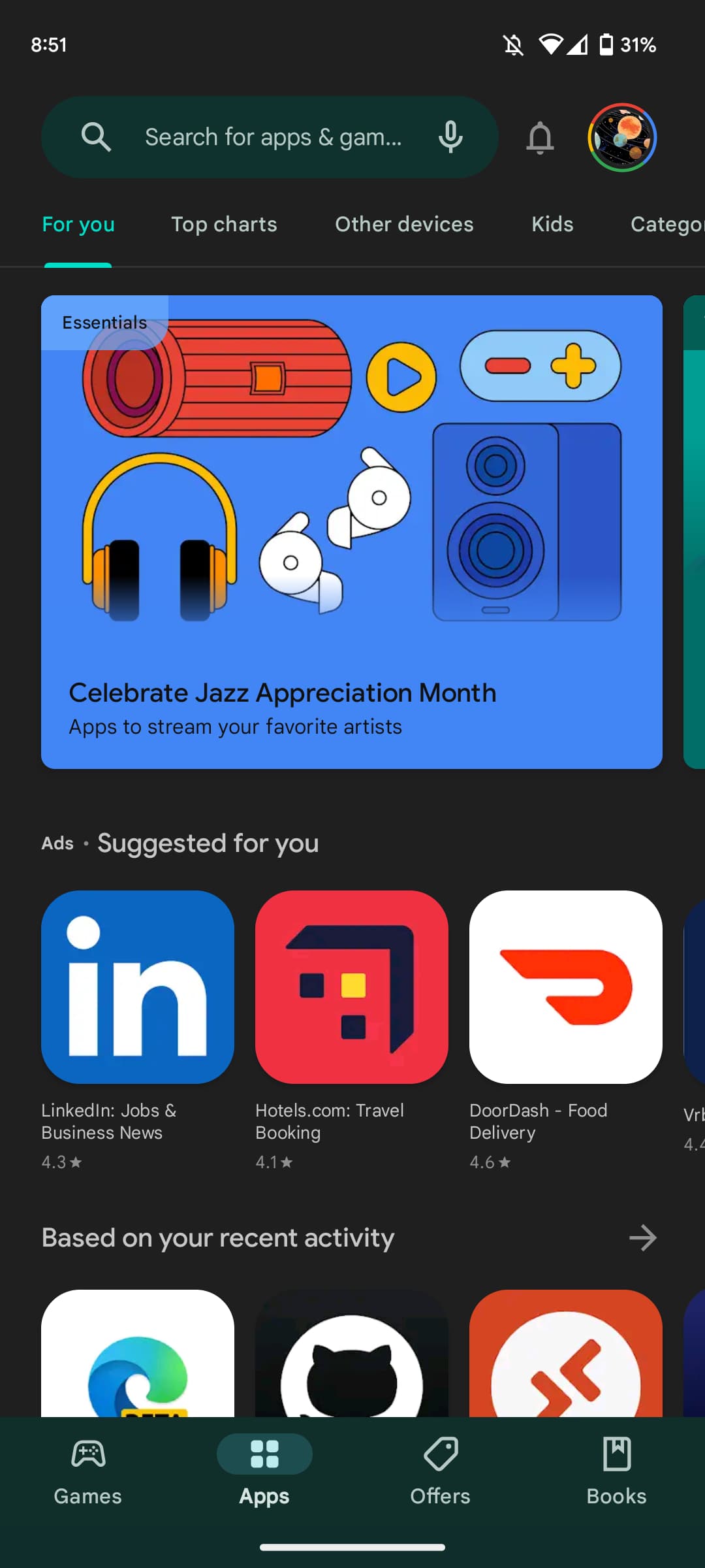
One of the more obvious aspects of Material You is a tall bottom bar, but some variation is now emerging across Google’s apps, with the Play Store switching to a shorter version.
Google Play is rolling out a short bottom bar where the container and pill-shaped tab indicator are not as tall. We first started seeing this server-side change last month with availability slowly increasing, but this is not yet fully rolled out.
The only real impact to functionality is a slightly smaller touch target. You don’t get to see meaningfully more – maybe a line of text – on your screen as a result of this cosmetic change.
Rather, it’s a matter of uniformity when it comes to Material 3 and first-party Google apps. Google Voice is the most recent Android application to get a Material You redesign and it uses a tall bottom bar, while Google Tasks in February gained a tall bottom app bar.
The precedent for going against specification is Gmail. Following the wide rollout of its Material You redesign in September of 2021, Gmail for Android switched to a short M3 bottom bar with a height identical to the M2 version. A year later, Gmail dropped the text labels for an ever shorter navigation element.
Meanwhile, the YouTube family of apps (main, Music, and TV) never adopted Material You or the new bottom bar style.


I’ve come to like the taller bottom bar as it matches the Material You aesthetic of bigger touch targets and more space. The shorter element looks ever so slightly off after nearly two years of Material 3.
More on Google Play:
- Google won’t be required to house third-party Android app stores in the Play Store after all
- Google appears to be testing multi-device app sync on the Play Store
- Material You Google Account switcher coming to Play Store
FTC: We use income earning auto affiliate links. More.


Comments