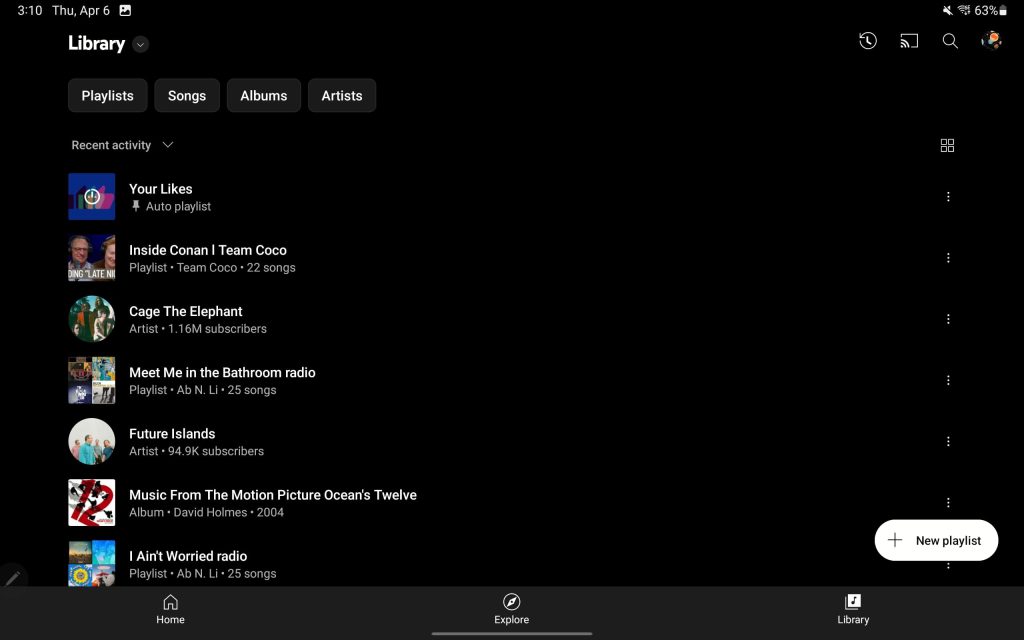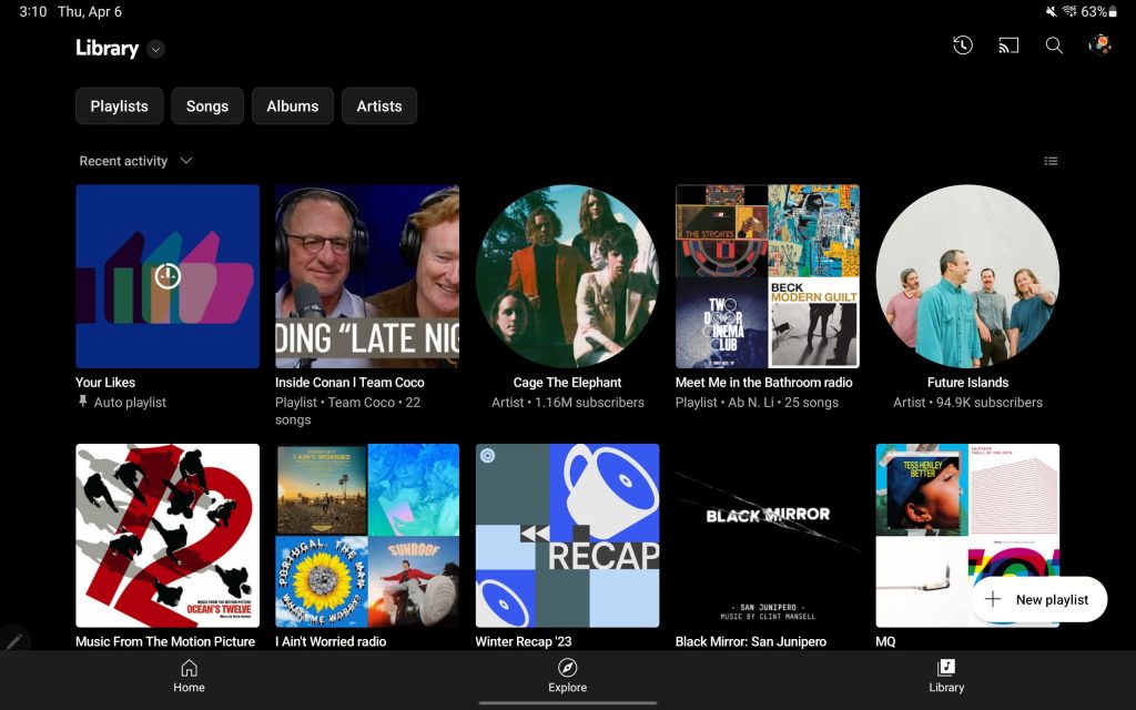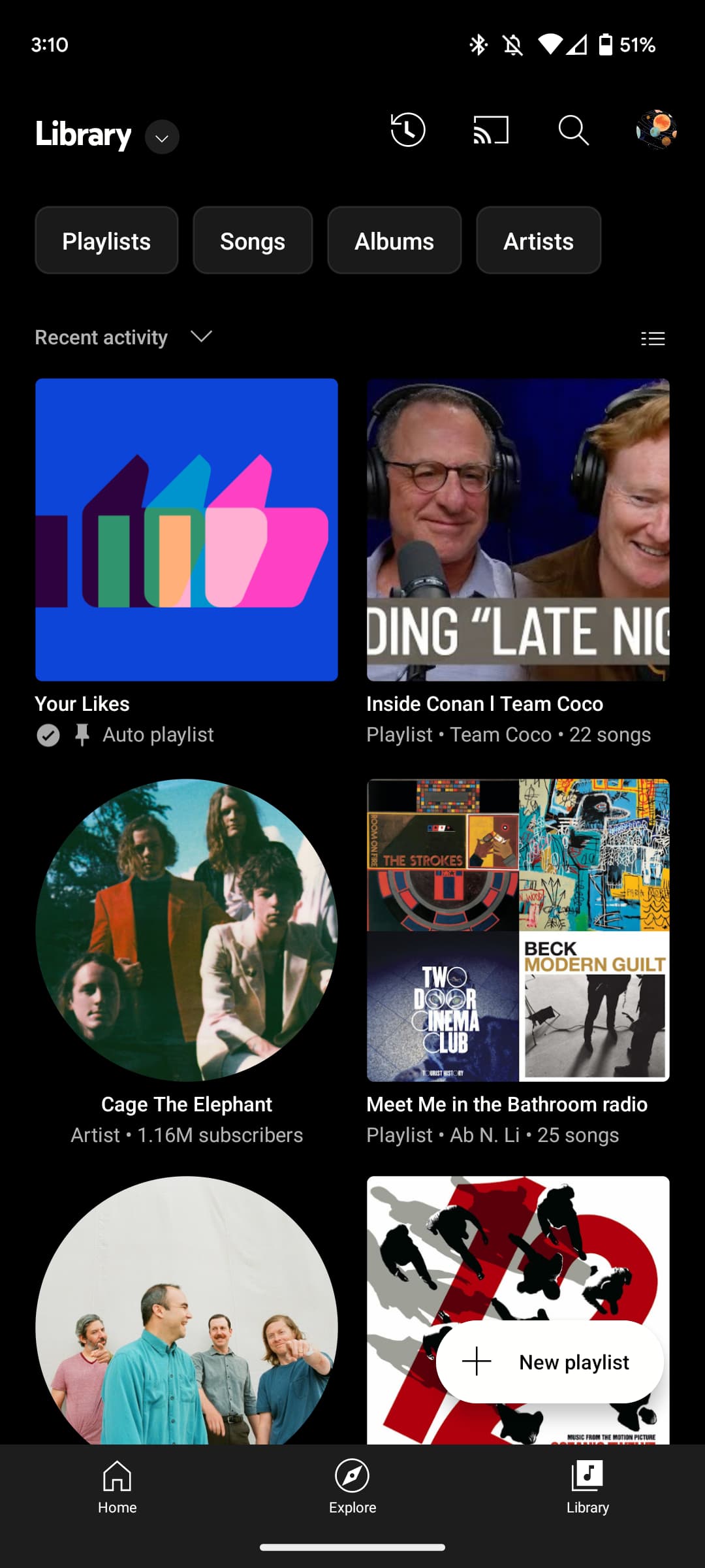
Back in January, YouTube Music overhauled the Library tab and is now testing a grid option to change up the list view.
Update 4/7: As of Friday, we’re also seeing the grid option on iOS.
Update 4/6: The grid view is seeing wider availability on Android. It’s persistent and applies to all views (Library, Downloads, Uploads), as well as when filters for Playlists, Songs, Albums, Artists, and Subscriptions are set.
On tablets, the grid view is a particular joy to use. Here it is on an 11-inch display:
Original 4/4: YouTube Music today uses a list view for everything in the Library tab. At least one user is now seeing a grid button across from the sort options. This activates a grid that fits two items per row. The cover art is quite large with the name and other details appearing underneath.
As such, you’ll see four playlists/albums/etc. in their entirety and the start of two more. In comparison, the list view shows eight items completely.
I’d prefer a grid view that fits three items per line, but this is a start and something that visual browsers will prefer. The grid option is presumably available for every view in the Library, but it’s not clear whether it will be persistent like a mode or if it’s a per-view setting.
Meanwhile, this new view could look really nice on tablets and end up being as dense as the website’s responsive grid.
YouTube Music’s grid view is not yet live on any of the devices we checked today.
More on YouTube Music:
- YouTube channel pages add dedicated ‘Podcasts’ tab
- Here’s the UI for podcasts in YouTube Music [Gallery]
- YouTube livestreaming all Coachella stages for 2023
- YouTube explains thinking behind outline-style icon redesign
FTC: We use income earning auto affiliate links. More.


Comments