Alongside the Pixel Watch, it looked like Fitbit was going to update its Android and iOS apps last fall. Instead, Fitbit removed screenshots of the revamp, but an image of the “new app design” has now emerged.
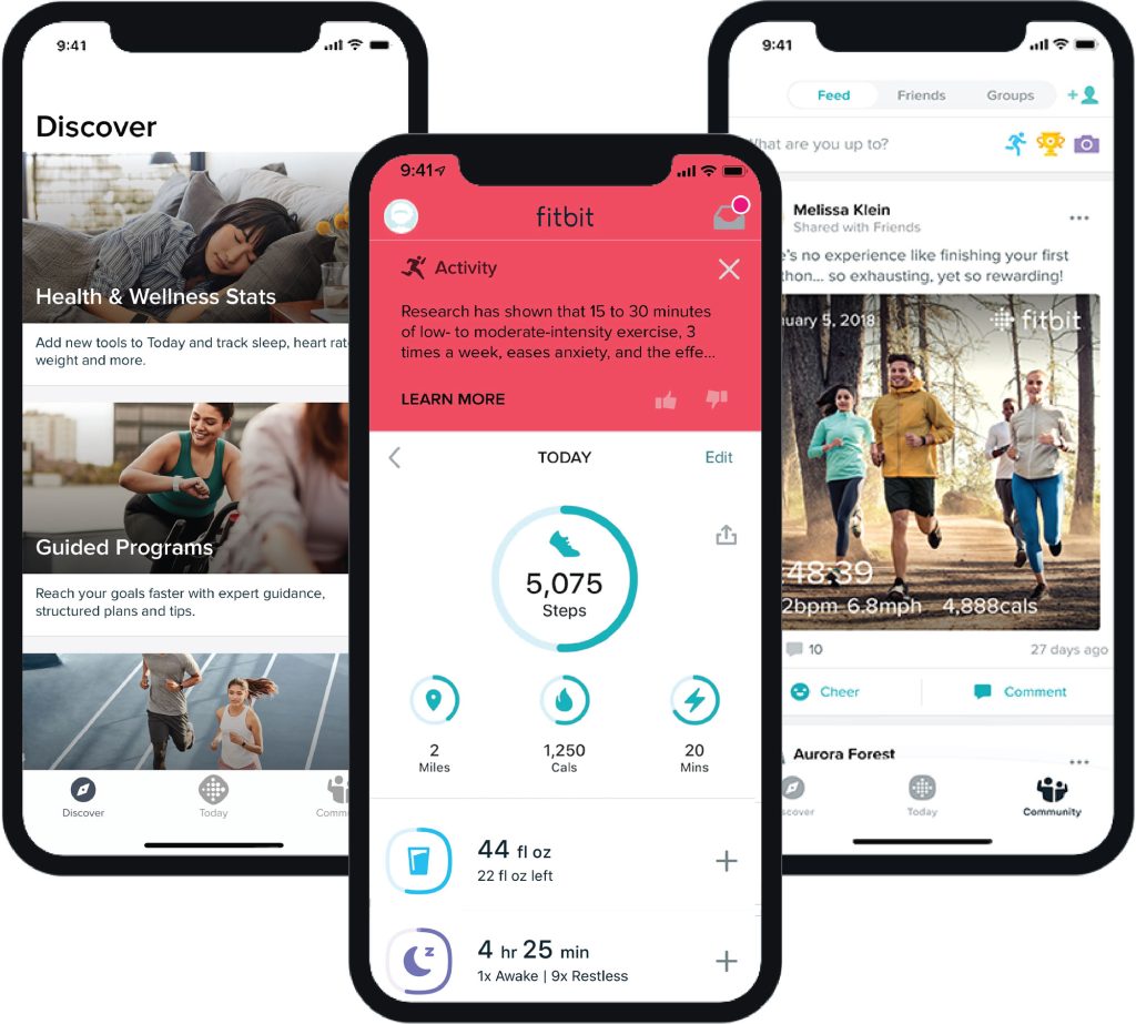
The image from a “How do I use the Fitbit app?” help article is named “new app design summary.jpg” and shows the iOS version. The Today feed has not meaningfully changed except for the stat completion rings adopting a new shape, a tweak not found on the previous redesign screenshots that appeared on Google Play and the App Store. This does not apply to the topmost stats, just those found in card form below.
We don’t see the bottom bar in the center image, but the navigation element appears in the left and right pictures. Today is now the center tab (with two different icons used, curiously), while the Discover tab is no longer a list of carousels. Instead, you get wide cover images that prominently link to health tools such as:
- Health & Wellness Stats – Add new tools to Today and track sleep, heart rate, weight and more.
- Guided Programs – Reach your goals faster with expert guidance, structured plans and tips.
We also get a look at the Community tab. It’s not drastically different from the UI available today.
Screenshots of the new design first appeared on the Play/App Store in October alongside the Wear OS interface. Updating the store listings implied a near-final nature. They were pulled from both app stores in late January. One possibility is that it was supposed to launch alongside the Pixel Watch, but Fitbit wasn’t able to meet that deadline.
The new image gives more credence to the idea that this is the intended design. In that case, we’re left with something that isn’t radically different from what’s available today. The changes might be more structural and under-the-hood, with Fitbit just laying the groundwork for adding new capabilities in the future.
As we’ve previously written, Fitbit for Android and iOS would benefit from a redesign that brings it in line with other Google apps. Material You and other changes would be nice, but I’d definitely settle for a dark theme of the current look at this point.
More on Fitbit:
- Fitbit login migration to Google Accounts starts this summer
- Fitbit making full Health Metrics Dashboard available without Premium
- Your Pixel Watch’s Fitbit Premium trial might be ending soon – Here’s how to cancel
FTC: We use income earning auto affiliate links. More.

Comments