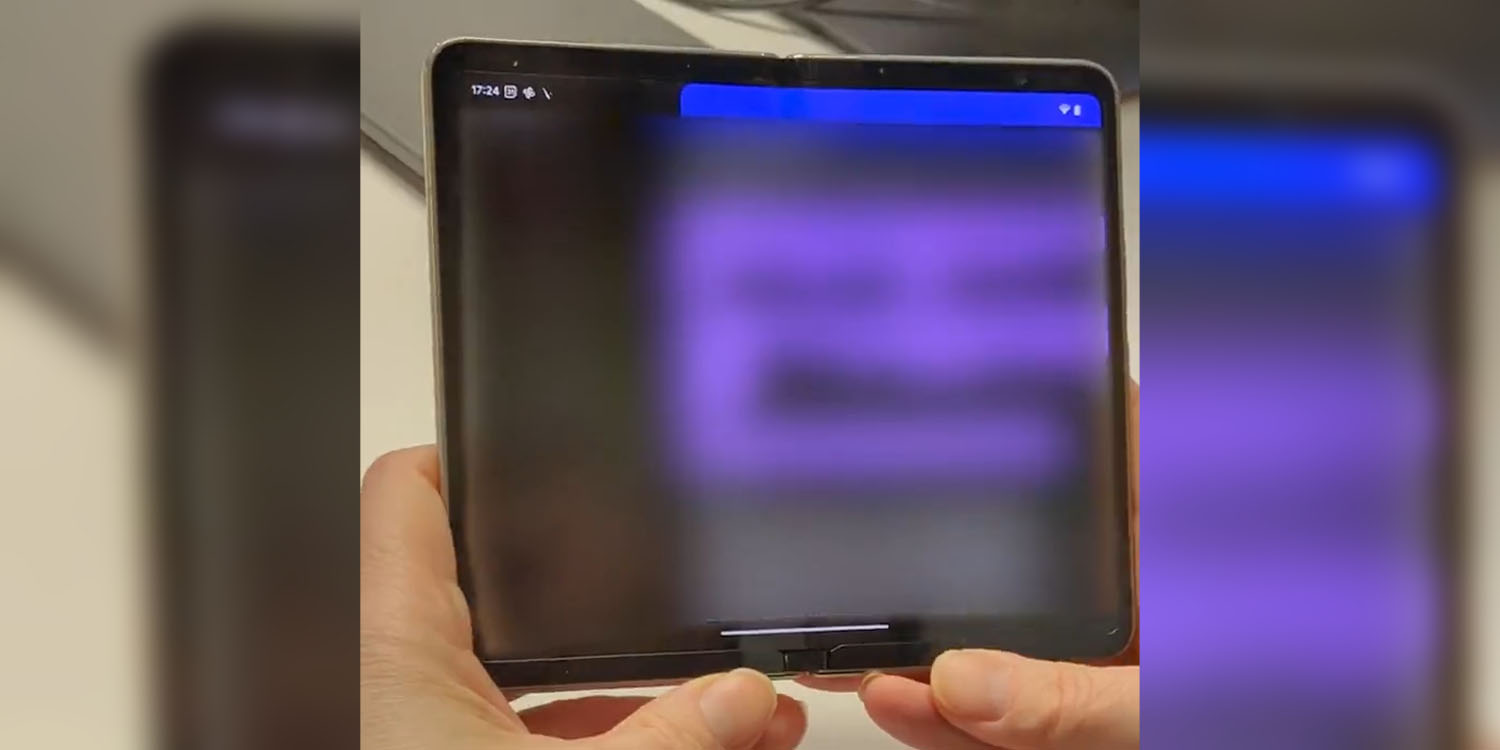
The Pixel Fold has bezels. As hinted at in previous leaks and now confirmed in the first hands-on one, Google’s foldable will have bigger-than-average bezels along the top and bottom. Here’s why that might not be the worst thing.
If you look at the latest leak of the Google Pixel Fold, you’ll notice a larger bezel along the top and bottom than you see along the sides. It’s not obnoxiously large, but it’s big enough to draw the eye and certainly quite different in the world of smartphone design we see today.
For many, asymmetrical bezels are already a complaint, with a “chin” on a slab smartphone already being cause for annoyance, so the Pixel Fold really catches the attention of some folks. A quick run through Twitter sees reactions such as “I already hate it” and “the bezel will keep me away” mixed in with comparisons to old Android tablets.
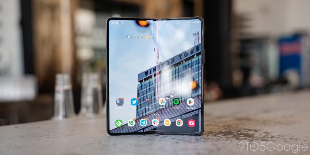
But, for me, my first reaction was actually rather positive. As someone who has used the Galaxy Z Fold series for the past few years, I think I’m actually in favor of Google’s choice here.
Thin bezels on a folding phone are a mixed bag. They look good, but they hurt things a bit functionally. The biggest downside really boils down to handling. There’s so little along the bottom of the display to hold on to if you want to just hold the phone one-handed, something you might want to do if you’re just reading.

Top comment by Benjamin Haube
I don't understand why people constantly complain about bezels. I still see people complaining about the bezels on the Pixel 7. They look fine to me. I think some people just need to have something to complain about at any given time.
The other more important bit of handling trouble is when closing the phone. A bit more bezel will be useful for pushing the screen closed, in turn helping out the screen’s durability in the long run.
Implementing this thicker (but really not that thick bezel) has another benefit too. Instead of putting the selfie camera in a screen cutout or an under-display cutout that’s not invisible, Google can just slot it in the top corner as they’ve obviously done. It creates a cleaner look for the display, which I’m certainly in favor of. Plus, that extra bezel probably has a functional benefit on the folding hardware, as Google has a bit more room to store hinge hardware than Samsung does.
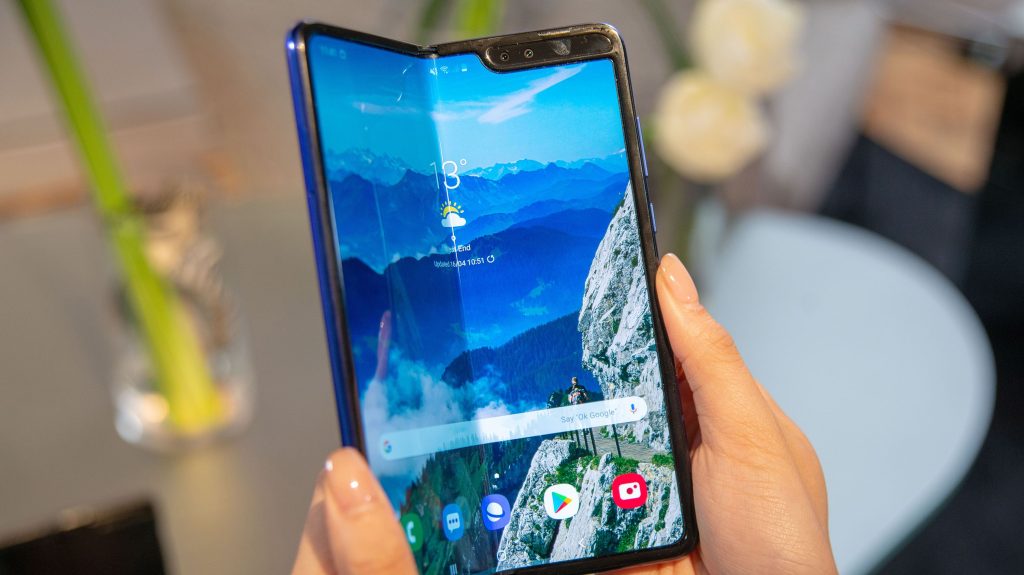
None of this is to say Google’s design choice here is perfect or even ideal. But I think, in the end, it’s one buyers will be fine with. Visually, it’s a little funky in the era after the war on bezels, but functionally, I think it’ll be fine, and it’s still a much better look than the first Galaxy Fold from 2019.
If you disagree, I’m sure the next generation will make some improvements.

More on Pixel Fold:
- Report: Pixel Fold will weigh 10 oz, offer water resistance, and cost over $1,700
- Google Pixel Fold will reportedly use new OLED display tech that Galaxy Z Fold 5 won’t get
- Pixel Fold leak details full specs, free Pixel Watch perk, more
FTC: We use income earning auto affiliate links. More.


Comments