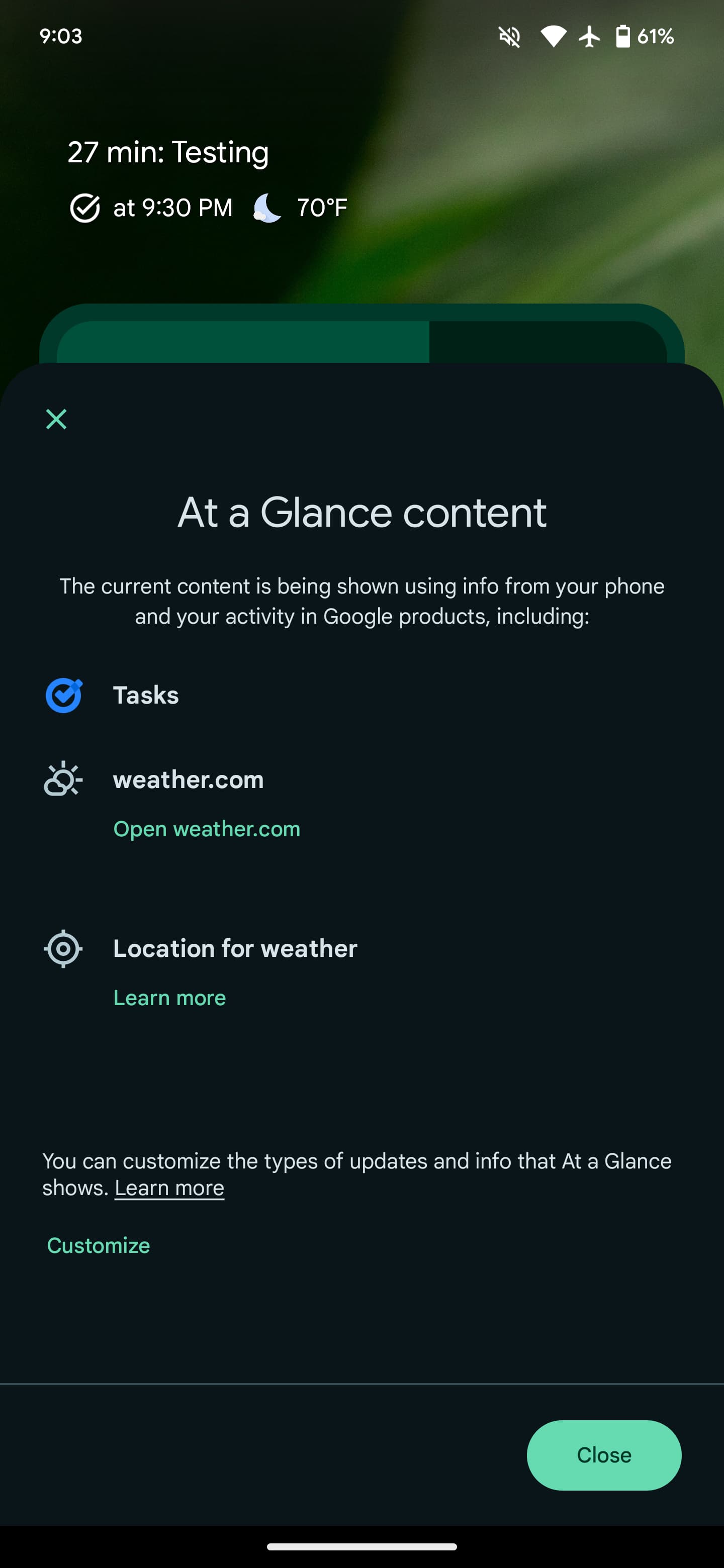
Before the big redesign that we’ve previously enabled, At a Glance is getting an “About this content” section.
Long-pressing At a Glance at the top of your Pixel Launcher reveals a new “About this content” section above the existing “Customize.” It slides up an “At a Glance content” panel that explains how “The current content is being shown using info from your phone and your activity in Google products.”
When just the temperature is being shown, Google notes how it’s sourced from weather.com and that At a Glance is using “Location for weather.” “Learn more” takes you to a support article, while “Open” links to a website rather than the Google Search-powered experience.
We’re also seeing About this content panels for upcoming Calendar events and Google Tasks, which still opens a web experience rather the installed app two months later.
At the bottom, Google links to the existing settings page with the various on/off toggles: “You can customize the types of updates and info that At a Glance shows.”
About this content for At a Glance is appearing on just one of our Android 14 devices after updating to version U.6.playstore.pixel7.551778374 of Android System Intelligence this evening.
This should be part of the broader visual overhaul to AAG that introduce the new pill-shaped design. That updated look might let you mark content suggestions is being “Useful” or “Not useful.” It might be Google’s way of better explaining At a Glance to end users, including those that wish there was an option to remove it.
Speaking of the upcoming OS release, At a Glance on the lockscreen switches to a one-line design, which is not a particularly good use of space, where the day/date and weather are side-by-side. Until the new AAG rolls out, the mismatch with the homescreen is unfortunate.
FTC: We use income earning auto affiliate links. More.


Comments