
Google Play Movies & TV is dead, but the libraries of purchases that users have made still exist throughout other Google products. However, in a frustrating twist of fate, the Google TV experience that’s partially so appealing for its deep integration with content you own, is much worse at showing that library compared to the latest Android TV updates, which have a simple tweak we’ve been asking Google to make for years.
Google TV, since its 2020 debut on the Chromecast with Google TV, has offered a dedicated “Library” tab to show your TV and movie purchases, and that level of homescreen integration has always been a nice touch. With a couple of quick clicks, users can access their library and start watching anything they own, no need to open additional apps.
However, as we said back in 2021, the UI of Google TV’s “Library” tab is terrible for a content library, especially if you own more than a handful of movies.
As it stands today, Google TV has a side-scrolling list of movies and TV shows that’s listed in alphabetical order. There’s no way to see more than four or so titles at once, or even to sort that list to see the most recently purchased movies.
We previously commented:
Like apps and recommendations, all of your purchased movies and TV shows are listed horizontally. If you only have a few titles in your library, this is fine, but with anything beyond that, this layout becomes tedious. In my own case, it takes several seconds of scrolling just to get to the various Marvel movies I’ve purchased, and that’s before slowly scrolling around to dial in my selection. It’s extremely frustrating and often pushes me to just use Vudu and Movies Anywhere instead.
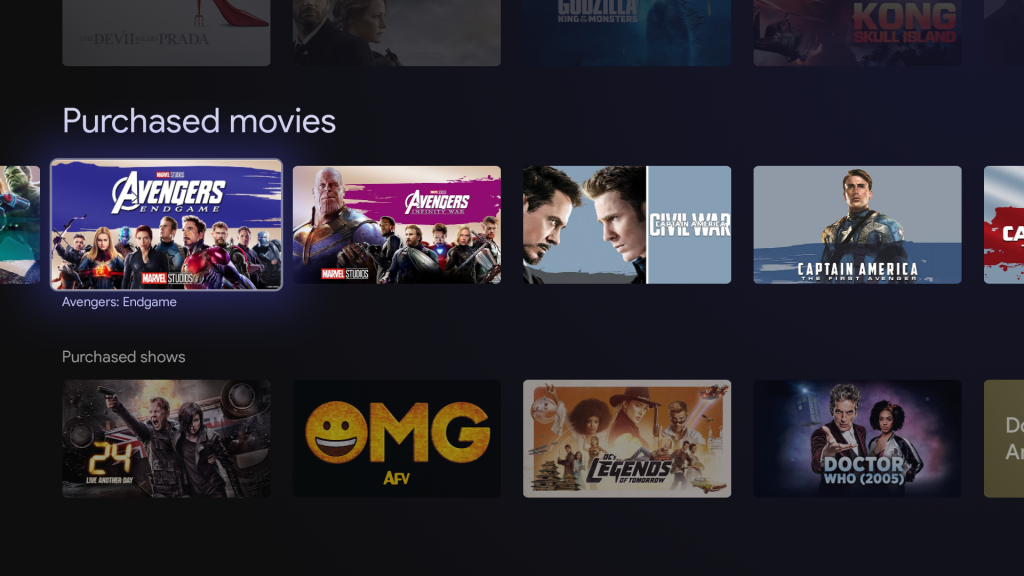
And over two years later, Google TV hasn’t addressed this library problem in any way whatsoever.
But, recently, Google started widely rolling out a new UI to Android TV that adds a “Shop” tab which, as the name implies, houses the ability to purchase movies, but also houses your existing library. Like on Google TV, there’s a horizontally scrolling list, but that list doesn’t contain your entire library. A few selections are shown, sorted by the most recent purchase, before a “View All” button appear with a four-wide grid of all of your movies that takes up the entire screen. There’s still no sorting option, but this is way easier to use compared to Google TV’s trainwreck.
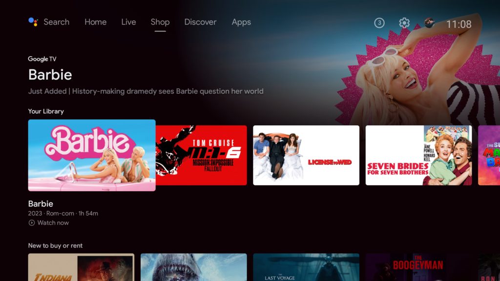
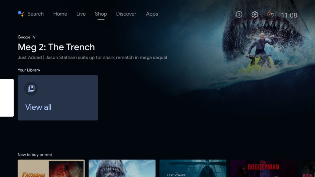
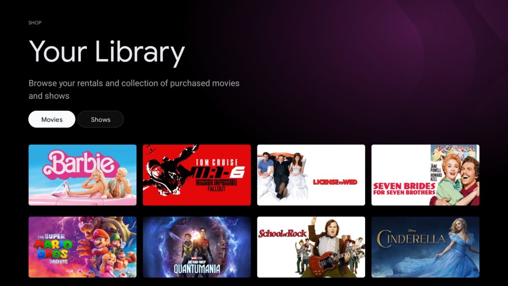
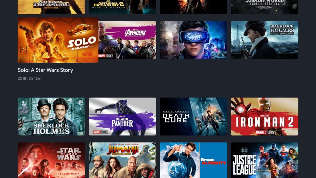
There are still problems with Android TV’s take here. I don’t like that the “highlighted” row is at the top of the screen, and the whole thing feels a little clunky in practice. And, on top of that, putting this on the “Shop” tab is just confusing, and borderline misleading. Frankly, I didn’t even know I had this ability until just recently.
Still, this is a drastic improvement, and something I want to see the regular Google TV experience adopt immediately. Perhaps in line with a new Chromecast?
More on Google TV:
- Chromecast with Google TV adds official support for streaming your PS5
- Here are all of the free channels available on Google TV
- Google TV update brings NFL Sunday Ticket integration, more free TV channels
FTC: We use income earning auto affiliate links. More.


Comments