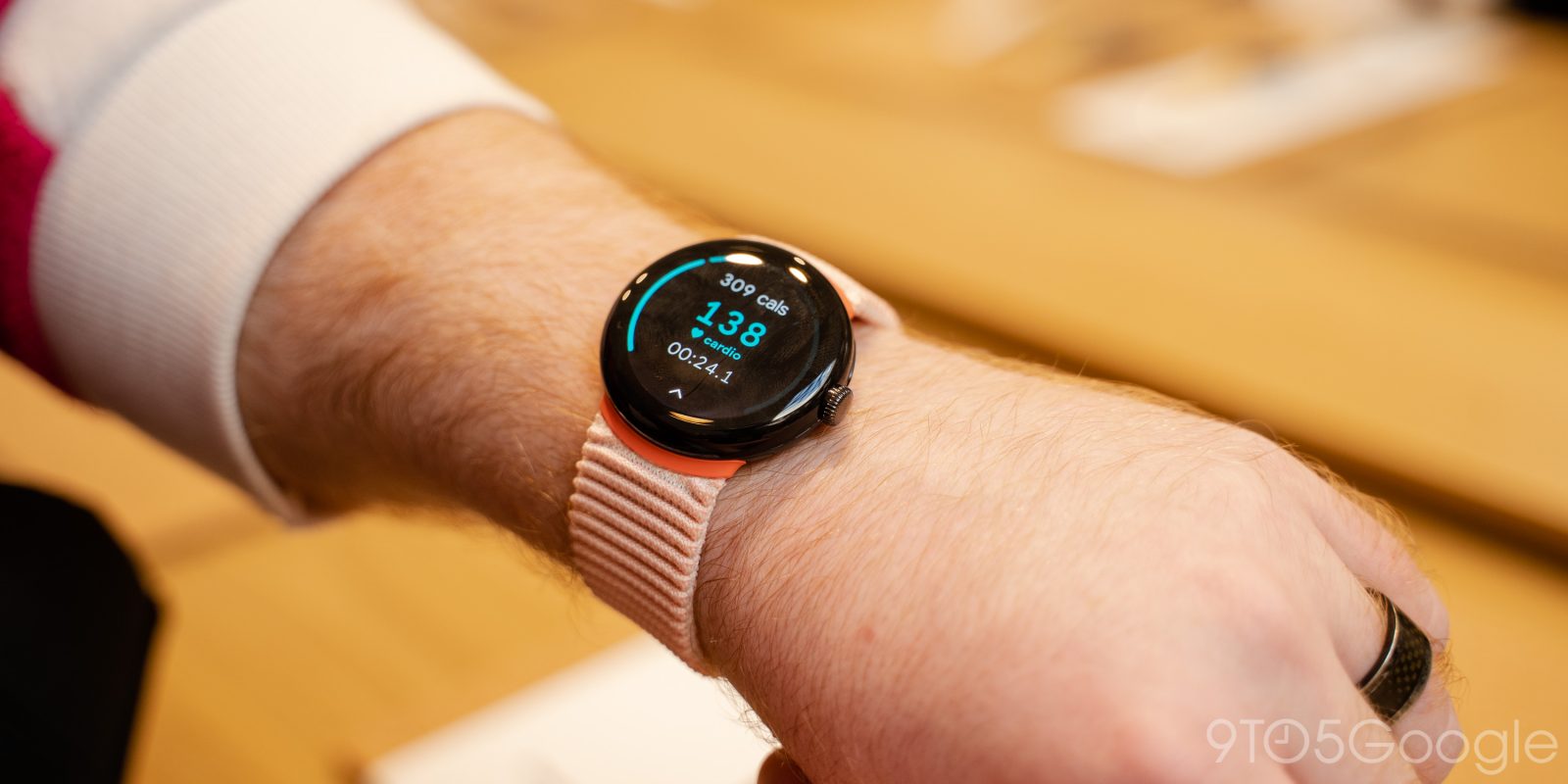
In addition to the Android and iOS redesign this week, Fitbit is rolling out some visual tweaks to its Wear OS app, including Tiles, on the Pixel Watch.
Update 9/25: Version 3.14 of the Fitbit Wear OS app is widely rolling out today (via Google Play) with the updated Tiles design and UI tweaks to the Today feed.
Original 9/21: Fitbit today offers Tiles for Daily heart rate, Exercise and ECG quick launch, Last activity, Main goal, and Sleep. The last two currently use a complete ring, which fills in clockwise, on the perimeter to quickly note goal completion.
With this redesign, Fitbit is switching to an arc design for progress Tiles that goes from left to right with a distinct gap at the bottom, much like a speed dial gauge.
Old vs. new
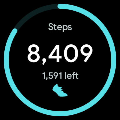
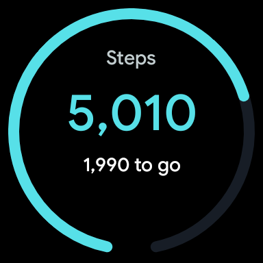
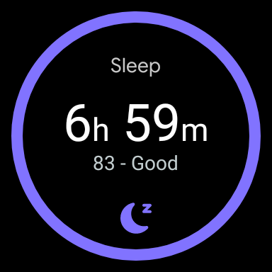
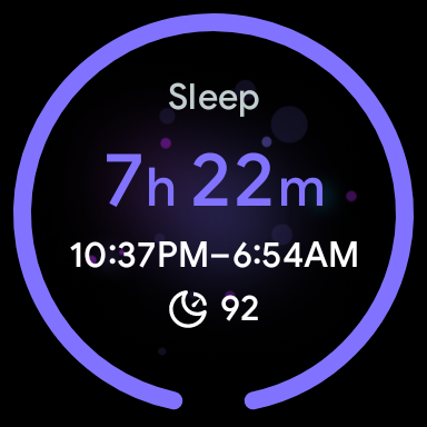
Meanwhile, the Sleep tile is showing much more info. In addition to hours slept, you now get sleep and wake times underneath it. The sleep score loses the text description and just features the number. This shows more meaningful information so that you don’t have to open the full page inside the Fitbit app.
The Fitbit Today feed also sees some tweaks. Card titles (Steps, Floors, Distance, etc.) are no longer color-coded. Blue was previously for activity, red for heart cards, and purple for sleep. Those accents are still used for the dials/rings.
We have one report today of these changes with version 3.14 of Fitbit for Wear OS on the Pixel Watch. This update is not yet widely rolled out on Google Play, and most people are still on version 3.13 of the app.
More on Fitbit:
- Fitbit teases September 28 announcement, likely Charge 6
- Sources: Pixel Watch 2 getting Fitbit revamp, thermometer, Personal Safety upgrade
- Sources: Fitbit Charge 6 gets a physical button, YouTube Music, and Google Maps
Thanks, Silvijn
FTC: We use income earning auto affiliate links. More.


Comments