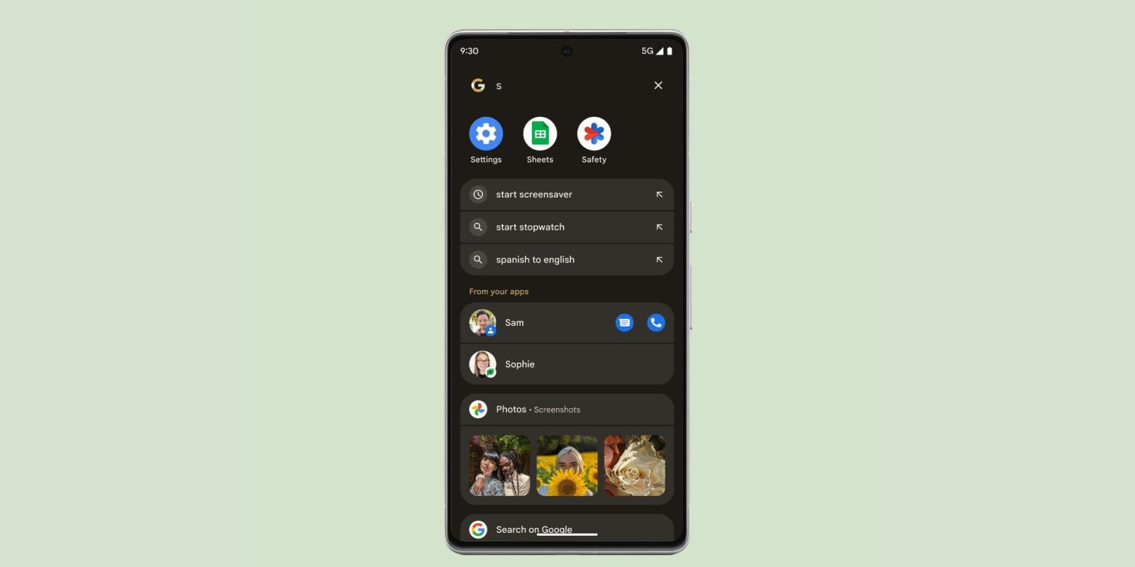
Google is rolling out a small redesign of how the Pixel Launcher displays web and local (app) search results to make things a bit more uniform. This applies to phones and tablets.
For starters, suggested queries from the web are now labeled as such. “Web Search” appears at the top with an arrow at the right that opens the Google app. This replaces the Dynamic Color-themed magnifying glass icon.
This design favors text over icons, which does make the Pixel Launcher a little cleaner. It applies to all other result categories, including Play Store, Settings, Search in apps, Contacts, Pixel Tips, etc. In the case of inline Google Play search, app icons are now placed in a circle.


Old vs. new
This also applies to when applications and their app shortcuts appear, which has the benefit of showing one more shortcut.
Meanwhile, the high-level “From your apps” grouping has been removed.


This redesign of Pixel Launcher search rolled out via a server-side update in recent days on both Android 14 stable and the Android 15 Beta.


More on Pixel Launcher:
- Pixel Launcher rolling out option switch to a different search provider in EU
- Google Pixel devices lose Assistant microphone shortcut
- Pixel Launcher now lets you search for Quick Settings Tiles
FTC: We use income earning auto affiliate links. More.


Comments