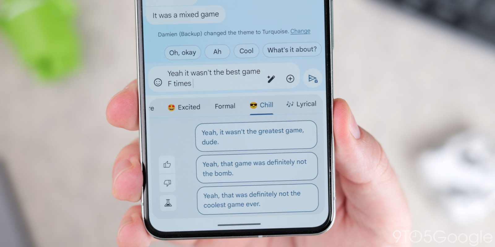
If something about Google Messages for Android looks different, it’s the tweaked design for the send button.
This small change sees the send button in a conversation get bolder. Previously, the paper airplane icon was themed and displayed against a light or dark background. It’s now the opposite for a more prominent highlight.
The background is now themed with Dynamic Color or one of the other eight preset Custom Bubble themes, while the icon is light or dark. The RCS end-to-end encryption (E2EE) lock icon or Gemini sparkle appears badged in the corner like always.
Old vs. new


So far, we’re seeing this updated send button in the Google Messages beta channel (version 20240813_00_RC00) where there appears to be wide availability. It follows work on a new read receipt system.
More on Google Messages:
- What Google Messages features are rolling out [U]
- Google Messages adding support for dual SIM RCS [U]
- The Gemini button in Google Messages has gotten worse
- Google Messages now lets you hide the Gemini button
FTC: We use income earning auto affiliate links. More.


Comments