The best applications of AI on the Pixel 9 Pro let people benefit from what large language models (LLMs) are good at — summarization, natural language/multimodal understanding, classification, etc. — without having to enter a prompt. The fact that Google identified this best practice is promising as the underlying hardware admirably provides premium hardware in a compact form factor.
Why an initial review? 9to5Google was granted seven days of early access to the Pixel 9 Pro ahead of today’s review embargo, not nearly enough time to reach a final verdict, especially in regards to Tensor G4, battery, etc. But with sales set to begin on August 22, we’re sharing our experience so far and will have a full review in the coming weeks with further thoughts.
Table of contents
Design + Hardware
With the Pixel 9 series, Google has reset the progress it made on refining the design language that started with Pixel 6.
This comes with ups and downs.


Starting with size, let’s paraphrase a similar sentiment: “big screen wins.” That is what the market has decided, with people understandably tempted by wanting big displays on the device they spend the most time on.
But I’m not a fan.
The last time I used a big phone for a year was with the Pixel 6 Pro. I regretted that decision as it was not the most comfortable to hold or easy to pocket. Meanwhile, I personally didn’t feel like I benefited from the extra real estate. In going back to the Pixel 7 a year later, I longed for a return to the Pixel 1-4 where the hardware gap between the sizes was more minimal.
The 6.3-inch Pixel 9 Pro is bigger than the 6.2-inch Pixel 8 I adored for being small. It’s taller (by 2.3 mm), wider (1.2 mm), and heavier (12 g). As such, I cannot call the Pixel 9 Pro a small phone. Compact and comfortable is the most fitting description (I typed a quarter of this review on the Pixel 9 Pro while walking outdoors.).
I’m a manual screen brightness person that lives at three increments. It’s 50% when indoors and 1% just before bed, while it goes to 100% outside. When in bright sunlight, I see no appreciable difference between last year’s Actua and the Pixel 9 Pro’s Super Actua (on paper, it’s 1,400 vs. 2,000 nits for HDR and 2,000 vs. 3,000 nits for peak brightness).

Pixel 9 Pro vs. Pixel 8
Related to the display is the cutout for the 42MP front-facing camera. It’s obviously not noticeable when the status bar is black, but in every other color scenario that selfie lens is noticeably bigger. The other issue is that this cutout is lower on the screen and almost escapes the status bar. It’s distracting when YouTube’s Ambient Mode is enabled because there’s barely any clearance. If it’s a lighter background color, you might be wondering why the video window has this random black circle connected to it.
But with this long-awaited size option, Google has also taken a step backwards on its unique, comfortable and rounded design. It’s a shame since the Pixel 8 was one of the most comfortable phones Google has made, with the Pixel 3 and 4a rounding out my top three.
The flat rails are sufficiently curved as they merge into the flat display and lovely “silky matte glass” rear panel so as to not cut into your palm. I still greatly prefer last year’s feel, but sharp edges were my biggest concern going in and it’s not an issue. One upside is how it’s so much more stable to hold the phone when you’re laying on your side because of the flatness. Similarly, you can rest the Pixel 9 Pro on its long left edge, though I’d be paranoid about it tipping over.

Another positive with this new shape is how the phone feels more like a solid brick with heft. I did not have issues with the structural integrity of Tensor Pixel phones that came before, but they are akin to slivers of glass, though you might personally enjoy that. The rails on the Pixel 9 Pro are the exact opposite of that and provide new rigidity.
I do not appreciate the polished frame from a fingerprint, visual, or tactile perspective. It does not feel particularly premium to me. A matte finish feels nicer and is more practical, with the regular Pixel 9 easier to firmly grip as a result. That said, the Pixel 9 Pro is not slippery, though I’d mostly credit the smaller size for that.
With this rail design, you get an equally flat power button and volume rocker. I love this small change for the larger surface area and stability it provides your fingers, though I could see others not liking how it’s not elevated enough and thus slightly harder to find. My complaint is that the power button is not large enough, especially if Google wants you to press and hold for Gemini.

One minor observation is how the Pixel 9 Pro’s bottom surface is not symmetrical. Instead of two cutouts, there’s only one for the speaker at the left. The microphone is now a circle to the right of the USB-C port, with the SIM card tray – which is ever so slightly curved on the right side to match the corner radius – taking up the remaining space. People will absolutely insert an ejection tool/paperclip into the mic and I hope that won’t damage anything. That being said, I think we’re still one or two generations away from going eSIM only.
This year’s camera bar is tall. Like last year, that thickness translates into being able to use the sidewalls – which are also polished – as a grip for your forefinger in portrait orientation. A bigger deal, literally, is holding the phone in landscape and with the short side in your palm and resting your pinkie, ring, middle, and forefinger on the corner of the bar. It’s somewhat nice for watching videos.
Finally, I really wish Google would share the same fun colors across the regular and Pro series. This year’s Hazel is somehow even more gray than last year, where the base Pixel 9 gets all of the fun and vibrant colors.

The ultrasonic fingerprint sensor is way more accurate than the optical version, and I’ve had significantly less unlock failures that require another tap. I’d say it’s gone down from a handful of times per day on the Pixel 8 to once or twice on the 9 Pro. However, the set-up process would benefit from more visual or haptic feedback since there’s no longer a (blinding) light.
Google introduced a vapor chamber for the Pixel 9 series, but I haven’t noticed this phone (Tensor G4) perform any cooler than what came before. Checking in with the rest of the team, they concur Tensor G4 still runs warm on average, mostly unchanged from last year, but it no longer unexpectedly or further ramps up the heat, like when playing games compared to last year’s Pixel 8 and 8 Pro.
With 12 GB of RAM (on the Pixel Fold), I definitely benefited from more apps staying in memory for longer periods compared to 8 GB. The 16 GB on the Pixel 9 Pro continues that, but that addition is for AI and a dedicated carve out rather than anything end users can truly perceive. The law of diminishing returns would prevent the extra 4GB from being particularly noticeable anyway.
From notifications to wait messages, you’ll notice when something is being processed by the on-device models. This is just an observation and not a complaint, but it’s far from instantaneous, though cloud AI isn’t either. In the case of Pixel Screenshots, it’s an “Adding to Screenshots” progress bar, especially if you take multiple captures in quick succession. For first-party apps, I think Android should hide it from the user — even if it’s still going on in the background — for a more seamless experience.

As for battery life, my weekdays usually span 16-17 hours with around 5 hours of Pixel 9 Pro screen time. The AOD was always enabled (no Battery Saver) with a Pixel Watch paired and 2-3 hours of playing audio through the Pixel Buds Pro and Beats Pill.
On a single charge, I’ve ended the day near 20% ± 5% with the caveat being that this past week hasn’t seen normal usage given review-related stress testing. Towards the end of my time with the Pixel 8, it’d hover below 20% by the time I go to bed. More testing is required there.
The Thermometer, which picks up a live camera view when measuring objects, doesn’t negatively impact the overall experience, so its inclusion remains fine. Google deserves some props for being opinionated and sticking with this sensor for another generation. (The app would benefit from a Quick Settings Tile for speedier access.)

Lastly, on the hardware, it would be nice if the double-tap gesture on the rear panel would work consistently. I was hopeful that the new design would contribute to improved accuracy, but nope. The recognition rate is south of 50% for me.
AI
I’d roughly classify half the AI features available today as being pure regurgitators of text, images, or videos where the primary input method is a prompt. To greatly simplify the landscape, everything else is closer to applied AI where you don’t have to click “summarize,” “generate,” or do anything else before getting the benefits of this new generative technology.
My favorite example of that is the AI Weather Report in Pixel Weather. Gemini Nano is leveraged to summarize various data points into a simple and actionable sentence that you can expand for more details (in the form of bullet points). It saves me from having to scroll through the app with one card conveying everything I need to know and move on. I find myself unexpectedly ascribing a personality to that summary that I enjoy for reasons I cannot fully encapsulate.


A bigger application of what I consider applied AI is Pixel Screenshots. After Recorder, I think this is one of the best apps outside of Google in recent years. First of all, the underlying premise of a dedicated place for your screenshots is a great one even before any of the AI aspects. It’s so much better and faster to access than my usual Google Photos workflow of starring a capture and later finding it by going to the Favorites album in a different tab, or making an image note in Google Keep.
Pixel Screenshots lets you easily add notes, group into collections, and even assign reminders. Google attaches the page link when you screenshot something in Chrome for a quick return. This alone is reason enough for me to use it.
Then you have the AI aspect that summarizes screenshots and makes them searchable. The natural language queries are fantastic and speedy. That processing takes a few seconds with a notification briefing appearing in the shade that I again think should be more hidden. All this is made possible by Gemini Nano with Multimodality.


Meanwhile, Google positions Gemini Live as letting you naturally talk to something that’s an expert in every domain.
I do find the two-way conversational capability to be more natural than voice experiences that came before. You don’t have to contort yourself into a specific command style, with naturally queries working best. Gemini Live allows you to interject and ask follow-ups or add information in a very human way.
The mechanics of Gemini Live are good and can be clearly applied to other tasks, but I just don’t see myself using the current functionality of a talking encyclopedia in my life. It seems more like an educational tool than something you’d invoke in day-to-day life. The responses are delivered too slowly and still feel on the long side, even though Google worked to make Live more concise. I wish there was a real-time transcript for faster digestion, especially several sentences in. As beautiful as the Gemini Live waveform animation is, it doesn’t hold my attention and I find myself exiting the app immediately to use it in the background or with the screen off.

Live will be useful when it adds support for Gemini Extensions that let you talk about your Gmail, Drive files, etc. The ability to control phone functionality with your voice will be very useful, and I wish Google started there.
Meanwhile, in the Gemini app or floating overlay, the Live icon appears in the bottom-right corner. There’s also still a microphone at the center for regular text input. There’s a clear difference between speech-to-text and full-featured conversational experience, but it’s getting a tiny bit confusing.
I’ve set the power button to activate Gemini after years of using the swipe. I still prefer the bottom corner swipe and will probably return to that, while I mistakenly find myself pressing the microphone in the search bar at the bottom of the Pixel Launcher so often these days.
A voice assistant for your phone should help you use that mobile device. The Gemini team was rightly panned in February for thinking version 1.0 of the Gemini app was able to replace Google Assistant on Android in any manner. Gemini Live on the Pixel 9 Pro is still not there yet. It does not yet fulfill the core hands-free control of your phone use case, but there’s a path there with Extensions. I see Gemini Live’s biggest advancement being two-way conversational interactions as the utility of having a talkative expert is not that handy. Again, Google has laid the foundation for a good assistant. It just needs to add the functionality.

Outside of Live, I think too much AI functionality is offloaded to the Gemini app. For example, summarizing your unread emails should be done in the Gmail app — though that’s changing — rather than Gemini. Ditto on webpages and Chrome needing to add a summary capability. Meanwhile, the new floating Gemini overlay that doesn’t take you to a fullscreen UI for responses is nice and reminiscent of 2019’s new Google Assistant. This makes Gemini feel lighter and better suited for quick commands.
As long as call recording is disclosed and agreed upon, I don’t think there’s anything wrong with the practice. That said, in the real world, I’m absolutely asking the person I’m talking with if they’re okay with the call being recorded before initiating Call Notes. Personally, I don’t think the automated — “Google Call Notes is on. Your call is being recorded. “ — message that plays is enough.
The real value of Call Notes — which is officially in “Preview” — is that recording and transcription, which Google says might take a few minutes to appear depending on the length of the call and even device battery level. The accuracy of the AI summaries are a bit hit or miss for wide-ranging conversations that are not topic-based. But again, what some people have long wanted is call recording and transcription that leverages Google’s excellent speech-to-text accuracy. AI for summaries here is an ignorable bonus.


As for Pixel Studio, in general, I think image generation is a slippery slope where the downsides outweigh the positives. You can absolutely make it output questionable content and I don’t think any amount of guardrails can stop that.
That said, my colleague Kyle aptly described Pixel Studio (which has a nice icon) as a meme generator for quick editing and sharing of existing pictures. Tap the button next to “Create” to browse your gallery and skip the main image generation part of the app.
Besides overlaying captions, you can create stickers and select objects in a scene to move, enlarge, or delete. It’s similar to Magic Editor but with less of a focus on fidelity. You can save stickers and add them to other Pixel Studio edits.
As such, this aspect of PS – I’m sure having the same initials as Photoshop is accidental – is another example of generative AI without the prompting. What you end up with is a pretty useful AI-powered editor where the quality of the edits — shared among friends — doesn’t really matter.


I’ve been happy to use Magic Editor (and Eraser) in Google Photos for deleting objects to make a scene perfect, but this addition of generative AI where you can drastically alter parts of an image is a step too far. In fact, I no longer think it’s a photo. To me, it borders a rendering.
Additionally, while I can appreciate that a prompt-based approach allows people to describe what I want in a natural manner, I think a blank field is so much more daunting than a guided UI that has suggestions.


Software
Android 14 on the Pixel 9 Pro is fine. Running an August build, it’s more polished than what’s running on the base Pixel 9 (July, initially). Google has a pass this cycle on not launching with the new version of Android since the phones launched earlier and the division merger happened in April, but it cannot happen again.
We miss out on Private space, but Google did backport some things from 15 to 14, like the new pill-shaped tray for screenshot previews. In separating the rectangular preview, Google has added a delightful glow to signify Pixel Screenshots.
Overall, Android 15 is not a big update – the new Material You volume panel is great though – and you aren’t missing out much, but it’s the principle of the matter. It also comes down to whether the Pixel 9 Pro will get seven or eight major Android updates depending on whether Android 21 in 2031 is released before August.
I’m glad that VPN by Google remains a perk on Pixel phones as an extra layer of security that causes no slowdowns.
AI aside, Pixel Weather is a beautifully designed experience that I enjoy opening throughout the day. The Pixel teams working on software are one of the better arbiters of Material You.
Unfortunately, reviewers won’t have a chance to access Satellite SOS until tomorrow’s retail launch. Joining Car Crash Detection, Safety Check, and Emergency SOS, it makes Pixel a Swiss Army Knife for safety, and speaks to how there are still one or two gadgets that can still be consolidated into a phone.
Camera
I will never hand my phone to a stranger for a solo picture or a group photo. I have suffered through awkwardly stretching out my hand as far as possible while using the rear camera (to get the best possible quality) at the expense of not being able to frame. So much so, that I had somebody ask if I wanted them to take the photo. Sure, you can first lock it then relaunch the camera via a double-tap of the power button, but what if you forget? The best practice is to just never do that.
In that sense, Add Me is a perfect feature for me. I do have qualms about that combined scene not actually existing, but I’ll take the simulacrum of that group moment over handing over my phone, a possession so critical to daily life, to a complete stranger.
Besides the small cover screen, my favorite part of using the Pixel Fold this past year has been the telephoto lens. In my life, being able to zoom in from afar is so much more powerful than an ultra-wide angle lens, with the regular wide one sufficient.
Having a zoom lens on a compact device has been fantastic:
Pixel 9 Pro: .5, 1x, 2x, 5x, 30x
Pixel 8: .5, 1x, 2x, 8x


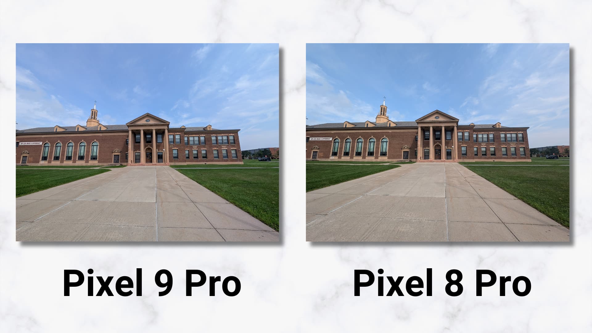
Pixel 8 vs. Pixel 9 Pro


Pixel 9 Pro 5x vs. 30x
Also of note is having a new dedicated Night Sight video mode in Pixel Camera.
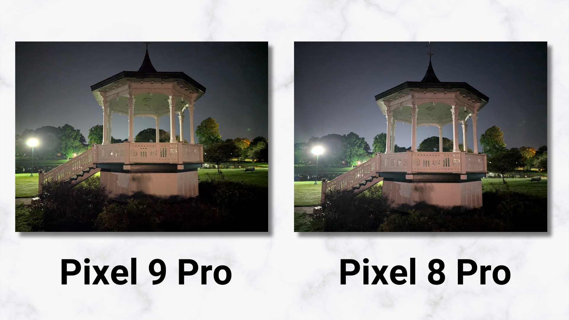
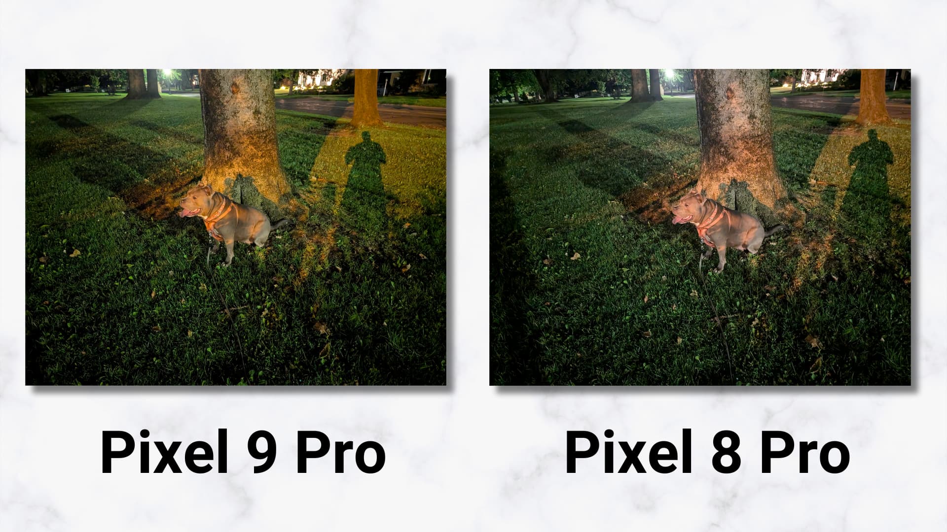
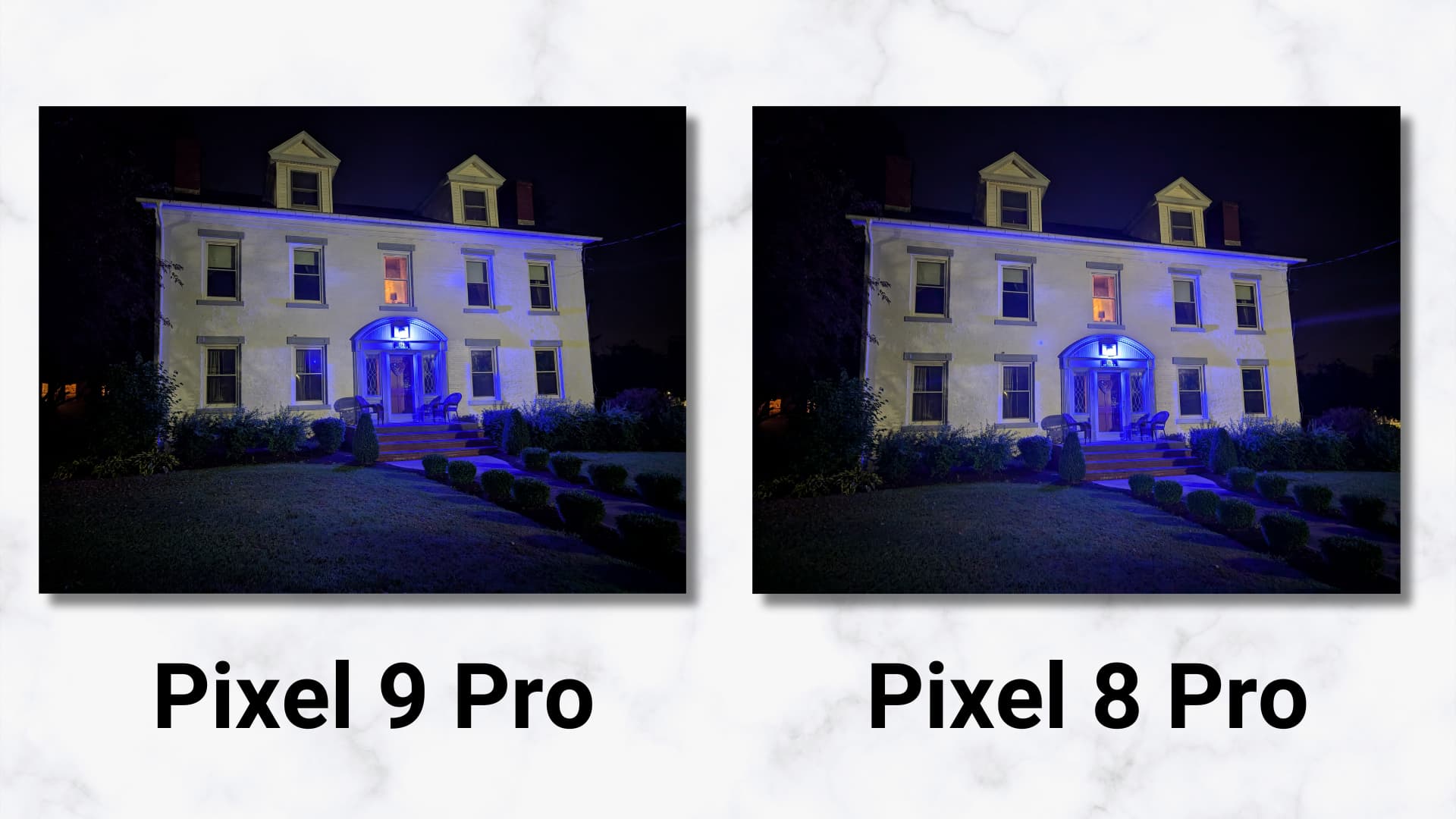
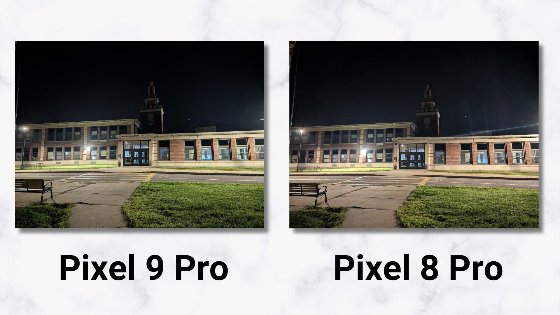
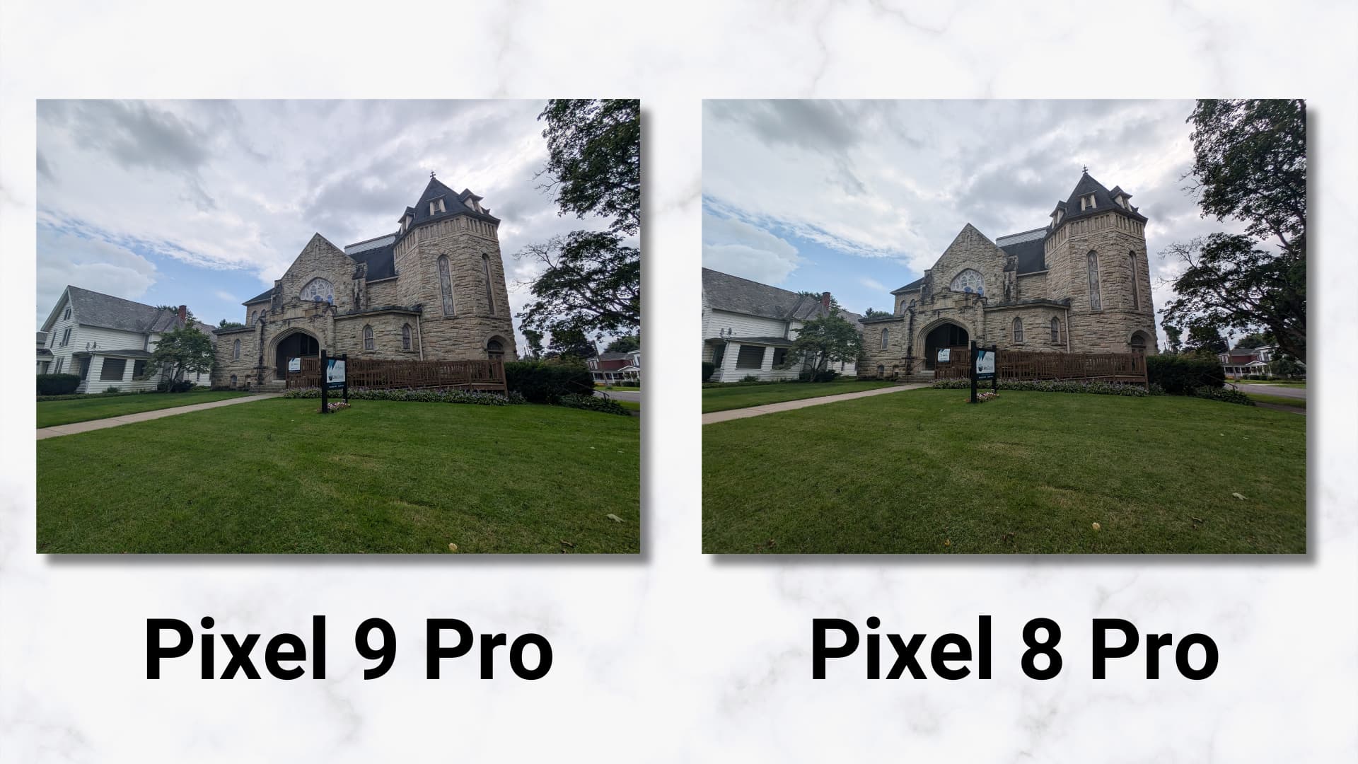
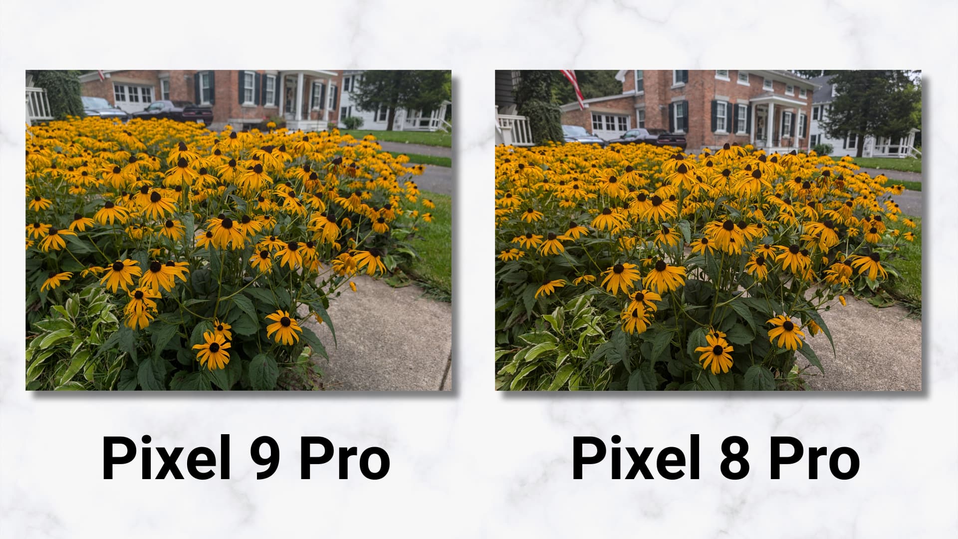
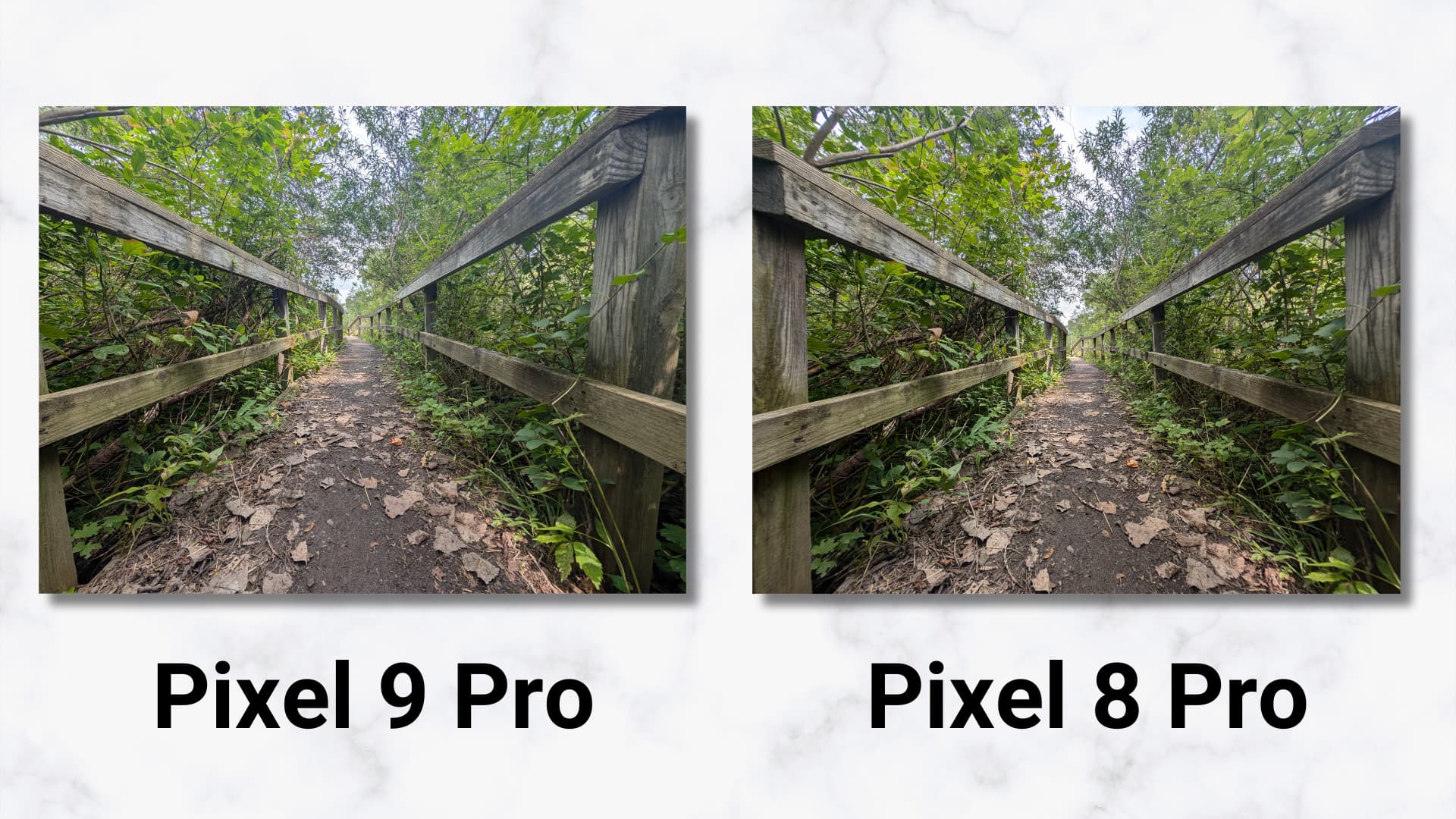
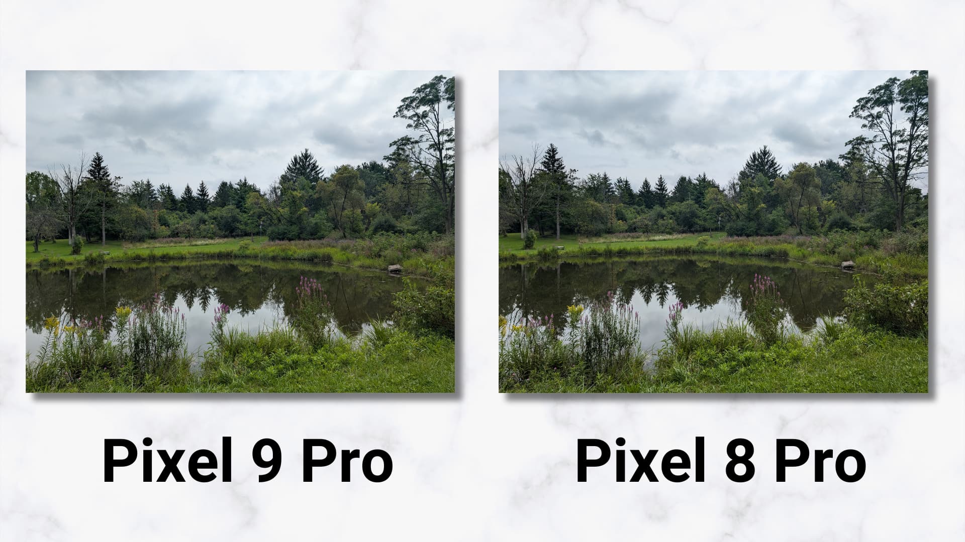
My colleague Jordan Floyd has more on the Pixel 9 Pro camera in his video. But in summary, we’ve noticed the Pixel 9 Pro being a little bit less vibrant, so there appear to be changes in color reproduction. Shadows are also a bit more detailed for dynamic range improvements, while the new 48 MP ultra-wide is cooler. In Night Sight, highlight control is marginally better as seen with less pronounced lens flare in the street lights. In all, the Pixel 9 Pro doesn’t offer any earth-shattering camera improvements, merely more tuning, minor enhancements, and a little extra Google tweaking.”
Stay tuned for our Pixel 9 Pro XL that goes more in-depth on the changes.
Conclusion
If you want a “premium” phone in a compact package, Google answered that call with the Pixel 9 Pro. This modern day “small” phone is 90% of what I want, and it’s comfortable enough size-wise that it doesn’t feel like settling. If you want the company to make more, I don’t think you’ll have any regrets buying this one to signal market demand.
As much as I like last year’s look and feel, this new design language contributes to the Pixel 9 Pro feeling like a significantly different phone than what Google has made in the past. If you want a change, I think it’s an easy upgrade given the telephoto lens and AI features, especially if you have any non-Pro Pixel.
Pixel Screenshots is so promising as a productivity, if not life organization, tool that I think it should be “Google Screenshots” for every single Android device to serve as a competitive advantage against the iPhone. As for Gemini Live, Extensions support cannot come soon enough. Overall, if this is what software looks like now that Gemini and its underlying models are fully available to the hardware team, I think Google will do a good job at thoughtfully integrating AI into the Pixel with the goal of making the smartphone smarter.
The Pixel 9 Pro will be available on September 4:
FTC: We use income earning auto affiliate links. More.










Comments