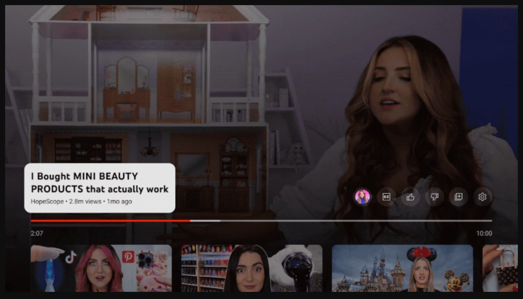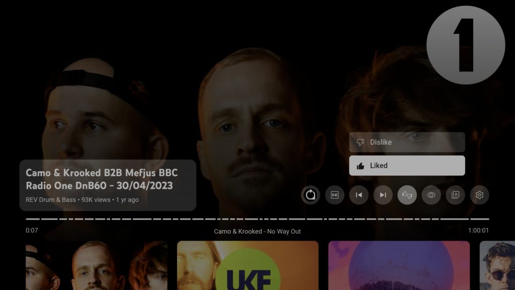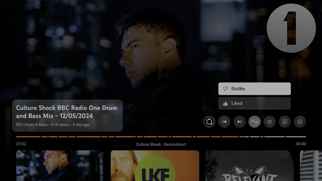
Google is well known for tinkering, but the latest change is a fused ‘like’ and ‘dislike’ button in the YouTube app for Android TV.
Previously, when viewing videos on YouTube for Android TV or Google TV, the menu bar above the playback progress scrubber would have dedicated ‘like’ and ‘dislike’ buttons alongside contextual content buttons such as settings, playlist controls, and channel hotlinks. For music videos and YouTube Music content you can see options to enable or disable album artwork too.


Now, you may see a new dual-purpose button that when clicked will bring up a mini pop-up menu where you can leave a ‘like’ or ‘dislike’ on the YouTube video in question. This menu adheres to the previous visual changes made to the home sidebar menu with enhanced animation.
We’re not entirely sure when this change occurred, but it appears to have rolled out over the past 24-48 hours to several of our Android TV and Chromecast with Google TV devices. Fusing this almost ubiquitous option into one button seemingly turns a common use case from a one-touch process to one that requires unnecessary extra interaction to signify your approval or dislike for specific YouTube content.
This feels similar to how YouTube removed public dislike counts from videos just a few years ago. You can still use the option, but the count for dislikes is no longer visible unless you use third-party extensions on web browsers. By fusing the like and dislike buttons, you’re simply making it more frustrating on the TV platform, which isn’t as intuitive as other YouTube platforms.
As you can probably tell, I’m not a fan.
More on YouTube:
- YouTube starts showing ads when you pause a video on TV
- YouTube Family Center links parent and teen accounts
- YouTube adds QR codes to share channels
FTC: We use income earning auto affiliate links. More.


Comments